For almost any beginner designer, typography is probably the biggest hurdle that you’ll have to overcome. Choosing the perfect combination of typefaces for a project is a difficult task for even the most experienced of professionals, so you can’t expect to hit the ground running when it comes to this surprisingly complex task. In order to become a competent typographer, you need to have a working knowledge of:
The terms that are used to describe various letterforms
How those terms translate into a visual outcome, giving each typeface a unique “personality”
The principles behind combining different typefaces, so that the results look cohesive and appropriate for each application
What makes a typeface work in different settings, especially as it applies to readability?
As you can see, understanding typography is a pretty tall order! Luckily, there are plenty of really informative tutorials to be found that help immensely in getting a good understanding of these fundamentals. If you start out by referring to these five resources, you should be well on your way towards making the kinds of sophisticated type choices that distinguish a professional designer from a novice.
1. Terminology
Start your typographic education by learning about the individual letterforms. Many of the shapes and styles (and even the spaces between the letters!) have names and specifications. This may seem like it’s not so important, but it’s actually essential for these reasons:
Closely examining individual letterforms is the first step in learning how they work in groups.
Once you know the terminology, you’ll be able to understand more advanced tutorials; many will refer to these terms.
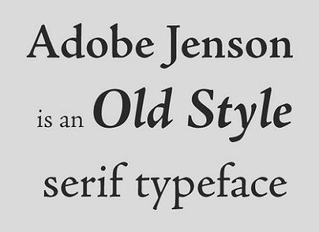
So take the time to find out the differences between old style, transitional, and modern typefaces, proportional vs. monospaced, and much more.
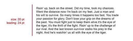
2. Leading, kerning, and tracking
You may never have even noticed letters or words that are too close together or too far apart. But the three types of typographic spacing—leading, kerning, and tracking—can make a startling difference in how your typography looks. They’re one of those things that aren’t noticeable when done right, but will ruin a project if done wrong. This tutorial will train your eye to notice awkward spacing, as well as show you the correct proportions for different types of text.
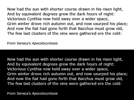
3. Readability
Of course, the most important consideration when it comes to typography is that the words are easy to read. With some things, like a large title, you can sacrifice readability a little in favor of aesthetics. But mostly it trumps all other considerations. And with the prevalence of web typography (and the increased difficulty of reading pixels on a screen rather than ink on paper), it’s even more important to learn how to make your text as readable as possible.
This tutorial will take you through the fundamentals of readability—and no, it’s not just all about having bigger text! Contrast, hierarchy, space, and several other concerns all play their part in making text as easily to scan and understand as possible.
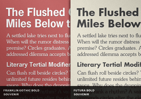
4. Combinations
Now that you’ve covered the basics, you’ll be fully prepped to move on to the most interesting and challenging aspect of typography: choosing the fonts! There are a lot of guidelines that are very helpful for picking the right combinations, and this tutorial provides you with a great start. You’ll learn a lot; from how to stay away from mixing moods and similar classifications, to making arrangements that utilize typographic color and contrast. Following the rules you learn will help you achieve balanced and interesting results.
5. Expand your skill set
The previous tutorials will give you a great start, but there’s still a lot to learn. Checking out this comprehensive list of resources will give you a good idea of all the formats and topics you can delve into once you’re ready. You’ll find resources for supplementing written tutorials with video tutorials and even online classes. Typography is a rich discipline that takes some work to get right. But it’s one of the most telling aspects of quality in a designers’ work, so it’s well worth the time that you put in.
About the Author

Mirko Humbert
Mirko Humbert is the editor-in-chief and main author of Designer Daily and Typography Daily. He is also a graphic designer and the founder of WP Expert.