In western societies, losing weight has become an obsession for some, a necessity for others, and a juicy market for an entire industry. It is interesting to take a look at how companies chose to communicate for these products. Most images in the following article have been found on the excellent Ads of the World website.

For slimming sanctuary

For weight watchers
Two ads that look pretty much alike, I do not know who copied who, but I think that the WeightWatchers one is probably more efficient. The “Entrance” – “Exit” signs are more easily readable and the whole idea more obvious.

WeightWatchers bus
On this ambiant, WeightWatchers use an optical illusion to make it look like the bus has a fat person making it go sideways.

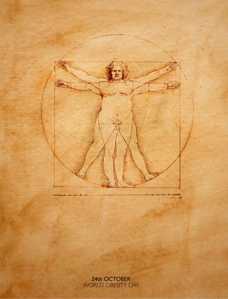
World obesity day
A day dedicated to inform people about the dangers of obesity. Advertising is often inspired by art, and this is an excellent example with this Da Vinci painting. The perfect man’s proportions are turned into a fat man’s proportions.

Sedentary people can’t run away from diseases. Exercise.
A campaign by the Ministry of Health of Portugal to encourage people to exercise more. Great visual illustration of one of the main reasons for obesity.

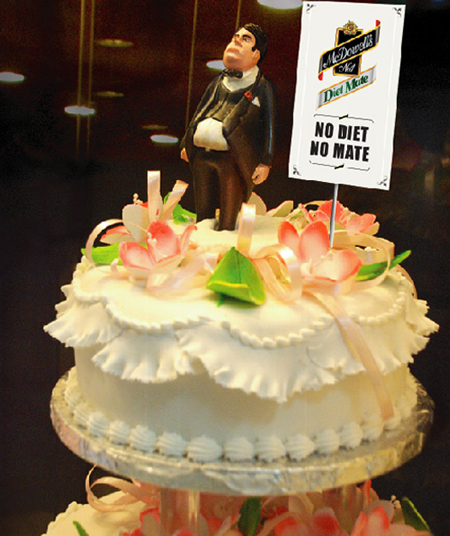
Diet Whiskey ad for McDowell’s
At least this ambiant ad taught me one thing, there is such a thing as diet Whiskey. While I would not drink diet Whiskey, I do find this ad well done and the idea not bad.

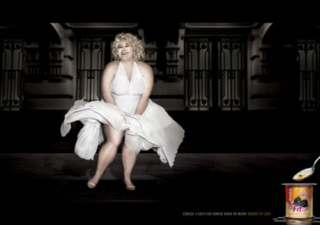
Fit Light Dairy
The idea of using an iconic image was pretty good in the beginning, but I find the end result not so tasteful. First, the message “Men’s preferences will never change” doesn’t make much sense, the original picture of Marilyn Monroe is a fine example of the changes in men’s taste. I also find that this ad is a bit insulting to the people that are supposed to use this product. Last but not least, the placement of the yoghourt is not good and the black thing in the spoon looks a little gross.

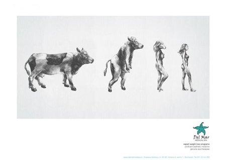
Del Mar medical spa, expert weight loss programs
Another example of poor taste in an ad for weight loss programs. Seriously, what went in the creative director’s head for him to think that it’s perfectly acceptable to portray overweight women as cows?

Xtra Slim
The idea is not bad, although not too creative, but a bit too complicated too quickly understand. Overall a not so efficient ad.

