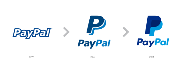
If you connected to your PayPal account recently, you may have noticed that the logo on the top left hand of their interface has changed.
The redesign is not a radical one, but the changes are important enough for PayPal to send out press releases about it. Most noticeable, bot capital “P”s have been closed and now overlap with a nice transparency effect.
The PayPal name’s typeface has also been subtly changed into a thinner, less italic one, with a different glyph for the “a”s.
This makeover is the work of Fuseproject, a design studio based in San Francisco and New York.


