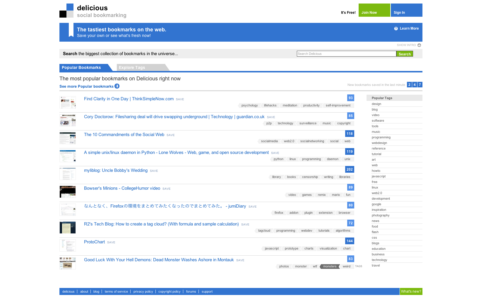
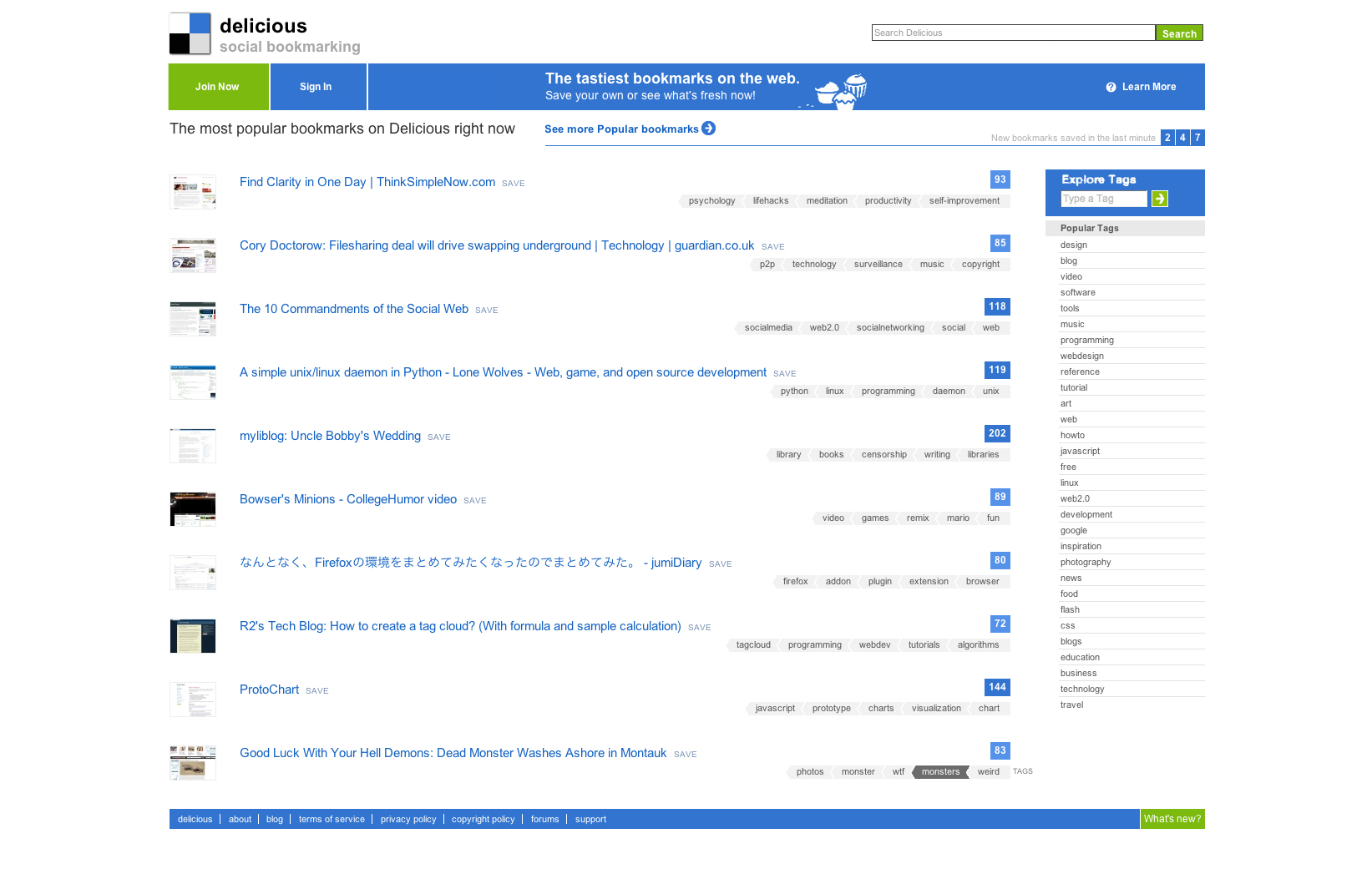
It may sound a little pretentious to share this screenshot of a redesign of the new Delicious design, but as a big user of the bookmarking service I really feel like they have not gone all the way. I actually didn’t do much but try to declutter the interface of the homepage and add a little space between items to let them breathe.

What I don’t like about the new design
While much fresher and attractive than the previous layout, this one has some flaws and feels really cluttered. The header takes too much space and is overwhelming with these horizontal lines for links, tabs, search, titles,… The bookmarks are the core of Delicious, but they start way too low and have tiny screenshots. I’d really love to see bigger screenshots to make those bookmarks more attractive.
The tags are also getting less interesting in this version, with a long list of bookmarks that doesn’t make much sense. We used to get one tag with three bookmarks, that was self-explanatory on the interest of bookmarks by saying: “Hey look, with this tag you can find this kind of cool web pages!”. It’s not the case anymore.

When connected, it’s pretty much the same, the new functionality are not well supported by the interface and the clutter makes navigating the site quite annoying.
What I do like about the new design
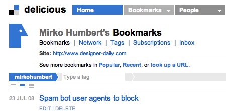
Not much really, the new color scheme is nicer and there is a very cool tagbar with some kind of breadcrumb where you can add tags.

Anyway, Delicious really improved it’s search and performance, which was I guess more important than the design of the site. I must also say that I don’t really care about Delicious design since I use the service mostly from my browser.
What about you dear readers? What do you think about Delicious redesign?


