In my last two post, I tried identifying alternatives to well known serif and sans typefaces.
I barely scratched the surface, so I thought I’d provide a list of more independent, less known type foundries I like—ones I haven’t included in the past—along with a review of one notable font on her production table.
One of these workhorses may be one that stays in your palette for a while.
Are you ready?
Darden Studio
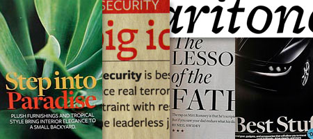
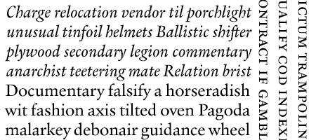
Joshua Darden’s Freight family of fonts could be seen notable publications around the world: from GQ, Better Homes and Gardens, The Boston Globe Magazine to Reader’s Digest; but I always have a soft spot for his unconventional slab serif, Jubilat. Its extra light and light weight (mind you, most slabs don’t even have a light weight to begin with) is reminiscent of Hoefler & Frere-Jones’ Archer. On bolder weights, Jubilat looks like a contemporary Clarendon. In addition to this, its historical and geometric alternate glyphs (historical slabs like Clarendon, geometric slabs like Rockwell) help make your text distinct.
Jeremy Tankard Typography
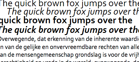
If you have Windows Vista, Office 2007 or 2008, you’ll already have Jeremy Tankard’s Corbel installed in your system. In my opinion, not many typefaces make a fine substitute for Verdana for on screen reading (Tahoma can be too tight, and Helvetica must be set in larger sizes for legibility.) Corbel is one—and here’s the kicker: in addition to being hinted for small sizes, it actually looks good when set large or printed on paper.
Now that the operating system and office suite are both available and growing in use on PC and Mac, you can safely try it on your next website.
font-family: Corbel, Verdana, sans serif;
Laura Meseguer
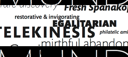
Don’t let Rumba’s ornate details scare you from setting it small. While it may not be the most appropriate choice for setting a full-length novel, it’s great for subheads.
Rumba’s size guideline is as follows:
Rumba Small: 16–24 pt (although I would say that it sets well down until about 14 pt)
Rumba Big: 24–72 pt
Rumba Extra: 72+ pt
But there’s more. Laura Meseguer’s intent in Rumba was to “Design a very good and functional type to be used in languages spoken in Spain (Spanish, Catalan, Galician and Basque.)” (Source, p. 4) As you know, different language has different alphabet distributions and letter combinations (digraphs,) and thus could create conflict not apparent in most type designed for English speaking audience. For instance, Norwegian has an ‘fj’ letter combination, found in words like ‘fjord,’ and German has the Eszett ‘ß.’ In addition to this, languages spoken in Spain has diacritic combinations not commonly used in other regions.
With this in mind, Rumba can set multiple languages perfectly.
Vanarchiv
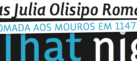
In case you hadn’t noticed, I’m a fan of types made from the Iberian Peninsula (thanks, diogo. Ricardo Santos’ Lisboa is one prime example of this. It has what the designer calls “hooked head terminals,” found in the upper-left part of ‘r’ and descender of ‘Q.’ These terminals gives it a smooth flow and warmth. Lisboa’s Italic swash capitals are rather idiosyncratic and tricky to use, but they make great Drop Caps.
MVB Fonts
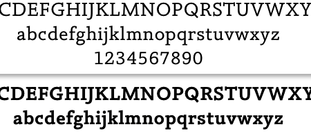
Mark van Bronkhorst’s Verdigris is perhaps the most well-known product from this foundry. If you read my review of Alternatives to Serif Typefaces, you’ll notice that I avoid suggesting safe alternatives to Garamond, choosing instead to be more adventurous and suggest ones based on different models. Verdigris is not one of those. It’s a honest-to-goodness contemporary cousin of Garamond, much like Sabon. If you need a book type that’s no frills and all business, Verdigris should be in your palette.
Terrestrial Design
I also reviewed Carl Crossgrove’s Beorcana family on the last Designer Daily post, but if you’re stopping by his site again, check out Mundo Sans, his contemporary response to Hans Eduard Meier’s “most humanist of sanserifs, Syntax” [source.]
Protimient
Ben Jones’ Nosta is an alternative to Palatino the same way Verdigris is to Sabon.
Stone Type Foundry
Sumner Stone was one of the early digital type designers who embraced the concept of superfamily—“integrating serif and sans serif styles in a single family” [source]—through his Stone fonts.
Among his excellent library, Silica particularly merits consideration. Silica is a humanist slab serif rests comfortably between Peter Matthias Noordjiz’s geometric/neo-humanist Caecilia and Carol Twombly’s roman-like Chaparral.
Hubert Jocham Design + Type
You may know Hubert Jocham from his caption and headline font design for the W Magazine, NewLibris. You may also know that the DIN font family is overused, but also has that engineer-designed construction that, like any good workhorse typeface, is hard to find decent alternatives to. This is where Hubert’s Konsens family come to the rescue.
Porchez Typofonderie
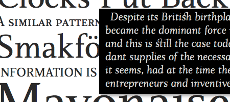
Porchez’s eponymous Le Monde superfamily is used in publications around the world, from periodicals like Harvard Business Review to the daily newspaper itself. I like his Mediterranean-spirited Costa, but his two part post of the history of typography, told from the French perspective (Part One and Part Two) is certainly worth a read.
And the list goes on!
- Peter Verheul
- Bionic Systems
- Suitcase Type Foundry
- Font-O-Rama
- primetype, typeface design by Ole Schäfer of FF Info fame.
Do you have a favorite type foundry or font family that you’d love to share with the world?
If you ask nicely, I’ll even review your suggestions 🙂
—
Bram Pitoyo is a brand strategist, hacker and typophile who aims to unite the creative and technology communities in Portland, Oregon, and around the world. On most days, you can find him planning, organizing and reporting events of this nature. On some other, you’ll find him talking to local personalities.
About the Author

Mirko Humbert
Mirko Humbert is the editor-in-chief and main author of Designer Daily and Typography Daily. He is also a graphic designer and the founder of WP Expert.