Vectors are an effective way of creating online illustrations which can be blown up to large sizes without losing quality. If you’ve ever looked at an image and believed it would look great as a vector, but wondered where to start, these helpful tips are for you.
When working with a vector program such as Vectornator, your first job is to get to know your drawing program. After this, taking a design down to its foundations will enable you to create an effective illustration.
Seek out the basic structure of your drawing

Seek out the core areas of your design. Based on the flat shapes in front of you, you’ll get an idea of the composition of the page.
Next, seek out the essential elements. How can you create focus by reducing the elements on the page? This will give your drawing focus.
As you develop base shapes for the elements of your page, such as the laptop, table, coffee cup and glass, you’ll see your rendering begin to take form. These shapes might feel flat, but you’ll begin to get a sense of your layout.
Add texture and patterns

Now that you have your layout, start to look at where you can add texture or pattern. You could look at the surface of the table and add just enough texture to show that it is made of wood.
Adding some grain will achieve this effect. Focus carefully on where you’d like to add texture so that you don’t complicate your page.
Repeat Elements

If you have repeat shapes such as window frames or coffee cups, you can repeat these images, adding some new details such as different blind lengths or patterns in order to create a unique image.
Take creative shortcuts
If you’d like to add interesting details to your drawing, such as shadows of trees framed against a night sky, you can use Image Trace.
This way you do not have to draw every detail, but you’ll still be able to add texture or background to your illustration.
Start with simple shapes
When you’re starting your drawing, begin with basic geometric shapes such as rectangles, triangles, squares or trapeziums.
From here, you can use the warp function to alter your shape. When you’re working from stock images, sketches or even your own imagination, begin by breaking the image down into basic shapes and work from there.
Consult your client

When you are about to hand over the final image to your client, find out the format they require. This way you can supply them with the file they want most.
If the client wants an Illustrator file, and you have a great many layers that you don’t want to move over one by one, simply draw a rectangle over your image, control, and right click, and ‘create clipping mask’.
This will give you the shape of your artwork that you are now able to present to your client.
Use Bezier Curves
When you are drawing with a Wacom pad and pen, you could use Bezier Tools to create smooth curves.
Bezier curves might take time to learn but they will give you the smooth lines or shapes you want. Learning keyboard shortcuts will help you to work quickly and efficiently with this tool.
Consider your medium
Your medium will determine your approach to your design. If you are designing for a magazine or a billboard, the end result will be different than a design you would like to spray onto a wall. Choice of shapes, color, texture, and complexity will all depend on the end goal.
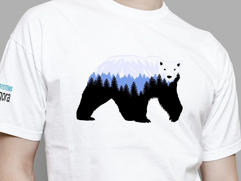
If you are designing a T-Shirt artwork, for example, you should look first at how others are creating them. Also, frame your design in a blank T-shirt template, so that you will present it better to your client.
Experiment

Feel free to play and experiment when working on your design. Create simple shapes, lines or curves, move them about, erase some of the details and then add new elements.
Allowing yourself to play with your design gives you space for spontaneity, and to allow the process to evolve. Even though you might plan your design carefully, allowing experimentation creates space for new ideas to flow.
Develop your own style

When working with vectors, try to find your own unique style. This is possible with Adobe Illustrator, which offers unlimited ways of working. After experimenting with the program, allow your own style to emerge. Below are some opportunities for experimentation:
When working with a pen, use the least number of anchor points and draw on curves so that your design looks clean and smooth.
Calligraphic brushes used alongside your tablet will give your illustration a hand-drawn feel.
In Illustrator, close off all the shapes you don’t need, and experiment with using the pencil tool. You can draw basic shapes, expand on them and use color to add life to your work.
If you are using line art, play with the lightness or thickness of your strokes. This will add texture and depth to your work.
Using layer folders
When you are creating complex artworks, it is often helpful to work in layers, an option provided by Illustrator. Layers are like clear folders which manage all the different elements of your artwork.
You can place them together, change their stacking order or delete aspects of your work that you no longer like. Shifting and playing with layers gives you the opportunity to experiment with your design without losing the original concept.
Color opacity and transparent gradients

The gradient palate is a very effective feature on Illustrator. Transparent gradients give you the opportunity to fade out a color in different areas of your page, providing different levels of opacity. Using transparent gradients will also give you a watercolor effect.
Store your work
Once you have created shapes or drawing, you can store them, giving you a collection of drawings or ideas to play with while working on a new project.
These shapes will be able to provide you with foundations for new projects which will feel easy and natural to use.
Use your imagination

When using Adobe Photoshop, creating new forms or shapes means imagining how they will look in 3D.
Working with multiple layers which add color, light, and shadow will create a three-dimensional effect. You can adjust these shapes or layers later on to suit your needs.
Which software is most helpful when drawing vector icons?
When Drawing Shapes
When creating icons, you can achieve incredible results simply by combining basic shapes and sizes. All drawing apps have tools for basic shapes, but when you’re choosing which product you’d like to work with, it’s worth thinking about how easy each program is to use, and the flexibility offered.
Photoshop is not so easy to use because it isn’t made for vector drawing, and so isn’t as smooth or intuitive as Illustrator or Sketch when it comes to drawing. You may also struggle with editing shapes such as polygons or stars, and this might limit your flexibility.
Illustrator is great for creating basic shapes, and it has a Live Corners feature which can smooth out corners. However, Illustrator (like Photoshop) can limit you when it comes to polygons or stars, which can’t be adjusted. Sketch allows you to edit all shapes, including polygons and stars and will let you round all corners, which gives you a greater degree of flexibility.
When using Pathfinder or Boolean Operations
You can use the Pathfinder panel to create new shape combinations. This allows you to add complexity to your vector illustrations. The panel gives you 4 options to create new shapes:
- Unite/Add: combines and merges selected shapes
- Minus/Subtract: Uses a cookie cutter to subtract top shapes from bottom ones.
- Intersect deletes shapes that do not overlap.
- Exclude: deletes everything that does overlap
Photoshop has non-destructive operations on Pathfinder (and so they won’t make permanent changes to your shapes), and these can be flattened if you need this. However, you will need to merge layers together as Photoshop can only perform pathfinders on single layer vectors.
Illustrator has a far wider range of Pathfinder options. These extra options increase the flexibility of your vector drawings. However, they are destructive, so they will make permanent changes to your shapes.
Sketch has non-destructive Pathfinder operations which can be modified within the various layers. You can also flatten your combined shapes to create permanent changes. Sketch is a very helpful program when it comes to Pathfinder options.
When exporting to SVG

SVG creates scalable vector graphics and is a standard format used by the World Wide Web Consortium. SVG is the best way to share vector illustrations as it is supported by browsers, drawing applications, and image viewers.
Photoshop enables you to export multiple SVG files by either using individual artboards or creating a .svg suffix for layers or group files. There is, therefore, no need to create an artboard for each icon. This sets Photoshop apart. It can be helpful when you are working with large numbers of icons or layers. You can also overlap layers in Photoshop using the same artboard.
Illustrator has a range of SVG export options which enables you to create font preferences, CSS properties, and image embedding. You can export multiple SVG files simultaneously. However, there is a limit of 100 artboards per Illustrator document.
Sketch allows you to export SVG files using Slices. However, this process can be buggier than Photoshop and Illustrator and can be a drawback when using Sketch.
Ending thoughts
Little tips can be effective to turn your work around, or allow your thoughts or ideas to ‘click’. Going through the foundations, although this may seem like common knowledge, might give you a simple solution to any problem you might be having. Good luck with your vector drawings.
About the Author

Mirko Humbert
Mirko Humbert is the editor-in-chief and main author of Designer Daily and Typography Daily. He is also a graphic designer and the founder of WP Expert.