Your ability to build a website with a friendly navigation scheme just got a whole lot easier. We had a long and grueling journey through various navigation schemes. As a result, the need for responsive web design has shown us what is important and not overly complicated.
This, in turn, has given rise to a new set of best practices. Best practices we probably should have been following all along. These best practices subscribe to a minimalist line of thought. The latter is focused on the main goal of each website page.
Check these top 5 best practices out.
Best Practice #1: Implement a navigation scheme that helps a visitor get to her main goal
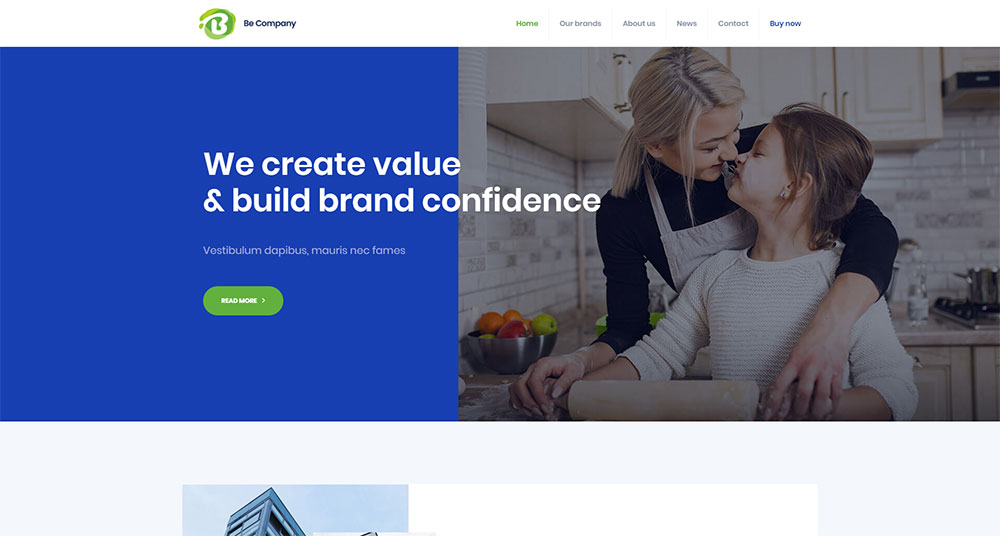
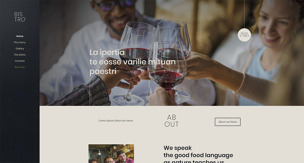
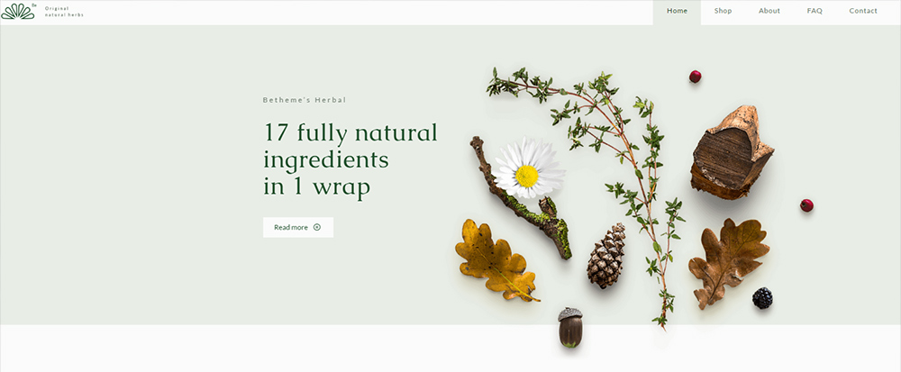
Visitors are often curious to see what’s new on a website. Sometimes, being able to quickly take in the latest news or updates is of great importance to them. Show what’s new up front and highlight it as such.
An attention-getting image on the home page accompanied by a CTA is an excellent way to do this.
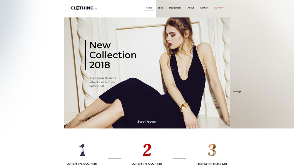
A visitor might be confronted with a choice when browsing a website is quite large or complex. In this case, it can be easy for that person to get lost. A search bar at the top of the page or several CTAs placed at strategic locations can help. These can prevent this from happening and point the visitor in the right direction.
“Read More” is one good option.
Best Practice #2: Always let the visitor know his or her current location
Implementing a current location element is a gold standard for website navigation.
Today’s increasingly complex eCommerce sites are good examples. It can be all too easy for users to get lost. Especially in the case of megamenus leading to a host of different product categories. A solution? Keep track of where the user currently is, where he or she has been, and where you anticipate the user might go next.
Use a contrasting color for the current location indicator. Like this, you can show users where at the website they are at the moment.
A mini-map of a user’s journey is one way to help the user trace back his or her steps:
A fixed menu on top of the page can help a user decide where to go next to further explore the website.

Best Practice #3: Use standard icons and lingo
Creativity is an asset every web designer needs. Creativity should be encouraged – except for website navigation. Cleverly designed icons can serve the same purpose as misplaced street signs. They can easily send a user off on a wild goose chase.
If you want to entertain your visitors, direct your creativity to other areas other. Stick to familiar navigation structures and elements.
How about a Hamburger menu for example? Yes! This versatile menu type can consolidate a lot of useful information on a page.
Or, maybe a cleverly shaped menu with random clickable areas? No! Menus are not there to entertain, nor should they be designed to make a user have to think.
How about a bold logo that takes you back to Home when you click it? Always a good idea.
An animated logo that warps you into another dimension? No! Animated logos can be irritating, distracting, and add little or no value.
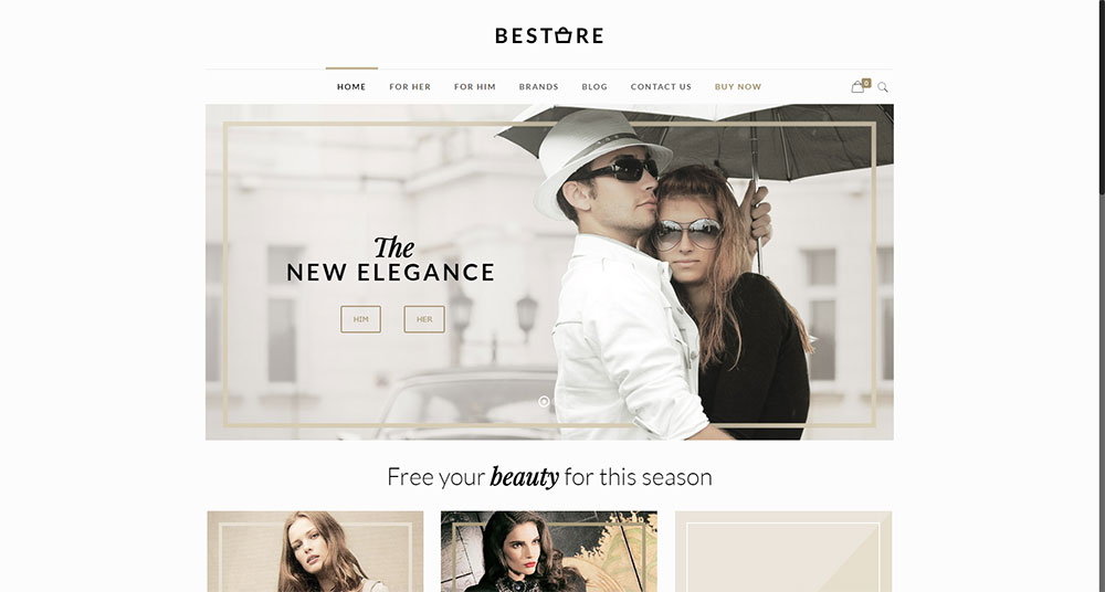
Best Practice #4: Don’t exceed 7 menu items
If you go beyond 7 menu items, people will have trouble remembering things. A crisp, clean menu is almost always user-friendly and is also good for ranking. A link serves the same purpose as a menu item, so don’t load a page down with links either, especially the home page.
“For Him” and “For Her” is all you need on this home page.
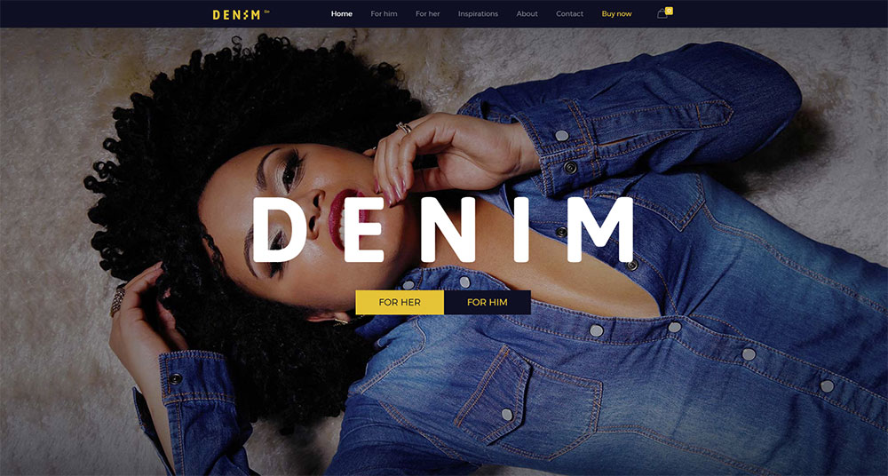
Stick to the most important things for the user and place their two key attractions on the top and at the bottom of the list.
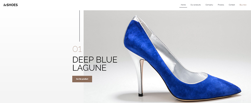
Best Practice #5: Choose the menu type according to the amount of content
Mindlessly following what others are doing is not recommended. This is the rule even when they appear to be following best practices.
The reason? Your website will generally have a different amount of content than other websites. You need to go with a menu type that’s a good match for the amount of content you have.
A single navigation bar may be all that’s needed. For a small shoe store specializing in seasonal wear or limited editions, this is perfect.
On the other hand, your online store might sell 100 or more brands of clothing for people of all ages and sizes. Then, you’ll be better served using a well-structured megamenu. A vertical collapsible menu is a good option, too.
BeTheme – A Simple Solution
How to best cope with changing website navigation standards? Do that by sticking to simple, easy-to-follow best practices that tend to be evergreen. The easiest way to do this is to use pre-built websites. At the same time, you can keep up with web design best practices in general.
BeTheme has the largest selection of these in the industry – more than 320. They’re aligned with user expectations for every industry sector and niche.
Summary
Here’s a wrap-up of the website navigation best practices covered in this article:
- Point a visitor toward her primary objective on every page
- Make certain the visitor knows where she is at all times, where she has been, and where she is likely to go
- Use standard icons and lingo so as not to mislead or confuse the user
- Limit menu items to seven to avoid overwhelming the user
- Base your menu type in accordance with the amount of content in your website
- Use pre-built websites. They make navigating a piece of cake.
About the Author

Mirko Humbert
Mirko Humbert is the editor-in-chief and main author of Designer Daily and Typography Daily. He is also a graphic designer and the founder of WP Expert.