The easiest way to demonstrate the purpose of design is maybe the absurd way. Good design isn’t always spectacular, while bad design will show you exactly what parts of the work the designer is paid for. Here are 10 examples of design fails that will make you smile.
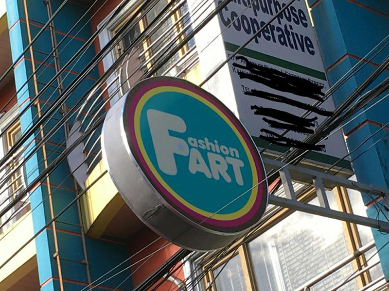
1. Fashion Fart
When using a capital letter in a big format, make sure that people understand which word it belongs too. With poor positioning, it can take a whole new meaning.
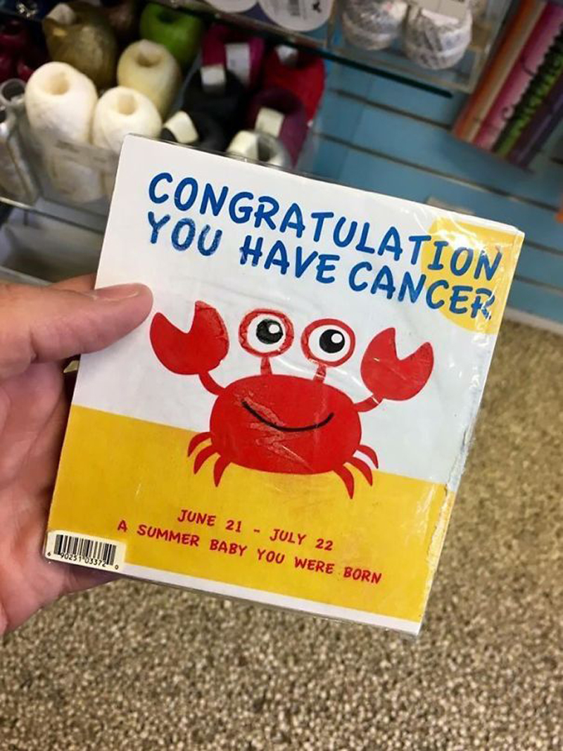
2. Congratulations you have cancer
This is not the right way to announce a baby to new parents, even if she or he is born between June 21 or July 22.
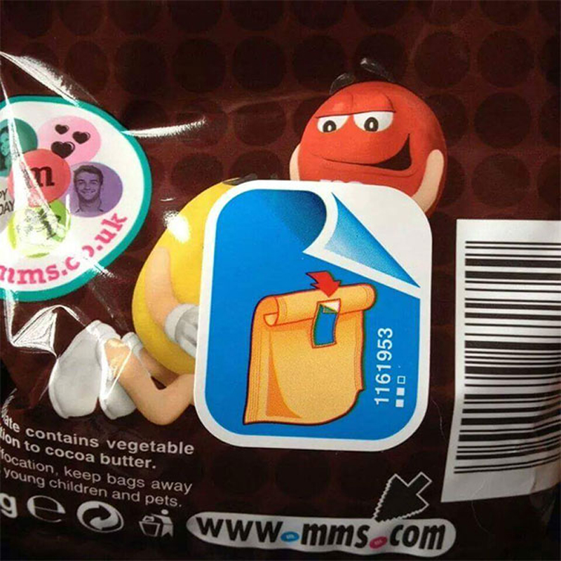
3. M&Ms sticker placement
Not a mistake at first, but the label placement makes this packaging illustration very ambiguous. Not sure if I would remove it.
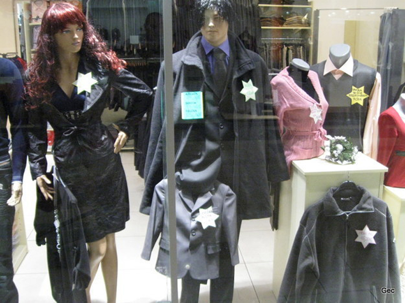
4. Failed price tag
Certainly, the worst possible way to add a price tag to clothes.
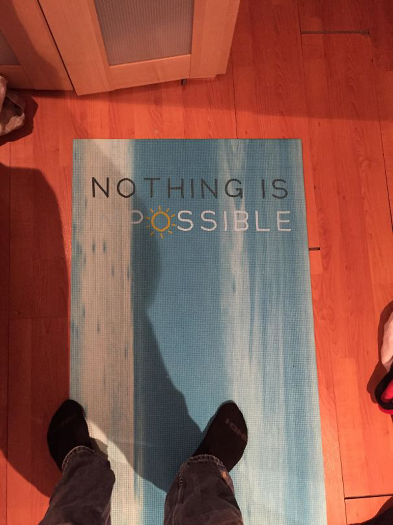
5. Nothing is possible
This doormat was designed with good intention, it was supposed to send a motivational message to cheer you up. Poor contrast and text placement turned it into a depressing way to welcome people.
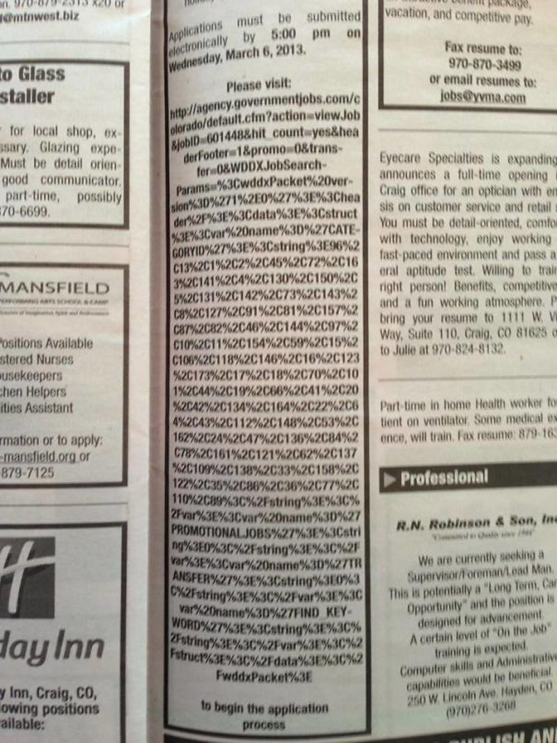
6. This advertisement for a job
It’s either a poor URL choice or a genius way to test applicants’ dedication to get the job. If you can apply to this, you really displayed a certain focus ability.
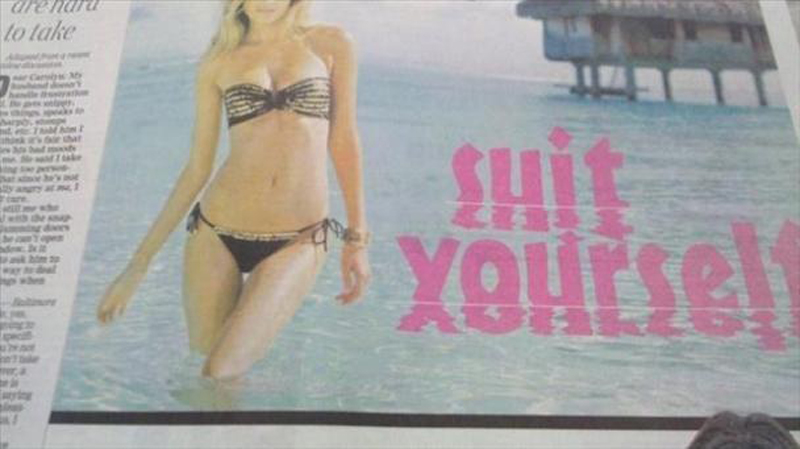
7. This newspaper title
Yes, adding a reflection to a text that is integrated into the water makes sense, but you should be careful with any potential changes to the meaning.
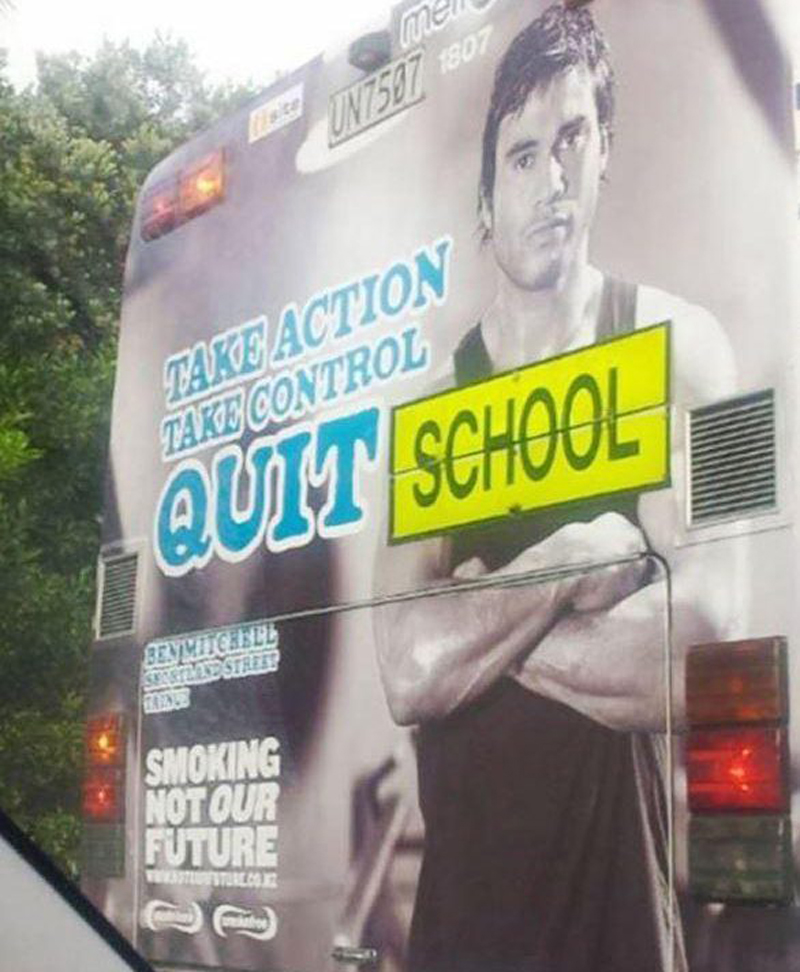
8. Quit school
This anti-smoking advertisement was placed on a school bus, it totally changed the message.
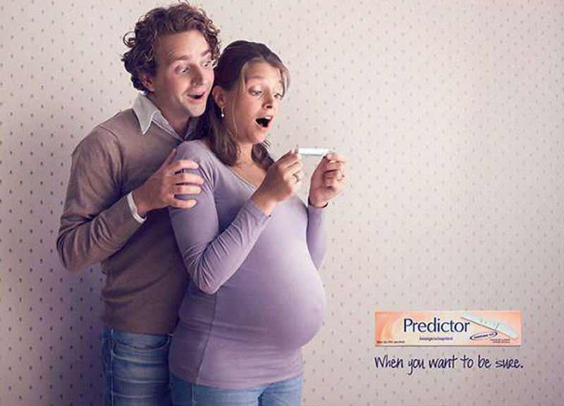
9. Pregnancy test advertisement
Apparently, even after 7 months of pregnancy, you can have some doubt. Take the test!
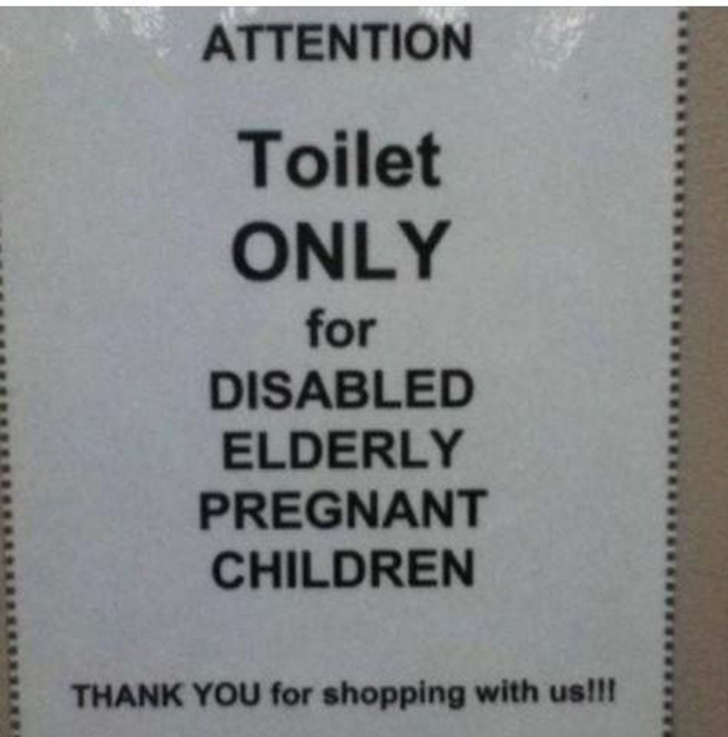
10. Disabled elderly pregnant children
Yes, commas matter when it comes to sending a message.
About the Author

Mirko Humbert
Mirko Humbert is the editor-in-chief and main author of Designer Daily and Typography Daily. He is also a graphic designer and the founder of WP Expert.