I’ve been wondering today, if I started a design firm today and could only buy ten fonts, which fonts would it be? Well, here are the results…
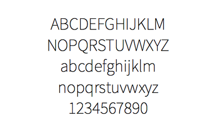
1. Source Sans Pro
Source Sans Pro is Adobe’s first open source font family. Open typefaces already existed before that, but even though some were very good, they couldn’t compete with Adobe’s open source sans serif typeface.
It comes in 12 weights and sizes, and also has a companion monospace font: Source Code Pro.
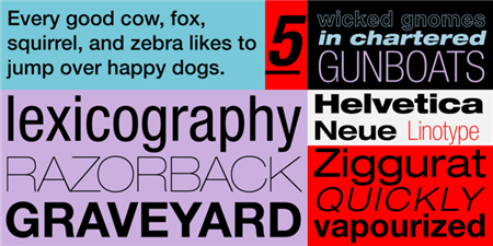
2. Helvetica Neue
You probably saw that one coming. Helvetica Neue is the redesigned version of Helvetica, a long time classic that you can find everywhere. Not only you will appreciate Helvetica Neue’s clean look-and-feel in your design, but you may need it when you take over another designer’s work.
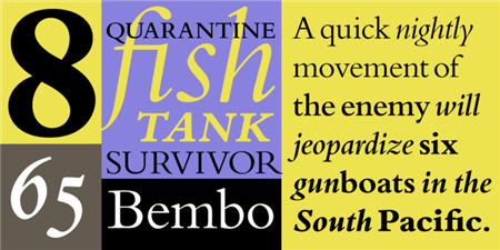
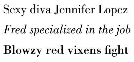
3. Bembo
I could have shared Garamond, but I have a personal preference for Bembo. Bembo was modeled on typefaces cut by Francesco Griffo for Aldus Manutius’ printing of De Aetna in 1495 in Venice, a book by classicist Pietro Bembo about his visit to Mount Etna.
Stanley Morison supervised the design of Bembo for the Monotype Corporation in 1929. Bembo is a fine text face because of its well-proportioned letterforms, functional serifs, and lack of peculiarities.
4. DIN Next
The name DIN refers to the Deutsches Institut für Normung (in English, the German Institute for Standardization). The typeface began life as the DIN Institute’s standard no. DIN 1451, published in 1931.
In short, you could think of it as the most German font out there, perfect for any technical centered designs.

5. Akzidenz-Grotesk
Maybe the other most German font. Akzidenz-Grotesk could be considered like the grandfather of Helvetica or Frutiger. It was created in 1898 by H. Berthold AG type foundry.

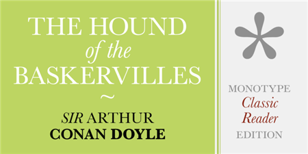
6. Baskerville
Baskerville was created in 1757, and then revived by Bruce Rogers for the Harvard University Press in 1917. The original typeface was used by John Baskerville to print a folio Bible. It is definitely a great choice of serif font for a book.

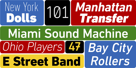
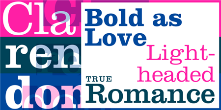
7. Clarendon
Originated in England by the Fann St. Foundry in 1845, these types are named for the Clarendon Press in Oxford. Clarendon was originally designed as a heavier complement to ordinary serif designs, and is used frequently in dictionaries and headline applications.
8. Bodoni
The Bodoni font distinguishes itself through the strength of its characters and embodies the rational thinking of the Enlightenment. It is used very often in fashion magazines or in the luxury industry.
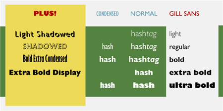
9. Gill Sans
Designed by Eric Gill and released by the Monotype Corporation between 1928 and 1930, Gill Sans is based on the typeface Edward Johnston, the innovative British letterer and teacher, designed in 1916 for the signage of the London Underground.
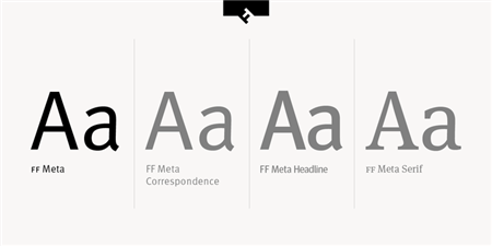
10. FF Meta
One of my favorite, FF Meta is a gorgeous sans serif designed by contemporary font designer Erik Spiekermann.
About the Author

Peter Makeshoff
Peter Makeshoff is the founder and main author of Designer Daily.