If you’re like me a wine lover, this article will be the tastiest you will have seen on Designer Daily. Unfortunately, I’m not a wine expert, so I often rely on the bottle’s label design when it comes to picking my future drink, while those personalized custom wine labels are more outstanding and attractive. Following is a list of wine label printing that I could have picked based on their design at the store, otherwise I should have learnt how to make mailing labels in google docs.
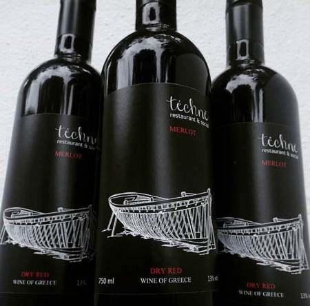
The use of white and red against deep black creates powerful contrast. Labels by FastPrint.
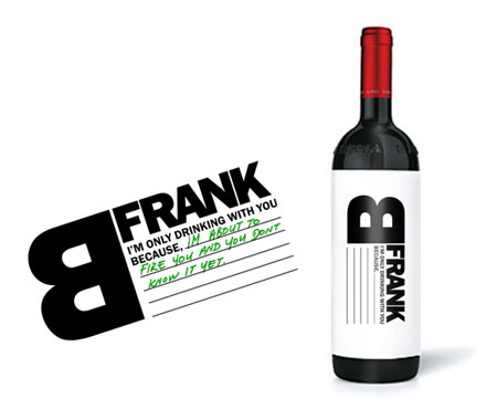
Frank B, label with a customizabe message, designed by Talia Cohen.
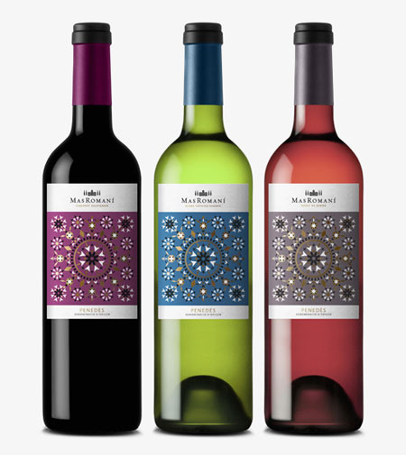
Mas Romani label designed by Gabriel Morales, good use of patterns and colors.
Nice concept by Hanna Backman.
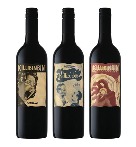
Do you like vintage movie posters? Then you’ll like these Killinbinbin labels.
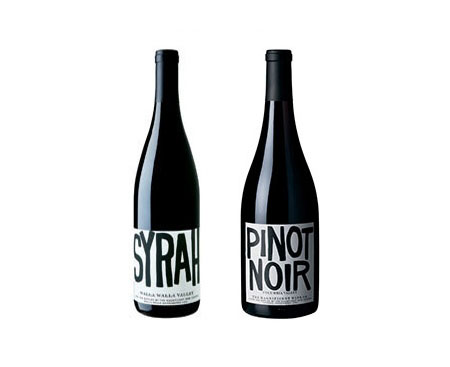
White space makes its way on a wine label, thanks to Stockholm Design Lab.
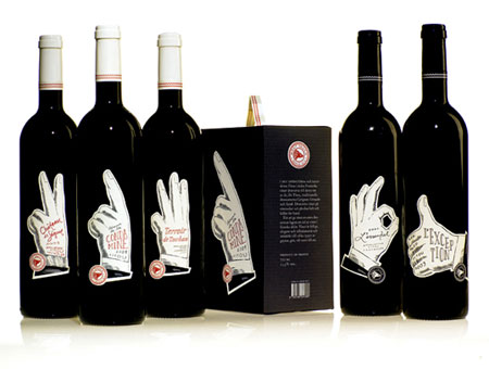
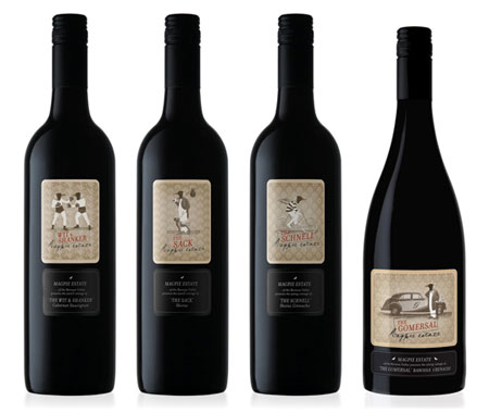
Wine labels based on circus characters, great work by Public Creative.
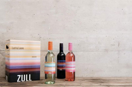
Colourful wine packaging for Zull.
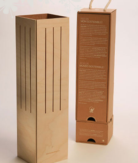
Wine box that turns into a lamp, by Ciclus.
Another vintage looking design by Mash.
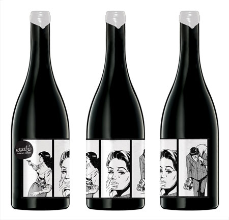
Mash does it again, comics-like wine labels.
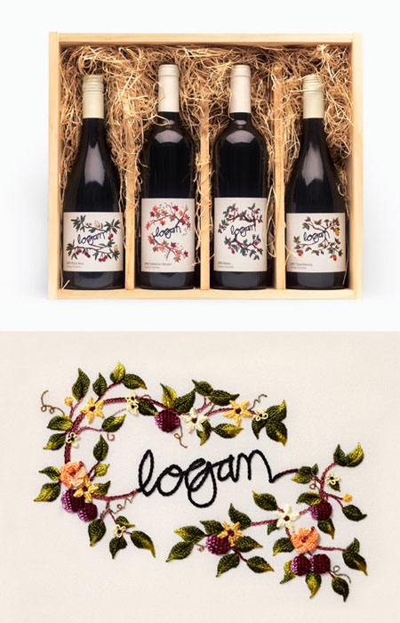
Logan wine, with embroidered labels. Lovely work by War Design.
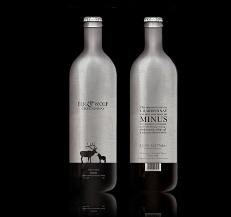
Beautiful looking typography, illustration and bottle by Elk & Wolf. Designed by Social UK.
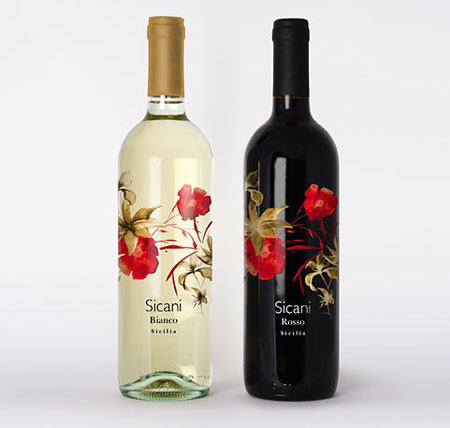
Sicani wine bottles, also by Social UK.
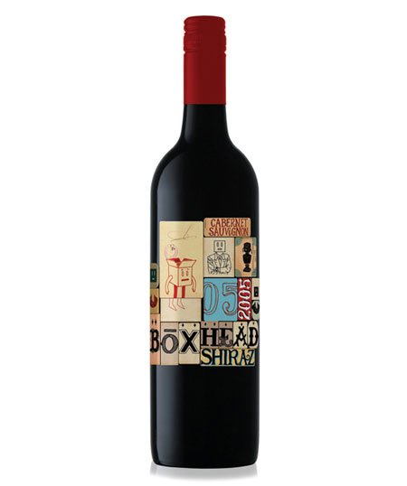
Boxhead bottle, creative label pattern with cute illustrations and type by Mash.
Nice and original box and bottle design by Hatch.
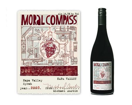
Also by Hatch, the cool illustrated labels for the Michael Austin wine.
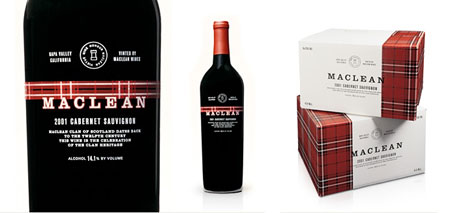
Sohne Vineyards, big typography for a strong branding, designed by Ned Wright.
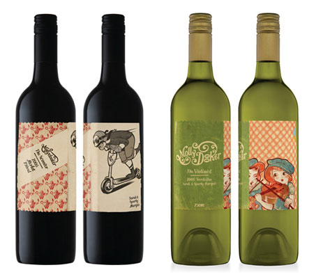
Molly Dooker, more great illustrative labels by Mash.
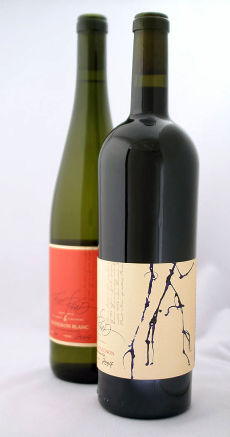
Five Rows, more traditionnal label with handwitten text and abstract design by Insite Design.
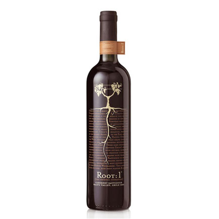
Going to the roots of wine labelling with Turner Ducksworth.
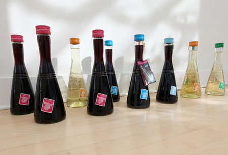
The Francis Ford Coppola’s wine encyclopedia sent some fine looking bottles to the fine people at NotCot.
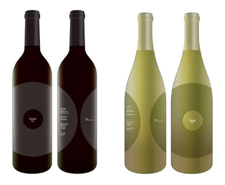
Oriel Wine, gorgeous bottles by the talented Julia Hoffmann.
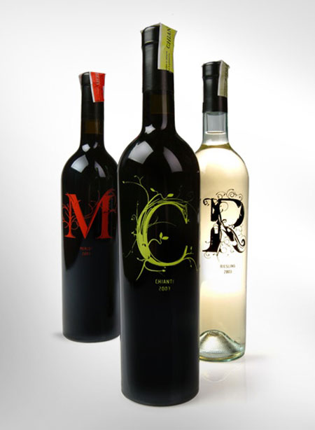
Huge type for magnificient wines, lovely.
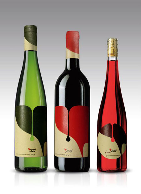
Who said awesome? Sheva wine bottles by Nine99 Design.
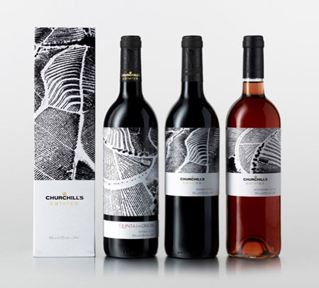
Beautiful black and white labels for Churchill’s wines.
About the Author

Peter Makeshoff
Peter Makeshoff is the founder and main author of Designer Daily.