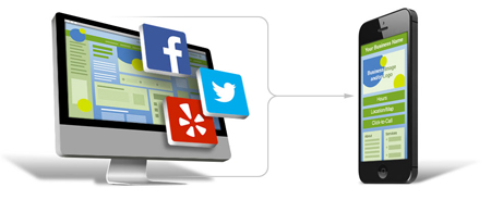
Adapting your full website to the requirements of mobile devices is a great way to improve your web presence and increase your reach. If you are one of the many companies who want to leverage on the full potential of mobile internet usage, you might want to use the ready-made mobile templates.
What are Mobile Templates?
Mobile templates are off the box, ready-to-use designs, or pages used to create a mobile website. Web development companies offer these to help companies create a simplified and condensed counterpart of their sites, which are optimized for viewing and navigation using handheld devices such as mobile phones or tablets. Using these templates is a convenient way for companies to translate their sites to a mobile-friendly version without the huge investments, costs, and complexities associated in making a mobile website. Since the designs are readily available for use, anyone, even those without technical knowledge, can use the mobile templates to make a website that looks like it was done by a professional. Plus, it saves you time and hassle tied with the trial-and-error process that one needs to undergo before website staging.
While custom-made services may still be the best option for most, not a lot of companies can afford to pay a premium for mobile website development. Another concern is that development time can take months, excluding user testing and acceptance. If you want a quick way and affordable way to get your site in mobile mode, using mobile templates might be the most viable option.
Things to Consider in Choosing Mobile Templates
With an onslaught of available options for mobile templates, it can be frustrating to choose the most suitable one for your business. To help you narrow down your choices and select the most appropriate service for your business, we’ve identified some important criteria to help you decide.
Your Industry: Choose a template that closely represents your type of business and service so that the design will look appropriate and well suited to your industry. Focus on the structure of the mobile templates being offered. If you are a retailer or an online shop, you need mobile templates that could accommodate photo galleries with secure e-commerce capabilities. On the other hand, if you are a news site, choose a structure that allows you to embed videos, audio, galleries, and commentary / feedback mechanism so that users who visit your site will find value in the content and functionality you offer.
Visual Language/Layout: This aspect is more of the design and graphical layout of your site. Choose mobile templates that, provides an uncluttered rendering of your site, meaning, your website should be arranged in such a way that it provides the user with a great experience navigating your site.
You should also choose a site that elevates your branding and identity. Opt for layouts that require minimal changes in fonts, colors, photos, and icons or characters. Make sure that what you have chosen is something that visitors will remember and associate to your brand. It should appeal and instantly grab your target market’s attention.
For example, if you are a medical facility or a diagnostic laboratory, you might want a clean, immaculate look. Choose a mobile template that aligns with the professionalism and ‘cleanliness’ you want project to people by choosing solid-colored and minimalist layouts. At the end of the day, it is choosing a layout that you think resonates to your intended market is the way to go.
Taxonomy/Hierarchy
Choosing an architecture that works for the content you have is key. It is how your content is displayed, and presented to form an organized pattern. These are the most common types of architecture you might want to dabble in:
Hierarchy: This is the most common pattern where the website’s structure is comprised of an index page and secondary pages underneath.
Filtered: Users are able to narrow down or the select the content they want to see on the mobile device.
Bento: This template shows snippets of information about a related site component displayed on the main page. This is a great way to inform users about your content through one-liner descriptions.
Tabbed: Here, content is segregated according to sections or categories with a toolbar menu, giving users an overview of the website content.
You might think that using mobile templates would make you look generic and ‘regular’ since they are pre-built for everyone’s use. This is not the case as there are hundreds of available mobile templates available, plus, you can tweak the look by touching some buttons, and doing some adjustments according to your desired look and feel.
There are many other things that affect how one chooses mobile templates; the ones presented are just some of the few that contribute to the physical look of the website. Since a building a responsive mobile website is all about providing a great user experience, companies need to focus on these three things to that enhance navigation and usability.
About the Author

Peter Makeshoff
Peter Makeshoff is the founder and main author of Designer Daily.