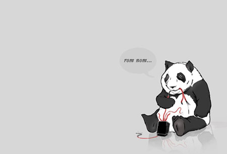
It’s never a good experience to expect to see a webpage and to get a 404 error, most of us will just hit the back button on the browser when experiencing such a thing. Since errors will happen no matter how good your website is, it’s a good idea to improve your 404 page to make it as useful as possible, the main challenge being to keep those visitors on your site.
What should your 404 page be?
Your 404 page should be branded
Don’t let your visitors in the wild, let them know that they are on your website by inputing some of the visual elements that make your website recognizable.
Your 404 page should be informative
When arriving on the page, the reader should know that he didn’t reach the page he was expecting right away. Inform him of what happened.
Your 404 page should be useful
If your viewers happen to reach a 404 page, it would be good to guide them through your site to let them find what they want. To achieve this, you can add some useful links and a search box, some will add links to popular posts or promotions.
Your 404 page should be tracked
Why don’t you add a tracker to your 404 page to know what happened, what people who stumbled on that page where looking for or where they were coming from?
Showcase of cool 404 pages
1. Blizzard
Probably the best 404 page I’ve ever seen, the visuals are great and just adapted for the kind of visitors Blizzard gets to its website.

2. GitHub
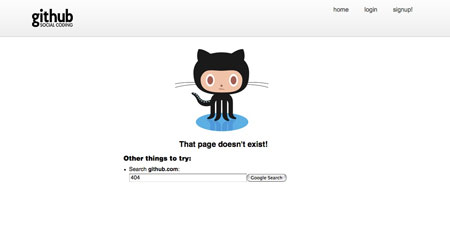
Simple, elegant and useful, the kind of 404 page we’d like to see more often.
3. CSS Tricks
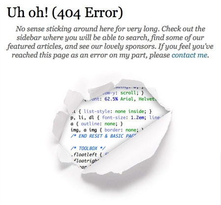
Chris Coyer likes to reveal useful code on his website, he even shows you the source on the 404 page.
4. Dawdle.com
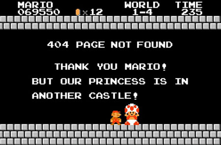
When you own a gaming website, is there any better way than this to appeal to your lost visitors?
5. 404 party
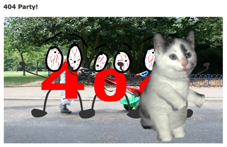
Beware: loud sound and nuts stuff on this one. Obviously not chosen for its visuals, but I had to admit that I laughed my ass off.
6. Springload
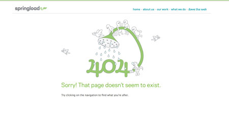
Cute and refreshing illustration, makes you a feel a little better about the missed page.
7. Scratchy cat 404
Either this is really cool, either it’s getting late and I’m too tired. (wait a bit before it starts)

8. iStockPhoto
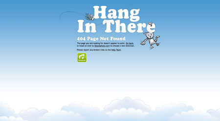
Nice vector illustration by iStockPhoto for their error page.
9. 8bit People
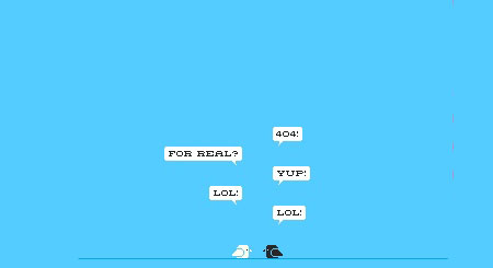
Much cooler than Twitter birds, two 8bits birds not taking errors too seriously.

10. BlueDaniel
I mention this one for the originality, but I wouldn’t recommend doing the same. First, the sound is annoying, second it’s in Flash and not very usable…

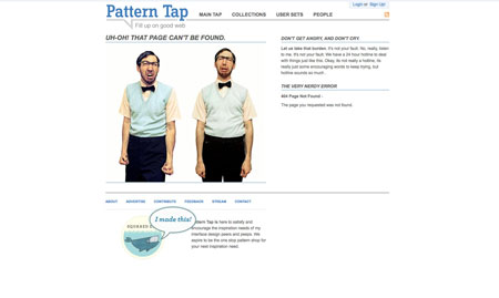
11. Pattern Tap
A funny picture, keeps the navigation so you are not totally lost.
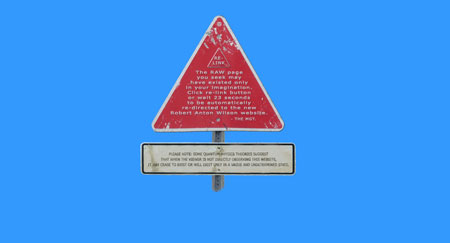
12. Robert Anton Wilson
One of the rare cases where the 404 page looks much better than the rest of the site.
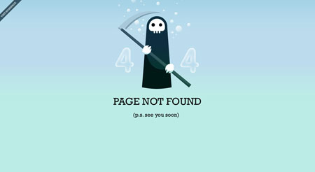
13. Chris Jennings
Probably the deadliest 404 page out there.
14. Above top secret
Some humour and a useful page with links to the main sections as well as a site search.

15. Grooveshark
Grooveshard shows a sense of humor, interesting insertion of Twitter updates.
