Keeping it Simple
This is a guest post by JP Jones, who is currently the Creative Director at Kenneth Hagin Ministries in Broken Arrow, OK, USA. She is also the owner of Paige1Media, a joint venture with Collipsis Web Solutions, LLC. You can also follow her observations of the market and musings on her designer’s resource blog, www.insearchofdesign.com.
Perhaps one of the biggest debates in design history, whitespace continues to be an elusive mystery for many. From print design, web work, and advertising all the way to billboards, the question arises, “If I paid for it, shouldn’t I use it?”
Quickly, let’s define this elusive “whitespace”. Not neccessarily “white” in color, whitespace simply refers to the negative space in a design. Negative space is space that is not actively being used.
Or is it?
From the designer’s perspective, whitespace plays a vital role in good design. This element is just as important as other visual elements such as images, text and graphics. Take it out, and the design is chaos. Add it, and you achieve symmetry and balance.
From the viewers perspective, properly used whitespace allows breathing room. A place to rest the eyes and take in the surroundings. Whitespace creates a visible path for the eye to follow. It allows all elements of a design to be seen.
From the clients perspective however, whitespace can seem like a waste of money. I mean, it’s being paid for, shouldn’t it be used? Isn’t all that whitespace wasted space? The client perspective is certainly understandable, however, marketing experts will confirm that the more chaotic a piece is, the less likely it is to generate funds. Unfortunately, by trying to fill every square inch of available space so that everything offered can be seen, the result is ensuring that nothing will be seen. A design without adequate whitespace is a design that doesn’t allow the viewer to determine when and where elements start and stop.
Effectively, that’s what it comes down to. How profitable is whitespace?
In terms of money generating ads, let’s think about the marketing of elegant and expensive products. Think back to the last Apple advertisement you saw, or a magazine ad for a pricey jeweler. Got it in your head? Chances are if you remember, the ad consisted of 2-4 elements simply arranged on the page.
The simple arrangement allows the real message of the ad to pop to the front. Having always been a fan of simplicity, I still believe the best advertisements ever created were a series that volkswagen produced in the 60s. Ahead of their time, the company’s marketer, New York ad agency Doyle Dane Bernbach, introduced this understated style when they took over the company’s advertising.
The design is simple. The words are profound. The whitespace abounds.

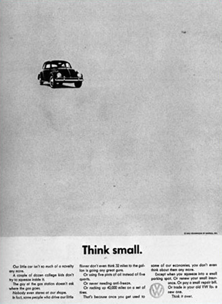
- Volkswagen Advertisement 1960


Nature would agree on that.
99% of its content is actually… emptyness. Is it not beautiful?
Reply
I couldn’t agree with this article more. Whitespace should be looked at as an asset, not a hindrance to designing.
Reply
White space is most assuredly an asset to marketing. If one’s product or service is overshadowed by cluttered elements, the overload will leave the viewer lacking and most likely will leave little or no impact upon them.
Well done on the article.
Reply
Great article! Bookmarking…
Reply
Definetely,
less is - - - -!
Reply
That is so true. It’s so common for clients to want everything they can fit crammed into the available space. Usually, once you explain that cramming everything together will practically guarantee that no one will see anything, they’ll often come around.
Without whitespace, or “breathing room,” as you so vividly out it, a page is usually very overwhelming and cluttered.
When dealing with the Web, visitors are very impatient and have many opportunities to move onto a competing site. It’s hard enough to get people to your site in the first place. Giving them a reason to leave, like a page full of unintelligible, chaotic content, is asking for trouble.
Great article.
Reply
Working in the printing industry for 4 years now, I have come across artwork from many different designers. Many of the pieces that are most appealing to my eye, are the ones that have more white space/negative space. When there are too many graphics on a piece, your eyes tend not to know where to focus. Usually when looking in a magazine, if there is too much on one page, I tend to just turn the page. I’m more of a get to the point kind of person.
I do agree with their insight on the topic, and would love to hear more of what they have to say!
Reply
Nice post. It’s hard to measure when content and graphics are too many. But yes usually in that variants - less is more.
Reply
I teach layout & design at a university and was adviser of a 196-page student publication. My vice president, who had no training in the area, wanted every inch of every page of the publication full and wouldn’t budge on the issue. I tried to explain the concept of white space being restful to the eyes, facilitating eye flow, etc. She wasn’t hearing any of it. Since knowledge wasn’t working for me, I decided to go with another approach…..creditability. I started submitting entries into statewide competition in categories other than design and started winning awards. After that the VP allowed me total freedom and gave approval of whatever my team created. Sometimes we have to earn the trust of our bosses/clients before they give us the freedom to create what we know is best.
Reply
[...] Visit Source. [...]
Nice post!
How will we draw the limit,that is how much of the page can be used for matter?
Reply
[...] the bubble meets desert? http://www.designer-daily.com/keeping-it-simple-1130 [...]
[...] Tools to Keep You in Sync With Clients and ColleaguesWhy Should Freelancers Use Mind Mapping?Keeping it SimpleAll photographers are liars75 (Really) Useful JavaScript TechniquesWhich Ad Manager Plugin Makes [...]
Blogs like this are why I use the internet.
Reply