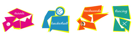
After launching their 700’000 dollars logo, I assumed that the organizing comitee of the next olympics didn’t have any money left for the pictograms. So, for the beauty of sport, I’ve invested some of my time and decided to help them out by suggesting them a set of icons.
Of course you may think that these icons do not look very nice, but I can assure you the the concept behind it is very interesting. In fact, the icons itself have no meaning and do not depict any sport, so you’ll probably rely on the name of the sport written in it. The cool thing is that the sport written in the icon is not the sport you are going to watch. This way you will be able to discover new sports and have a new start.
About the Author

Peter Makeshoff
Peter Makeshoff is the founder and main author of Designer Daily.