Creating a minimalist design may look simple to non-designers, that’s why it’s often so hard to sell minimalist designs to your clients: they have the feeling that they could do it themselves. However, achieving simple yet powerful designs is a time-consuming task. I’ve made a selection of websites that did a great job creating efficient designs.
What these sites did right
Content going straight to the point
Hard to design a minimalist site if you have to fit in every products of your client with descriptions, 2’000 words and two menus with a bigger logo. On the web especially, content will be more efficient if short and targetted, it will make it easier to design a simple website.
Grid-based designs
Not all of these sites did, but most of them have a grid based design. Using a grid makes it much easier to give balance to your designs when no extra visual elements weigh in the layout.
Clear hierarchy of information
Notice something on these websites? Yes, they are very easy to navigate and more usable than your average website. Removing unnecessary information forced the designers to really think what importance every element has in the website.
Showcase
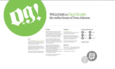
1. Old Guard
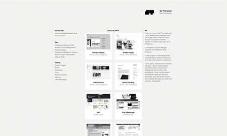
2. Jez Thompson
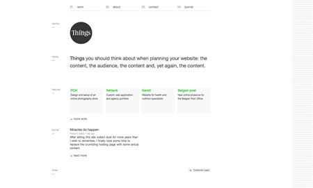
3. Thing.be
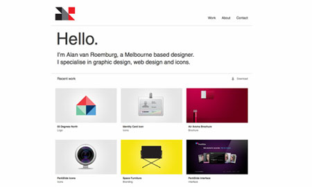
4. Alan van Roemburg
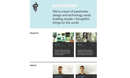
5. Indie Labs
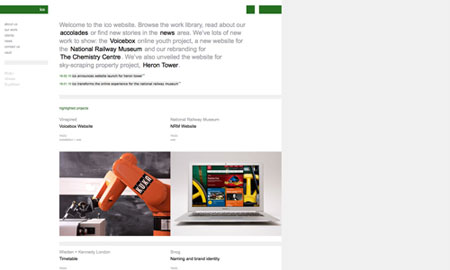
6. Ico Design
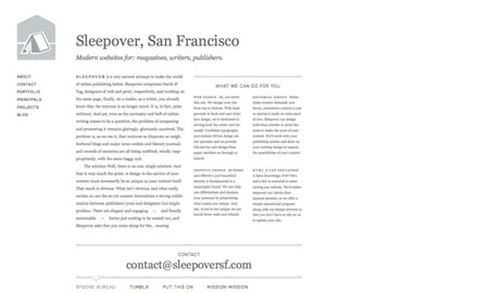
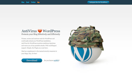
7. WP AntiVirus
8. Ideas on Purpose

9. Make Nice
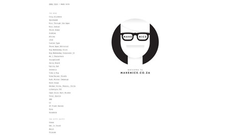
10. iMac SOS
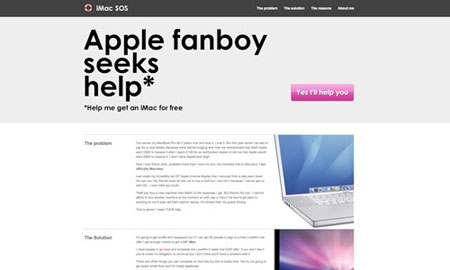
11. Max Wanger blog
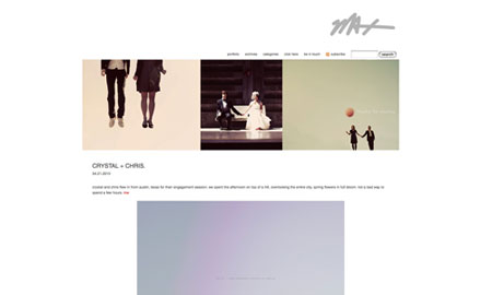
12. Digital Mash
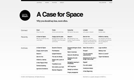
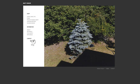
13. Matt Singer
14. Noon style
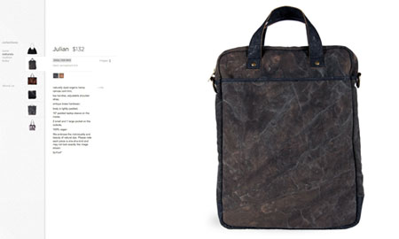
15. Sleepover
