For a web-designer, the portfolio website is not only a portfolio but also an example of their designs. The subtle balance between putting the focus on the portfolio elements or putting it on the website design, is very difficult to achieve. There are some tricks to the trade, as displayed by the following grab-bag of portfolio sites. These websites are selected to demonstrate specific points, they’re all great and have some fantastic design techniques and in each portfolio have some shining quality.
Grzegorz Kozak
With the single column portfolio being halfway down a very, very long website, the designer has used a curiosity device to keep you scrolling down. Very clever.

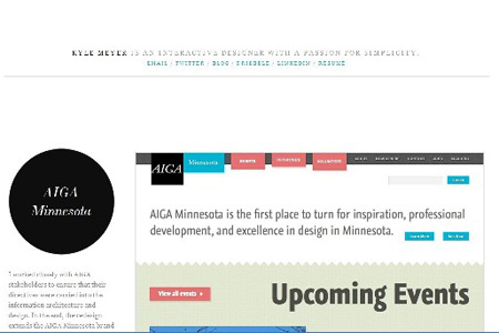
Kyle Meyer
An example of clean grid design with a bit of typography. Perhaps a little too clean. The large spacing on the title pushes the portfolio elements below the fold on a 768px display.
Nico Hagenburger
Clean design using a carousel above the fold. Portfolio contents then continue vertically. The dynamic element of the carousel adds to the interest of the website. An initial cycle of the carousel on load makes its purpose clear.

Justin Wanstall
A little bit of a dynamic banner, plus some color catch the eye. The portfolio is in a four column grid format using crop-shots rather than screenshots.

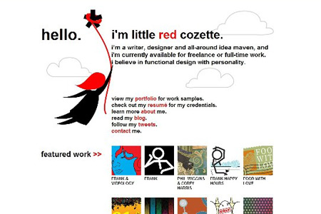
Cozette Lehman
Simple stylized design without clutter. The designer’s own style lends itself to an uncomplicated, even stark, website. The first row of the portfolio contents is above the fold.
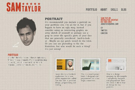
Sam Taylor
Using some typography and a gentle texture, this uncluttered website maintains the user’s curiosity. The first row of a three column portfolio matrix is above the fold. The designer also attempts to use humor to maintain interest.
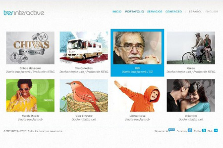
Tres Interactive
An example of the simplest form of portfolio, where the samples speak for themselves and the designer has minimized all other aspects of the website. Focus is left on a 4×2 grid of screenshots.
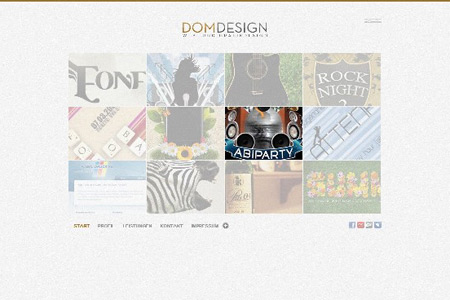
Dom Design
Another simple portfolio. Here the designer has used a mouse-over highlight, but until the mouse-over occurs the website has a washed out look.
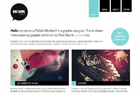
Monk Design
A portfolio for a graphic designer rather than a web designer. The web design takes back seat to the portfolio elements.
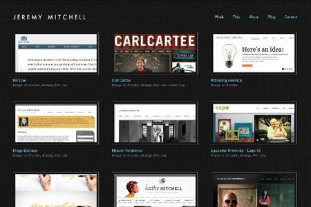
Jeremy Mitchell
Choosing a dark, gently textured background, the designer has given over the site to a vertical gallery style portfolio. Minimal website to set off the portfolio contents.
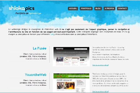
Shloka Pics
With a significant banner and introduction, the first elements of a one column portfolio grid just make it in above the fold. With a single column the designer is able to include additional information, aside from the graphic.
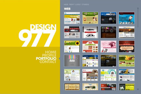
Design 977
An impact site, using a bold color and sacrificing half the screen. Combined with a little typographic design of the logo this design makes big claims. The four column portfolio grid offers little detail, but you feel obliged to click through.
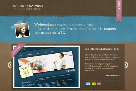
Ousmane Ndiaye
Textures and breakouts lend interest and help direct the flow of the website. A huge single-element carousel forms the portfolio. Simple arrows on either side control the navigation, maintaining focus, but thumbnails might make it clearer there is more on either side.
Giorgio Molinaro
Bold typography grabs and holds you. A click through is required to the portfolio, which uses a large vertical accordion. The accordion is so large the next elements are not visible above the fold and navigation is not immediately clear.

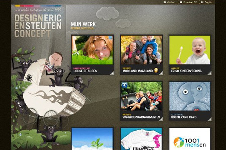
Eric Steuten
With crop-shots rather than screen-shots, forming the portfolio grid elements, they stand out clearly. This allows the designer to be more creative in the web design, without detracting from the portfolio.
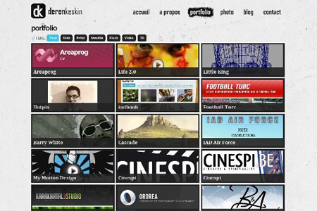
Deren
Perhaps more functional than pretty, this website uses a highlight mouse-over, which only fades the other portfolio elements when the mouse-over occurs. Better than #8 where everything is faded until mouse-over occurs.
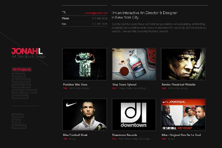
Jonahl
A dark background website. An example of simple grid design.
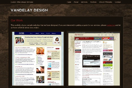
Vandelay Design
A design shop portfolio, this website uses a textured background for a little depth but otherwise does not detract from a big two column portfolio grid. The elements being double height screenshots.
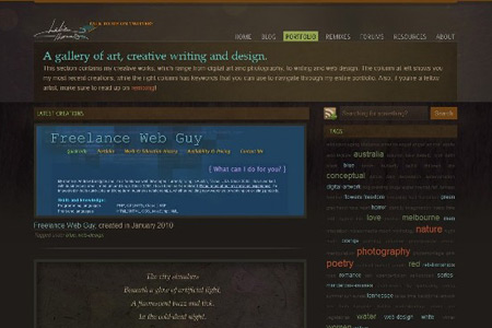
Lelia Thomas
As exemplars, the designer has used textures, typography and grid design. A single column portfolio grid leaves room for a large tag cloud and navigation on the right. Note the column width ratio.
Kyle Haskins
With textures that do not detract from portfolio, the designer has given over the full width to a single column portfolio grid with each element being a large screen shot, title, a little information and links.

Gummisig
Large margins give a good framing to a two column portfolio grid, but also caters for smaller window browsers. A header graphic guides the eye and creates a contrast to an otherwise minimal design.

Fly Guy Designs
With a massive banner and byline taking up most of the website, the top a single column portfolio grid barely makes it above the fold. With the website being wide, the portfolio elements comfortably include wide screenshots and blurb.

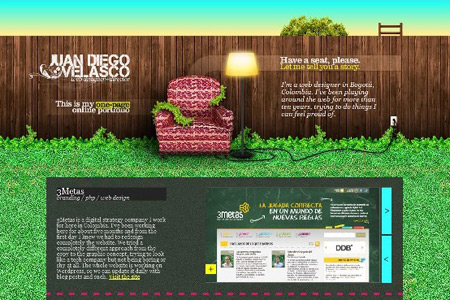
Juan Diego Velasco
With textures and quirky style the designer invites you into the website. The banner and graphics dominate your attention, until you notice the portfolio elements, in a wide single column with blurb and screenshot, starting only just above the fold.
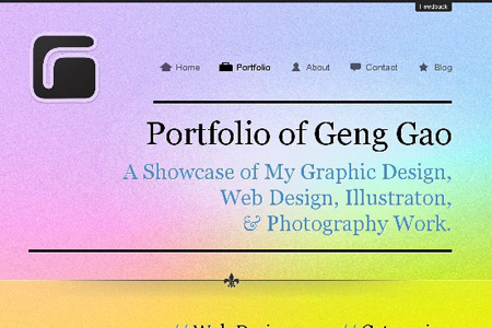
Geng Gao
The typography based banner is direct and effective, but takes up the entire height of a 768 screen. Scroll down to reveal the narrow single column portfolio grid.
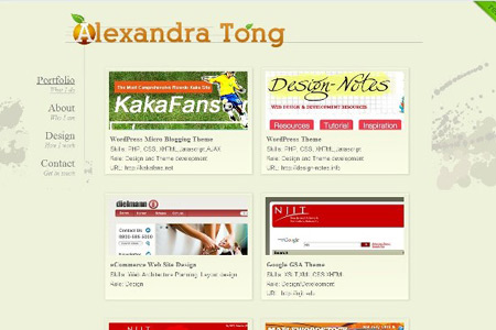
Alexandra Tong
An unpretentious design with crop-shots in a two column grid. Primary focus on the portfolio.
Final Thoughts…
Do’s and don’ts are not clear cut, as they depend on individual styles and design types. But some salient points can be drawn from the above examples:
The vast majority of these websites use a portfolio grid to display screen shots. A cluttered look is difficult to avoid with four column grids. Even three column grids need work to make them look good. The use of too much exemplar design also clutters the page and as can be seen above, textures have the potential to dominate the page and should be chosen with care. Forgetting where the fold is on a typical display can leave your portfolio grid out of sight! The use of crop-shots rather than screen shots allows for better graphical composition of the portfolio grid and creates space for blurb. A little bit of a dynamic element helps set the focus or convey understanding about navigation.
As any web designer worth their salt knows, it’s tough to get a good reputation. But a good portfolio website is the first step.
About the Author

Peter Makeshoff
Peter Makeshoff is the founder and main author of Designer Daily.