Negative space—the “empty” areas around and between design elements—is one of the most powerful tools in visual communication. When used cleverly, as we saw in the negative space logo designs, it can convey dual meanings, create memorable logos, and deliver striking messages without clutter.
In advertising, negative space isn’t just about aesthetics; it’s about storytelling. A well-placed void can transform a simple image into an optical illusion, a hidden message, or an emotional trigger. Below, we’ve curated 15 brilliant examples of brands and designers using negative space to craft unforgettable ads.
Why Negative Space Works in Advertising
- Grabs attention – Our brains love solving visual puzzles, making negative space ads inherently engaging.
- Enhances clarity – By stripping away excess, the core message becomes stronger.
- Creates double meanings – Some of the most iconic ads hide secondary imagery in plain sight.
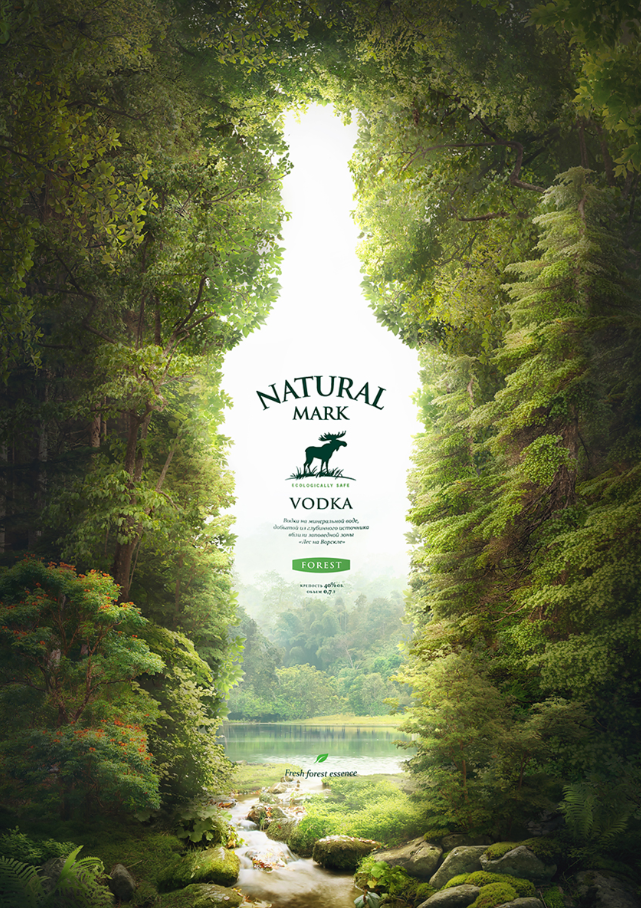
1. Natural Mark Vodka
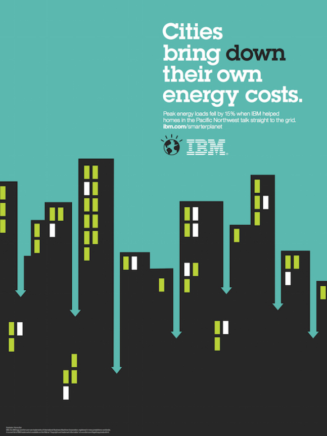
2. IBM
3. Tatra Beer

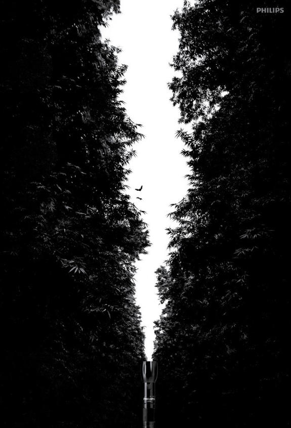
4. Philips LED torch
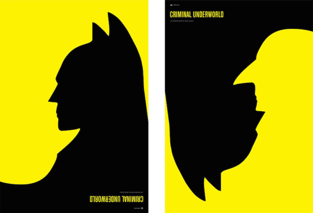
5. Batman: Criminal Underworld
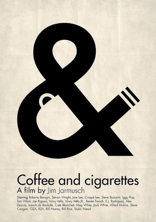
6. Coffee and Cigarettes movie poster
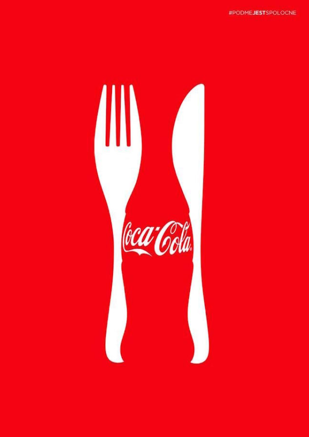
7. Coca-Cola
8. UNEP: Skyline

9. Coca Cola (again)

10. Volkswagen

11. Support Center Union for Victims of Sexual Assault in Israel

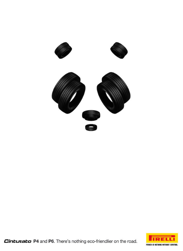
12. Pirelli
13. Jeep

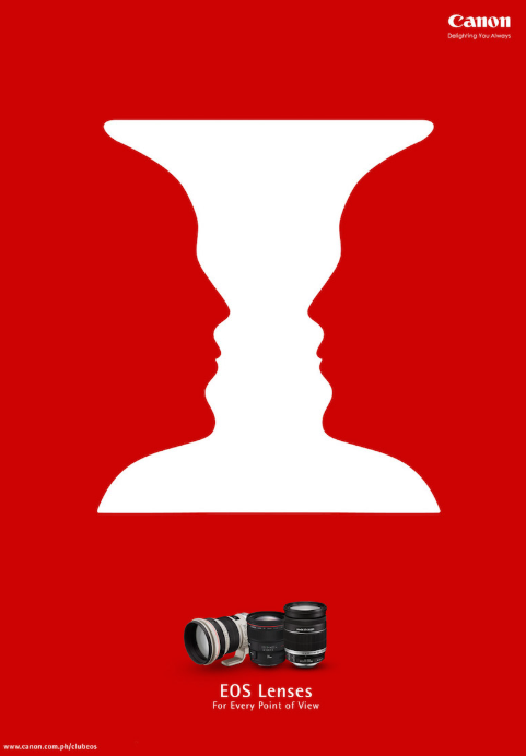
14. Canon
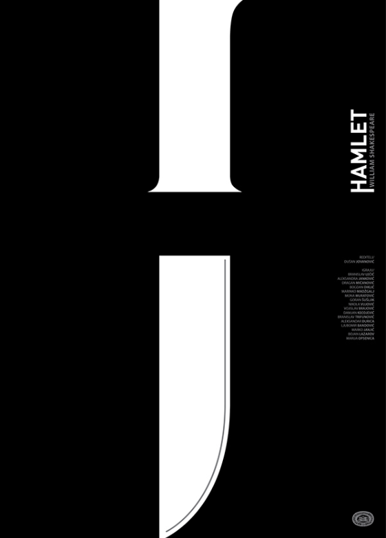
15. Hamlet
About the Author

Peter Makeshoff
Peter Makeshoff is the founder and main author of Designer Daily.