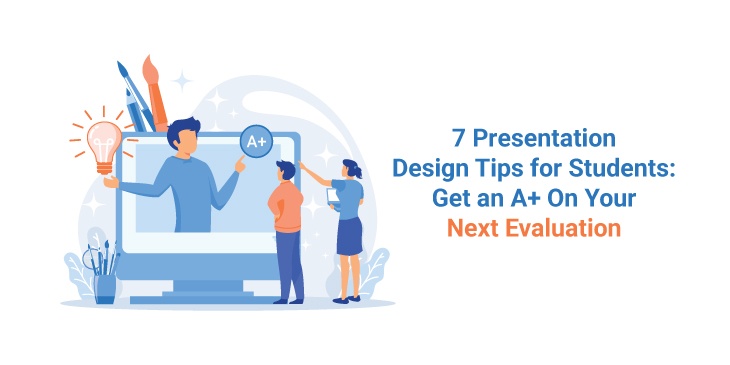
7 Design Tips for Students for an Outstanding Presentation
Imagine being assigned a presentation assignment for your next evaluation. Your mind might be brewing with a hundred brilliant ideas, but when it comes to putting them on the screen, you find it difficult to find the right inspiration for them. Sounds disappointing, doesn’t it?
Well, designing a presentation is indeed a tricky job, but when equipped with the right knowledge and tools, one can master the task on the brink of time. Here are seven tips and tricks that will help you design the perfect presentation for your next assignment and help notch up your presentation game!
Enhance your presentation design with this powerful tool that incorporates cutting-edge technology. Follow these presentation design tips for students, and with the help of Plus AI which ensures your next evaluation earns you an A for impressive visual content and impactful delivery.
1. Get Creative: Think Outside the Box
Preparing your presentation by taking references from books is boring and done by every other student. What would make your design stand apart?
Introducing snippets, stories, anecdotes, or interview clips in your presentation can add value to your design. It will inspire students to learn new things through creative ways of learning. For instance, if your subject is Geography and you’re talking about crops, you can add farmer stories, anecdotes from vendors, and interviews of unions about those crops. This will make your presentation unique and different.
2. Work Smarter, Not Harder
Everybody wants to create the perfect presentation for assignments, classes, and activities. But do you have enough hours to craft a presentation from scratch? Well, that would take up too much time, effort, and energy. Let us work smarter here, not harder!
Instead of making your slides, it is much wiser to use expert-designed PowerPoint diagrams in your presentations. These templates are completely editable and are the perfect fit for any presentation. These premade templates will not only save you time, but will also make your slides look much more professional and spectacular.
3. Include Animations and GIFs
What is the best way to hook your peers’ attention onto your presentation? Add relevant animations and GIFs to your slides!
Animations make your presentations more dynamic and memorable. Similarly, GIFs help you explain difficult topics more easily and intrigue the students effortlessly!
For instance, imagine trying to explain the Water Cycle theoretically with images. You will probably need 3-4 pictures and texts to explain the cycle. Instead, you can use one GIF, and the entire process can be easily conveyed.
4. Create a Brand Board: Use Consistent Fonts, Colors, and Theme
Before you start working on your slides, deciding upon the fonts, colors, and themes you will use in the entire presentation is vital. Doing so will establish consistency in your slides. Make sure to opt for fonts and colors according to your topic to communicate your message in a better way.
For instance, if your subject is Art, you could use multiple colors, bold designs, funky fonts, and bigger texts. However, if your topic is History or War, you can stick to basic fonts, monochromatic colors, and simple design.
5. Use High-Quality Images
This is probably one of the most important parts of designing a good presentation – using high-resolution images!
Imagine sitting in the audience, somewhere at the back, and the images you are looking at are pixelated, not visible, and dull. This would instantly take your mind off the presentation. Therefore, it is extremely crucial to use images with higher pixels that can be enlarged on a bigger screen and do not get blurred.
6. Draft an Index and Stick to It
What is the trickiest part about designing a presentation? Perhaps, drafting its index or its line of order! A presentation without an agenda or index looks unappealing and reflects a sense of recklessness and shabbiness.
A well-organized presentation has a table of content with slides corresponding to it. This makes the audience aware of what they can expect and in which line of order information would be passed on to them.
7. Choosing the Dimension: Which One is Right for You?
Before you commence creating your presentation, make sure to choose the right dimension. If your room is big and you have a wider audience to attend, it is better to opt for a Widescreen Dimension (16:9). This would give you more space for design and content and would be ideal for visibility in a bigger area. However, if your content is limited, and so is your audience, you can select Standard Dimension (4:3). This creates a compact area for your slides and restricts space.
Conclusion
Creating unique presentations is no longer rocket science. With practice, patience, and determination, one can easily master the skill and ace the game!
We hope these tips help you in your next presentation endeavor!
About the Author

Peter Makeshoff
Peter Makeshoff is the founder and main author of Designer Daily.