Negative space is an often misunderstood and underused idea. It breaks down very simply. Positive space represents the elements of your site—navigation, content, ads, images, and so forth. Negative space is where those things are not.
It’s the empty space between those elements, the space around and between them. Negative space helps structure and define your website design.
It’s a necessity that you rarely think about. Understanding how it plays a part in web design more thoroughly will help your designs achieve results better.
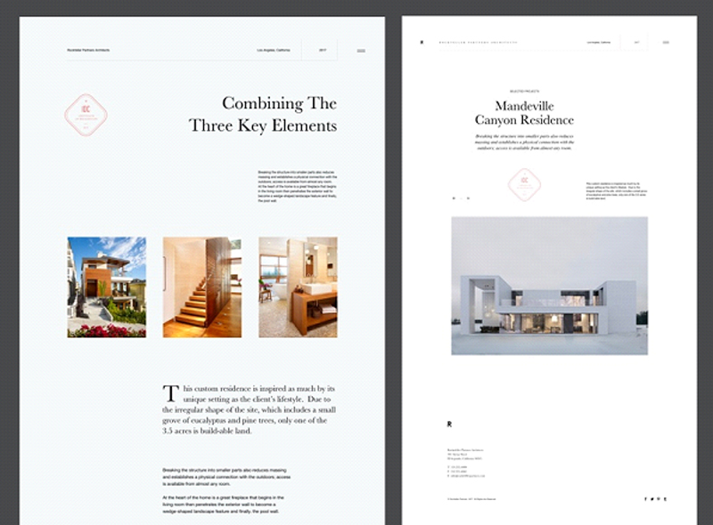
https://dribbble.com/shots/3765288-Rockefeller-Partners-Architects
There are two kinds of negative space: micro negative space and macro negative space.
Micro negative space is the small spaces between the small elements of your web design, like the space between lines of type, the space between paragraphs, even the spaces between words and letters.
Macro negative space, on the other hand, is the space between larger elements like your header and footer. Both micro and macro negative space are vitally important to the overall effectiveness of your design.
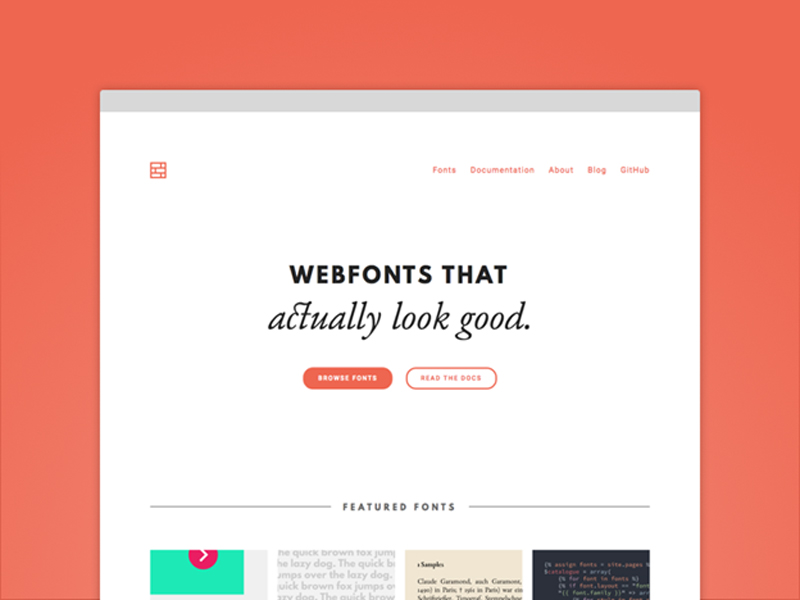
Why is Negative Space So Important?
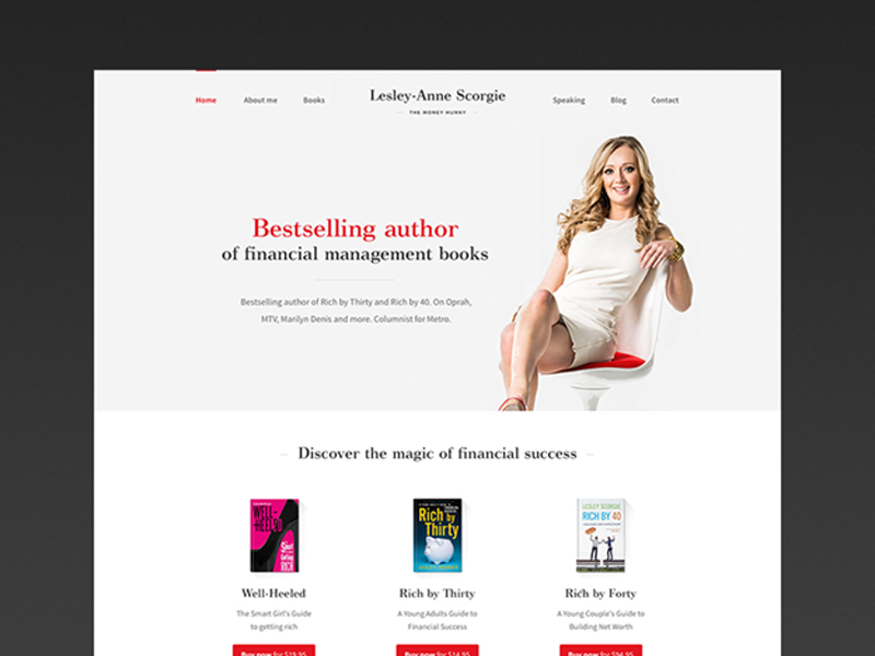
https://dribbble.com/shots/1482948-Lesley-Anne-Scorgie-Personal-Website
Negative space makes a huge impact on the usability of a site. It makes sure that the users find it easy to read the text and easy to navigate between different pages or elements.
A cluttered, visually busy site makes it incredibly hard to find what you want to be found.
Negative space is especially useful in the header design, where the first impression of your site is created.
It’s all too easy to think that you need to fill up every last bit of screen space with info to catch a potential customer’s attention, but the truth is that this overabundance of information makes it harder for that potential customer to focus on what they need and want to know.
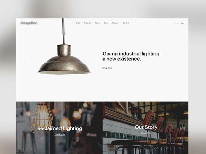
https://dribbble.com/shots/1988063-Reclaimed-Lighting-Homepage
It’s very important for a web designer to understand the vital importance of negative space. You’ll probably find clients that want an incredibly cluttered site design. You need to calmly convince them of how that is more of a hindrance than a help to their business or organization.
A site with negative space is not a waste of money or screen space. It’s an important element of creating a useful, clean, navigable, and professional looking website that will help them stand out.
How do you explain this to a client?
Getting Clients to Understand Negative Space
The first thing you need to do is demonstrate to your client that you can, in fact, fit everything necessary (and a lot of desired elements) onto a cleaner looking website that makes use of negative space.
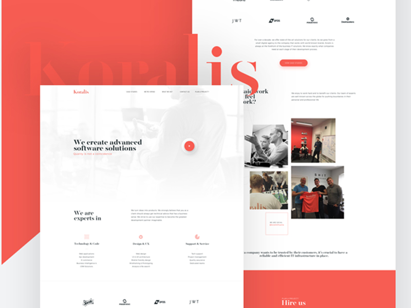
https://dribbble.com/shots/3956119-Koralis-Software-Agency-homepage
It’s okay if potential customers need to scroll through the site, and is in fact expected. Content should still be chosen widely, especially the content that will be featured on the front page and “above the fold”. Offering too many options on the front page can make the site unnavigable to a user, who will quickly move on.
A well-designed site’s negative space will not even be obvious to a user. They will instead focus on what matters. They’ll pay attention to the details of a product or service, or find it easier to find the articles that interest them. For most website design, the best approach is “less is more”.
Think of Negative Space as an Active Element of Web Design
https://dribbble.com/shots/1804403-It-s-real
A lot of fancier elements of web design do not actually make a very big impact on a user’s experience, like flat design or parallax scrolling, but they are still treated as active elements of design.
You really think about them. Start to think of negative space in the same way, because it definitely makes an impact on the user experience of the website.
Now that you’re going to start thinking about negative space as a design element unto itself, what are ways that you use negative space? There are a lot of them we see and use in web designs that we don’t even think about.
Page breaks
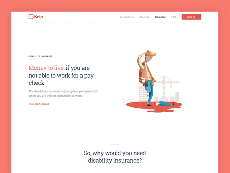
https://dribbble.com/shots/3206666-Disability-page-animation
Negative space is used to offer visual relief and separation between messages and items on the webpage. This allows the viewer to between understand what’s going on.
If they better understand what’s going on, they can better get to the goal that you and/or your client want them to achieve.
Highlighting a central message
Negative space will draw a user’s eyes to the main items on the page.
It helps make sure the page is focused on the message and emotions it wants to communicate. It makes the page more readable without having to anything elaborate.
Directing the flow of a page

https://dribbble.com/shots/3633666-Blog-Single-Post-Negative-Space
Negative space dictates the way a user moves through the page and the entire site.
Placing it in certain ways can direct people to scroll down for more info, view page elements in a particular pattern, or prompt them to go to a different landing page. Negative space creates visual relationships between elements and provides direction.
How to Successfully Apply Negative Space
Practice different arrangements of negative space. Every website will need to use negative space in a different way. Some might need to use it less, while others may need more.
Make sure the pages are easy to read and comprehend

Before you even begin to work on the design proper, create a list of required interface elements. Doing this will help you to estimate how much content the page will need.
From there, you can create a rough wireframe to see how much space you require to include all this content in a way that can be easily read and understood.
Keep the design fresh and modern
Proportionate font sizes and asymmetrical uses of negative space create an overall very stylish look that is both uncluttered and interesting.
Use negative space practically
This will assist in the overall readability. Separate blocks of content out to make it easier for visitors to access. Include margins between different elements. Use padding to create space inside an element and prevent overcrowding.
Experiment with the proximity and containment of the elements
Proximity is how close or far objects are from each other, while containment is used to group objects together.
Understanding how negative space focuses and organizes a page will help you get the elements right.
Conclusion
Negative space can make all the difference in the functionality of a web page. You should create your web designs while thinking of negative space as a major element.
About the Author

Bogdan Sandu
Bogdan is a designer and editor at DesignYourWay. He's reading design books the same way a hamster eats carrots, and talks all the time about trends, best practices and design principles.