In the world of type design, where digital storefronts can often feel as rigid and impersonal as a default system font, stumbling upon a foundry with genuine personality is a treat. Enter BlazeType, an independent French type foundry founded in 2016 by Matthieu Salvaggio. From their base, this international team of type designers, researchers, and font engineers has spent the last decade doing something quite special: crafting innovative variable and static fonts for what they call “bold brands and brave designers.”
What strikes you first about BlazeType is their philosophy. They describe their fonts as being “made by designers, for designers,” and it shows. Their catalog isn’t just a collection, it’s a curated selection of over 100 variable families and more than 4,000 fonts, all built with a clear dedication to staying ahead of the curve. They emphasize modern features, extensive language support, and a treasure trove of alternate glyphs. But it’s not just about what the fonts look like; it’s about how they work. With a simple, perpetual licensing system and a promise of yearly updates for licensed fonts, BlazeType has built a foundation of trust and quality that makes their recent website redesign all the more exciting.
BlazeType’s Website Redesign: A Playground for Typography
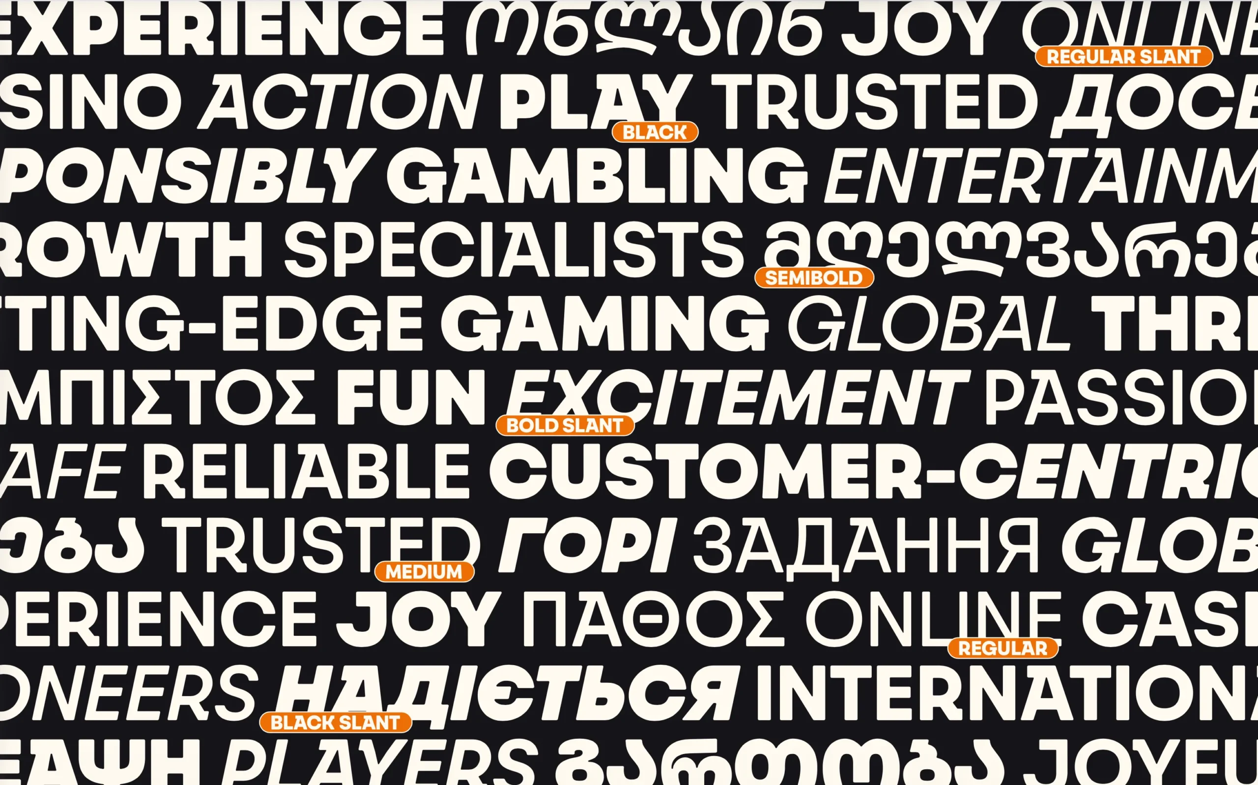
The new website, particularly the typefaces page, is a masterclass in letting the product take center stage. Gone are the days of dry, endless lists of font names. Instead, you’re greeted with a vibrant, colorful mosaic where each typeface family gets a moment to shine. The layout is clever and dynamic as it uses the fonts themselves to create the preview.
For instance, you might see the bold, geometric curves of “Bagne” spelling out a playful, all-caps word, set against a contrasting background that highlights its confident stroke. Scroll a little further, and the elegant, transitional serifs of “Signifier” are used for a longer, more literary passage, immediately communicating its intended use for elegant editorials. This isn’t just a catalog, it’s a gallery wall where each piece is thoughtfully displayed. The colorful layouts and varied text samples give you an immediate feel for the font’s personality. It makes browsing feel less like shopping and more like exploration, inviting you to stop and play with each new discovery.
Font Pairing Made Easy
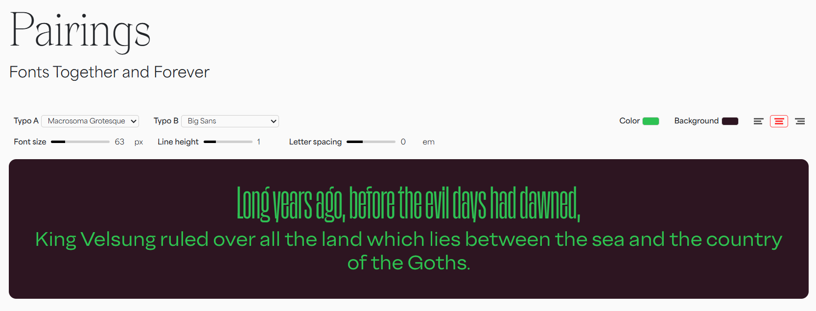
One of the most daunting tasks for any designer is choosing typefaces that not only work well individually but sing together in harmony. BlazeType has tackled this head-on with an absolutely brilliant tool on their new pairings page. This isn’t just a blog post with suggestions; it’s an interactive playground for font matching.
The tool presents carefully curated combinations, like the friendly, humanist sans “Faro” paired with the sturdy, confident slab serif “Eddy.” But the real genius lies in the ability to test the pairing with your own text. You can instantly see how a headline in one font looks above a paragraph in another, adjusting the scale and seeing the relationship in action. It’s like having a senior designer looking over your shoulder, offering tried-and-tested combinations, but giving you the freedom to tweak and experiment. For a young designer or a seasoned pro looking for fresh inspiration, this tool is invaluable. It transforms the abstract concept of “typographic harmony” into something tangible, interactive, and genuinely useful, saving hours of trial and error.
Try Fonts Before You Use Them
In an industry often guarded by watermarks and PDF specimens, BlazeType’s commitment to letting users truly test-drive their fonts speaks volumes about their confidence. The ability to thoroughly try fonts before purchasing is a cornerstone of the new site. It’s one thing to see a beautifully styled specimen image, but it’s another entirely to drop a font into your own design environment and see how it handles your specific copy, at your specific sizes, in your specific layout.
This level of access is a profound statement of trust in the quality of their own work. It acknowledges that a typeface is a tool, and the only way to know if a tool is right for the job is to pick it up and use it. By removing the barriers and friction, BlazeType empowers designers to make informed decisions, ensuring that when a purchase is made, it’s a perfect fit for the project. It’s a user-first approach that builds immense goodwill and reinforces the feeling that this is a foundry partnering with designers, not just selling to them.
Conclusion: A Human Touch in a Digital World
Ultimately, what makes the new BlazeType website, and the foundry itself, so compelling is its humanity. In a field with industry giants, they retain a personal, thoughtful touch. This is beautifully exemplified by their student discount program, offering an astonishing 80% off their entire catalog. It’s a significant investment in the next generation of designers, giving them access to world-class tools and, just as importantly, showing them that there are companies who believe in their potential.
This commitment to real-world application and community is further reinforced by their case studies. These aren’t just generic logos; they are deep dives into complex challenges, from evolving the visual identity of a major football club to creating a custom variable font system for a dynamic sports brand. They serve as a powerful testimony to BlazeType’s skill in custom work and font production, proving their typefaces can carry the weight of major international identities. With this redesign, BlazeType hasn’t just built a better website; they’ve built a better bridge between the art of type design and the designers who bring it to life.
About the Author

Peter Makeshoff
Peter Makeshoff is the founder and main author of Designer Daily.