Remember flipping through vinyl bins at a record store, letting a sleeve catch your eye before you’d heard a single note? That moment hasn’t disappeared. It’s just migrated to a 200-pixel square on a phone screen.
Album covers shrank. But their cultural weight? That never budged.
In fact, 2026 might be the year the album cover officially reclaims its place in design history. The Recording Academy just added Best Album Cover to the Grammy categories for the first time, recognizing what designers have known all along: that little square does a lot of heavy lifting . Nominees include Bad Bunny (art directed by the artist himself), Tyler the Creator, Wet Leg, and Perfume Genius . After 68 years, the industry finally gave the visual side its own trophy.
The Paradox of the Tiny Canvas
Here’s the design challenge nobody talks about enough: an album cover has to work at two completely different scales simultaneously.
At thumbnail size on Spotify or Apple Music, it has about three seconds to stop a thumb from scrolling past. That means high contrast, bold shapes, and immediate recognition. But when that same listener buys the vinyl, holds the gatefold, or stares at the digital version on a tablet, the cover needs to reward closer inspection with detail, texture, and meaning.
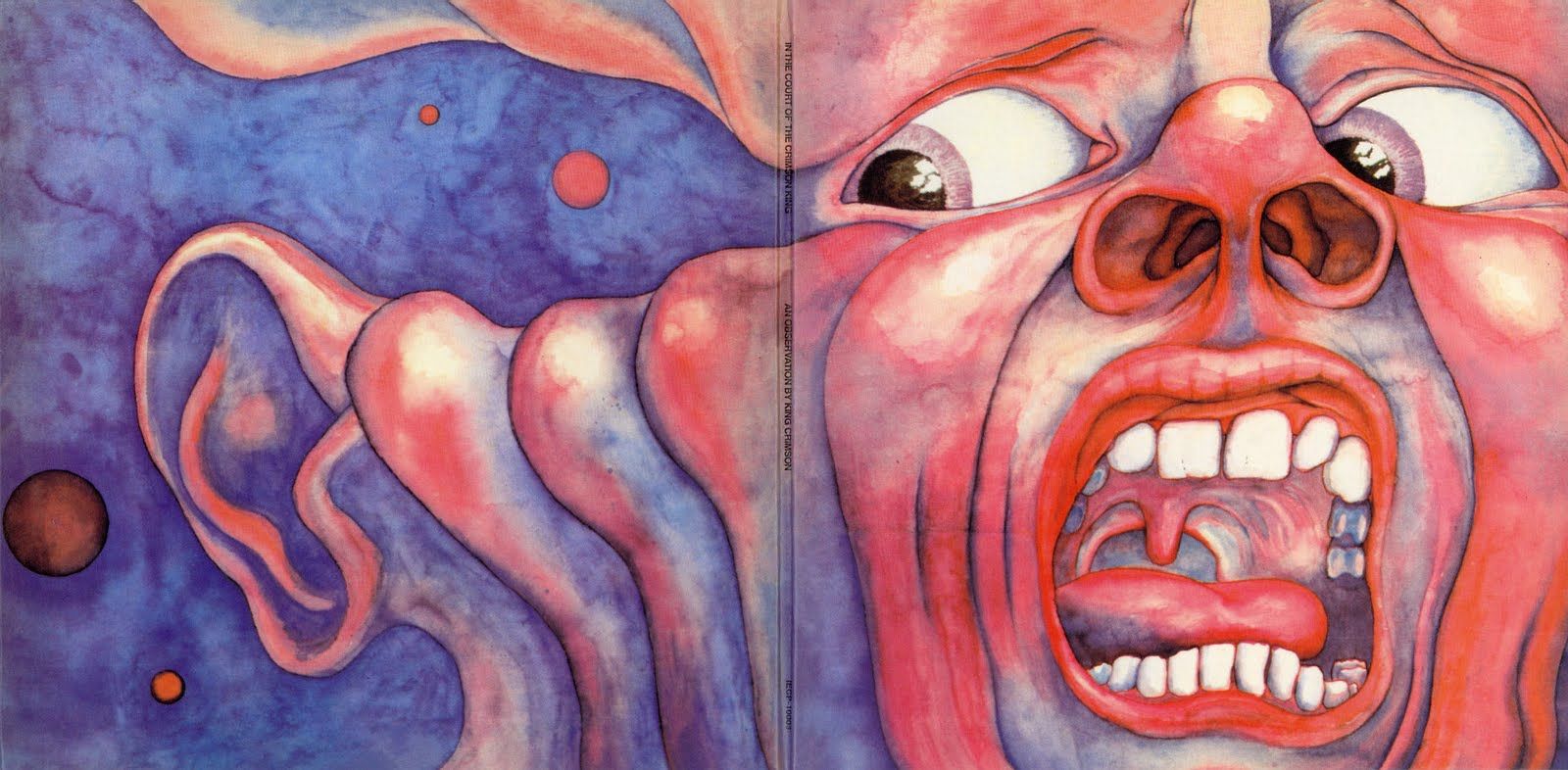
The cover for King Crimson’s In the Court of the Crimson King pulled this off decades ago with zero text, just a haunting painted face that became instantly recognizable . Nirvana’s Nevermind works the same way. You know it at postage stamp size. You can also stare at it for an hour wondering what that baby is chasing .
The best contemporary covers understand this duality instinctively.
What Makes a Cover Stick
There’s real psychology behind why some covers become cultural shorthand. Research on Iranian album covers suggests designers use three approaches to create lasting impact: evocative (triggering a memory), associative (connecting to existing ideas), and imaginative (creating something new) . The covers that work best combine these methods, creating something that feels both familiar and fresh.
The academic term for this is “mental harmony” between the music creator and the audience . In plain language: the cover becomes a bridge. It translates sound into sight in a way that resonates before a single track plays.
Rough Trade’s Kerenza puts it more simply: when she’s stuck for what to play, she digs through the racks until a cover speaks to her . “I know they say you should never judge a book by its cover, but they never said anything about records.”
Trends Driving 2026 Covers
If you’re designing album art right now, these visual directions are worth watching:
- Neo-Brutalism and liquid chrome. Think sharp metallic edges, industrial textures, and zero apologies . This look conveys power and modernism with aggressive clarity.
- Lo-fi surrealism and analog glitch. As a response to digital fatigue, designers are embracing film grain, tape bleed, and overexposed portraits . About 32% of Gen Z listeners report digital fatigue, which explains the pull toward textures that feel tactile and imperfect .
- Y3K retro-futurism. If 2024 was about Y2K nostalgia, 2026 is looking further ahead. Iridescent finishes, holographic textures, and a “post-human” aesthetic that feels both futuristic and organic .
- Thermal imaging and night vision. For street and trap genres especially, this “found footage” aesthetic provides raw, unedited energy that resonates with listeners seeking authenticity .
Motion Enters the Frame
The square isn’t static anymore. Berlin-based label Upon You Records has been experimenting with animated covers that transform static images into “vibrant installations” that shift in response to the music . Each cover becomes its own audio-visual experience, merging sound and motion into something that feels alive.
This isn’t replacing the still image. It’s extending it. The cover still needs to function as a frozen moment of recognition. But when the platform allows, it can breathe.
When Covers Become Cultural Symbols
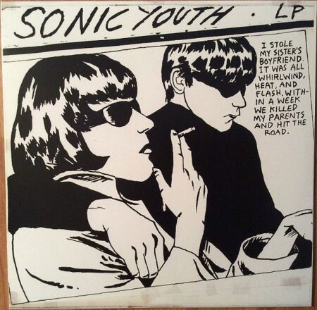
Some covers transcend the music entirely. The Arctic Monkeys’ AM waveform aesthetic shaped indie design for years after its release . Aphex Twin’s distorted grinning face became a personal logo so recognizable it functions like a brand mark . Sonic Youth’s Goo cover, illustrated by Raymond Pettibon, took a dark tabloid image and turned it into pop art that’s been widely parodied and reprinted on t-shirts .
Siwei Wang, writing for Istituto Marangoni, argues that these albums become fashion symbols. They migrate from record sleeves to runway inspiration, from album art to cultural shorthand .
The Thumbnail Test
Here’s the practical takeaway for designers working in this space. Before you ship a cover, shrink it down to 200 pixels on your phone. Can you still read it? Does it stand out in a grid of competing images? If not, simplify.
The streaming economy runs on speed. But the best covers understand that speed isn’t the only currency. They also reward the pause, the zoom, the moment someone decides this album deserves more than a glance.
Your cover is the handshake. Make it count at both ends of the scale.
About the Author

Peter Makeshoff
Peter Makeshoff is the founder and main author of Designer Daily.