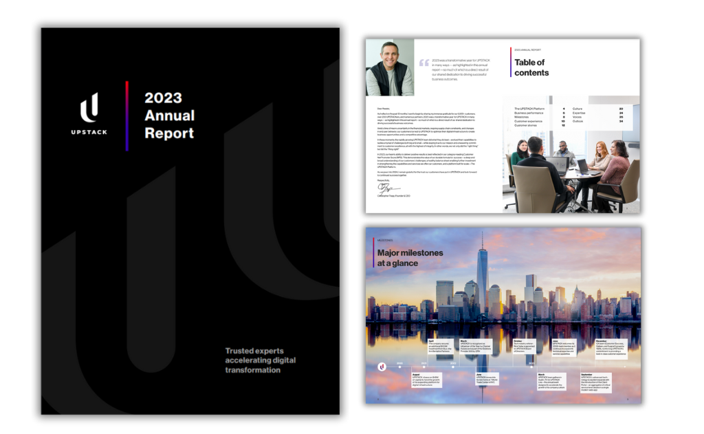
Let’s be honest. For most people, the phrase “annual report” conjures images of a dense, text-heavy PDF, crammed with financial tables and corporate jargon. It’s a document that feels like an obligation, something to be filed away, not truly read.
But what if your annual report could be different? What if it became a powerful piece of strategic communication that stakeholders, from investors and employees to customers and partners, actively wanted to engage with?
The secret lies in recognizing that an annual report is not just a financial disclosure; it’s a branding opportunity, a storytelling platform, and a trust-building tool. It’s time to move beyond compliance and start creating connection.
Here’s how to design an annual report that people will actually read.
1. Start with a Compelling Narrative, Not Data
Before you open Illustrator or Figma, put away the spreadsheets. The first step is to find your story.
What was the overarching theme of your year? Was it Resilient Growth? Purpose-Driven Innovation? Community Impact? Your financial data and operational highlights are simply the proof points for that story.
Actionable Tip: Structure your report like a feature article or a magazine. Lead with a powerful letter from the CEO that frames this narrative. Use section headers that tell a story (“Navigating Challenges,” “Investing in Our Future,” “Our People, Our Power”) instead of dry, generic ones (“Financial Review,” “Operations Update”).
2. Embrace the Power of Data Visualization
A wall of numbers is intimidating. A well-designed chart or graph is illuminating. Your goal is to make complex data instantly understandable and memorable.
- Go Beyond Bar Charts: Use icons, illustrative graphics, and creative layouts to bring data to life. Instead of just saying “we reduced our carbon footprint by 15%,” show a compelling infographic of a tree growing 15% larger.
- Focus on the Key Metrics: Don’t visualize every single data point. Highlight the 3-5 most important metrics that support your core narrative. Less clutter means more impact.
- Keep it Honest: Ensure your visualizations are accurate and not misleading. Transparency builds trust.
3. Prioritize Human-Centric Design
Stakeholders connect with people, not just corporations. Weave the human element throughout the report.
- Showcase Real People: Feature photos and quotes from employees, customers, or community members your company has impacted. This adds authenticity and emotional resonance.
- Use an Accessible Tone: Ditch the legalese and corporate-speak. Write in a clear, concise, and conversational tone. Imagine you’re explaining your year’s performance to a smart, interested friend.
- Think About Usability: A great digital report should be easy to navigate. Include a clickable table of contents, anchor links, and a clear path for the reader to follow.
4. Choose the Right Format for Your Audience
The days of the print-only report are over. Today, the format is a strategic choice.
- Digital-First & Interactive: An interactive microsite or a well-designed PDF is the new standard. It allows for embedded videos, animated data visualizations, and clickable elements that deepen engagement. It’s also more shareable and cost-effective.
- The Strategic Print Piece: If you do go to print, make it count. A beautifully crafted, high-quality print report can be a powerful physical artifact for key investors, partners, and at high-profile events. Think of it as a premium brand brochure.
- A Hybrid Approach: Often, the best solution is both. A dynamic digital report for the masses, complemented by a shorter, beautifully designed print summary for a select audience.
5. Master the Fundamentals of Good Design
A great story can be lost with poor execution. Solid design principles are non-negotiable.
- Hierarchy & White Space: Guide the reader’s eye through the page. Use clear typographic hierarchy (headlines, subheads, body copy) and generous white space to prevent cognitive overload. A cluttered page is a page that gets skipped.
- Cohesive Branding: Your annual report should be an unmistakable part of your brand family. Use your color palette, typography, and visual language consistently to reinforce brand recognition.
- Accessibility: Design for everyone. Ensure high color contrast, use alt-text for images, and create a logical reading order. An accessible report is an inclusive one, widening your potential audience and demonstrating social responsibility.
From Obligation to Opportunity
A well-designed annual report does more than just inform, it inspires. It transforms your yearly summary from a regulatory obligation into a strategic asset. It can attract new investors, engage employees, build customer loyalty, and strengthen your brand’s reputation.
So, the next time you’re tasked with the “annual report project,” see it for what it truly can be: your company’s greatest story, waiting to be told. Don’t just file it. Design it.

