
Arcade-style gaming interfaces still return to dark palettes because their job is larger than navigation. They have to stage anticipation, compress hierarchy, and make a fast emotional impression before a viewer reads a single line. For design readers, that is the interesting part. The dark background is not just a mood choice. It is a layout tool that clears the field so a few active elements can do more work.
You can turn darkness into focus
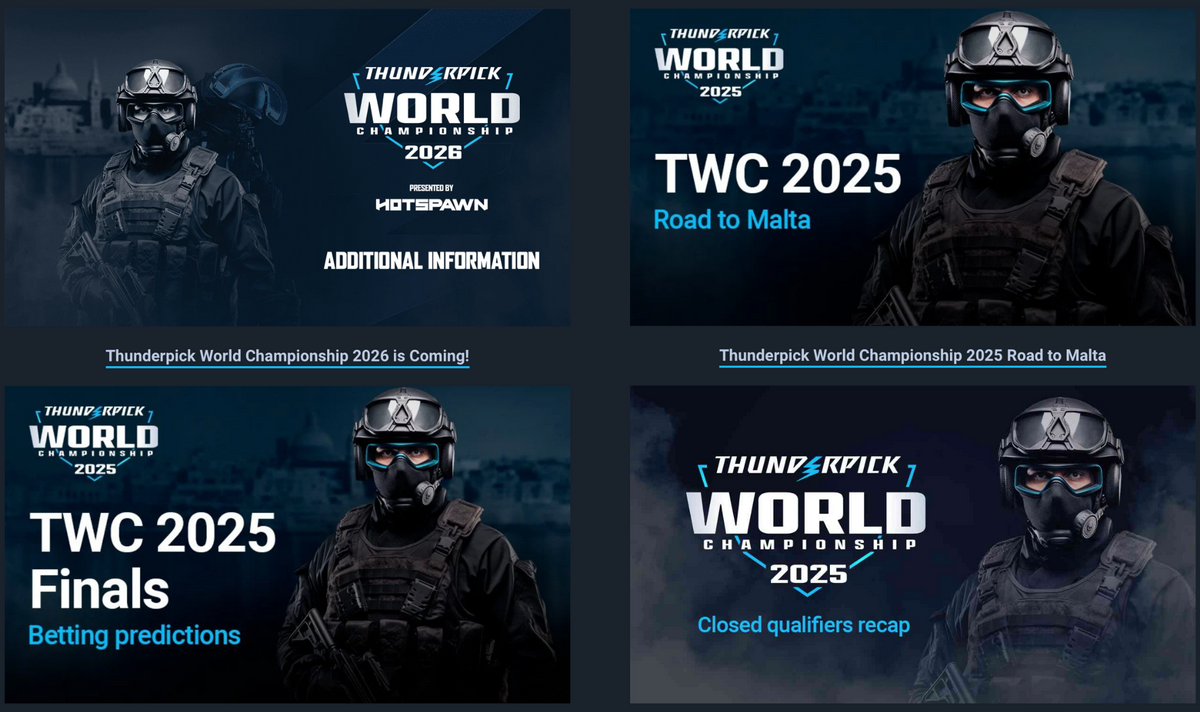
Gaming itself is a very wide industry, and website designs vary a lot. A video game provider will introduce a fundamentally different design from a casino site. However, let’s first look at a platform called Thunderpick, because it sits in between the worlds of esports and casino gaming, and can be an interesting case study. On the Thunderpick World Championship page, which is esports obviously, the main colors are very simple:
- a very dark blue-black background,
- bright blue-cyan highlights,
- and clear white text.
At the top of the page, the main section uses a dark space with soft smoke and light diagonal lines. In the middle, the logo and title stand out with white letters, bright blue brackets, and a blue lightning-style symbol.
That immediately creates a stage effect. The page does not feel like a flat website first. It feels like an arena graphic that happens to contain interface elements.
Why the dark background does more than set the mood
The first smart choice is the background itself. Near-black and navy do more than look dramatic. They push unused space into the distance, which makes the central wordmark feel larger and more important without adding more graphics.
In other words, darkness is doing structural work. It reduces background chatter and keeps the eye fixed on the center. The smoke and angled light shapes add motion, but because they stay inside the same cool range, they build depth without breaking the page into noisy pieces.
The cyan accent feels sharp instead of loud
The second choice is the accent color. Cyan is bright, digital, and fast, but it is used with restraint. That matters. When a glowing accent appears only on brackets, marks, and a few edges, it reads like a signal system rather than decoration. It tells the eye where to look next. A warmer accent would have made the page feel louder and less precise. This cooler blue keeps the mood intense, but still controlled.
It is careful color budgeting. The page holds back most tones so that one charged accent and one readable neutral can carry the whole atmosphere. That is also why the game provider feels so aligned with today’s dark-first gaming design. The palette is not trying to impress through quantity. It works through hierarchy, restraint, and timing. The same hierarchy of colors is visible in their YouTube game streaming, by the way; which is a good lesson of brand consistency throughout channels:
Dark palettes fit the devices and habits of modern play
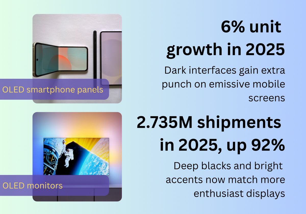
Three current market signals help explain why designers keep returning to dark-first gaming interfaces: the global games market is estimated at 3.6 billion players and $188.8 billion in 2025, OLED smartphone panel units are expected to grow 6% year over year in 2025, and global OLED monitor shipments reached 2.735 million in 2025, up 92% from the year before.
This helps explain why dark palettes keep spreading beyond pure gameplay screens and into event pages, lobbies, overlays, and branded landing pages. On displays that can render rich blacks and very bright accents, designers get a stronger split between background and active elements. That makes glow, outline, and motion feel more precise. A dark field also gives screens a cinematic feel without needing many colors.
There is also a human factor here. Modern gaming design often has to work for both active players and people who are only watching, scanning, or checking in quickly. In that kind of environment, dark layouts make it easier to build obvious focal points.
The next step is readable drama, not just neon drama
The real test of a dark palette is not mood. It is clarity. WCAG 2.2 says that color should not be the only way to show information. The best designs do not depend only on color. They also use:
- clear shapes,
- good spacing,
- labels,
- and strong contrast.
That way, the page still works even if the colors are hard to see. For designers, this means dark gaming screens cannot only look stylish. They also need to be built in a way that helps people understand the page clearly.
A 2025 study looked at 128 web colors and tested how people with different kinds of color blindness might see them. It found that light and dark levels often stayed more similar, but the actual colors were more likely to look changed or confused.
That is a useful clue for arcade-style design. It suggests that strong dark interfaces work best when separation comes from brightness and structure first, then accent color second. In practice, that means clear text, obvious outlines, distinct icon shapes, and highlight colors that are used sparingly. The future of this style is not a louder rainbow. It is more disciplined stage lighting.
About the Author

Mirko Humbert
Mirko Humbert is the editor-in-chief and main author of Designer Daily and Typography Daily. He is also a graphic designer and the founder of WP Expert.