A car that looks fast standing still is not magic. It is the result of understanding how to translate motion into static lines. Automotive design is unique among design disciplines because the product is evaluated on performance it has not yet delivered. The sketch must promise speed, handling, and power before a single engine turns over.
Here is how to sketch vehicles that feel fast, aggressive, and planted.
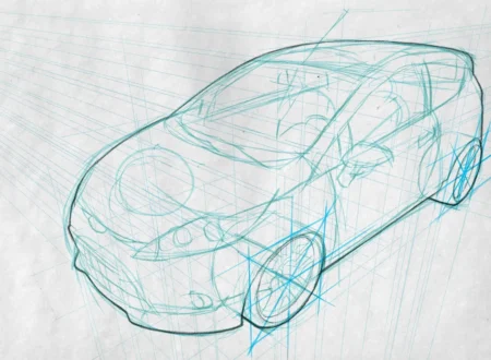
The Illusion of Movement
A parked car does not move. But a well-designed car looks like it is accelerating even when the wheels are stopped. This illusion comes from proportion, line direction, and stance.
The wedge is the fundamental shape of automotive speed. Low at the front, rising toward the rear. The nose cuts into the wind. The tail anchors the car to the ground. Even a family sedan follows this logic, just softened for practicality.
The A-pillar (the roof support at the windshield) should flow into the hood with minimal interruption. The rear deck should taper rather than truncate. Every surface should suggest forward motion, even at rest.
Proportion Rules That Never Break
Automotive sketching has non-negotiable proportion rules. Break them, and the car looks wrong regardless of rendering quality.
The wheelbase. The distance between the front and rear wheels should be roughly three wheel diameters. Shorter looks cartoonish. Longer looks stretched and unstable.
The cab rearward. For a sports car, the cabin sits behind the midpoint of the wheelbase. The hood is long. The rear deck is short. This is the classic front-engine sports car proportion.
The cab forward. For a family sedan or electric vehicle, the cabin moves forward, making more interior space from the same footprint. The hood shortens. The windshield steepens.
The overhangs. The front overhang (bumper to front wheel) should be shorter than the rear overhang (rear wheel to bumper) for a dynamic stance. Equal overhangs look static. Unequal overhangs suggest motion.
These proportions are not aesthetic preferences. They are structural realities that viewers have internalized. Get them right, and the car reads as credible. Get them wrong, and the sketch looks like a toy.
Line Language: Speed and Tension
Automotive design uses three types of lines, each with a different job.
Character lines are the main creases running the length of the car. They should start sharp, widen, then taper back to nothing. A character line that stays the same width reads as static. A line that breathes reads as alive.
Feature lines define specific elements: the edge of the hood, the shoulder of the fender, the cutline of the door. These lines should follow the logic of the character lines, reinforcing the same directional energy.
Highlight lines are the reflections on the body surface. They are not drawn. They are implied by the shape of the form beneath. A smooth, sweeping highlight suggests a taut, muscular surface. A broken, chaotic highlight suggests a surface that has lost its tension.
The key is convergence. All lines should point in the direction of travel. A line that curves backward fights the car’s forward energy. Every line is a vector. Make them all point forward.
Stance: How the Car Meets the Road
The space between the tire and the wheel arch determines the car’s attitude. A large gap suggests off-road capability but looks clumsy on a sports car. A tight, even gap suggests precision and performance.
The wheel itself should fill the arch. A wheel that looks too small for the body is a common amateur mistake. Sketch the wheels first, then build the body around them. The wheels are the anchor. The body is the sail.
The side skirt (the panel between the wheels) should be visually heavy. A light, thin skirt makes the car look tall and unstable. A thick, planted skirt roots the car to the ground.
Perspective: Seeing the Whole Car
Automotive designers work in three standard views.
Three-quarter front is the hero view. The car approaches the viewer, slightly turned. This view shows the face, the hood, and the side profile in one frame. It is the most dynamic and the most difficult.
Pure profile is the architectural view. The car is flat against the picture plane. Proportion is everything here. The profile reveals whether the wheelbase is correct and the cabin is properly positioned.
Three-quarter rear is the aggressive view. The car is departing, showing broad shoulders and a planted stance. This view emphasizes width and power.
For each view, establish the perspective grid before sketching. The horizon line determines the camera height. Low horizon (car below eye level) makes the car look heroic. High horizon (car above eye level) makes the car look small and vulnerable. Sports cars are sketched from below. Trucks are sketched from above.
Speed Sketching vs. Rendered Finish
Automotive sketches have two distinct phases.
Speed sketching is loose, gestural, and fast. The goal is proportion and line energy, not detail. Use a single marker or a thick pencil. Draw the car in thirty seconds. If you cannot capture the essence in thirty seconds, you do not understand the proportion. Speed sketches are for exploration, not presentation.
Rendered finish is tight, precise, and controlled. The goal is surface quality, material definition, and lighting. Use markers, pencils, or digital tools. This is the version you show to clients.
Do not render a car that has proportion problems. The rendering will not save it. Fix the proportion in speed sketch first. Then commit to finish.
Materials: Glass, Paint, and Chrome
Automotive rendering requires distinguishing between materials with the same line.
Glass reflects the sky. It should be dark at the top, light at the bottom, with a sharp horizon line separating them. Avoid rendering individual windows. Treat the glass as a continuous band that happens to have body-colored pillars dividing it.
Paint has soft, sweeping highlights that follow the form. The highlight should run parallel to the character line, not across it. Metallic paint has a sharp highlight and a deep, dark shadow.
Chrome has hard, bright highlights that sit exactly on the edge of the form. Chrome does not have soft transitions. It goes from white to dark gray in a millimeter.
Tires and wheels. Tires are dark gray, not black. Black tires read as holes. Dark gray tires read as rubber. Wheels should be rendered with the same care as the body. A beautiful car on poorly rendered wheels looks incomplete.
The Bottom Line
Automotive design is structural before it is artistic. Get the proportion right, and the style will follow. Get the proportion wrong, and no amount of rendering will fix it.
Start with wheels. Establish stance. Lay in the wedge. Draw the character lines. Then refine. The car that looks fast at rest is not an illusion. It is engineering, expressed in line and form. Learn the rules. Then break them with purpose.
About the Author

Peter Makeshoff
Peter Makeshoff is the founder and main author of Designer Daily.