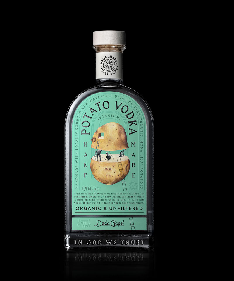
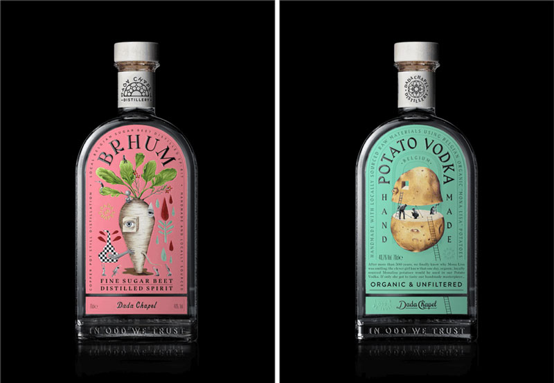
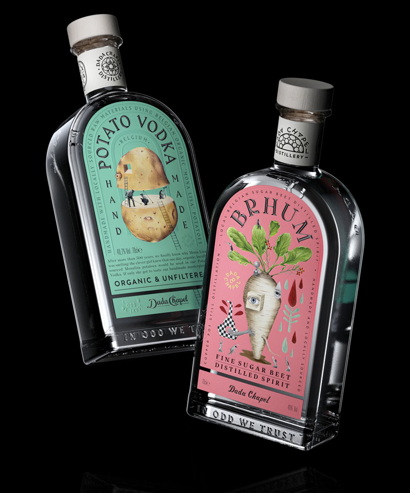
In the world of spirits packaging, few agencies push boundaries like Stranger & Stranger. Their latest project for Chapel, a premium brand, embraces the chaotic, rule-breaking ethos of Dadaism—turning traditional packaging on its head with surreal, irreverent design.
Dada Meets Distillation
The Dada art movement rejected logic and embraced absurdity, and Stranger & Stranger channeled that energy into Chapel’s branding. The result? A label that feels like a collage of fragmented imagery, bold typography, and playful disruptions—mirroring the unpredictability of the spirit inside.
Breaking the Rules with Purpose
- Typography as Art: Letters collide, overlap, and warp, refusing to conform to clean, structured layouts.
- Surreal Imagery: Unexpected visuals—like distorted figures and abstract shapes—create intrigue.
- Controlled Chaos: Despite its rebellious nature, every element is meticulously placed to ensure shelf impact and brand recognition.
Why It Works
In a market saturated with minimalist luxury designs, Chapel’s packaging stands out by embracing controlled madness. It appeals to consumers seeking something bold, unconventional, and deeply artistic—proving that sometimes, breaking the rules is the best way to make an impression.
For designers, this project is a masterclass in how to balance avant-garde aesthetics with commercial appeal. Stranger & Stranger didn’t just create packaging—they crafted a statement.
About the Author

Peter Makeshoff
Peter Makeshoff is the founder and main author of Designer Daily.