Thursday evening before a major fundraising push usually brings absolute chaos to nonprofit communications teams.
Mateo sat at his desk staring at a massive checklist for an upcoming end-of-year campaign. His deliverables spanned a complete donor journey. He needed an initial awareness video for social media. Next came a dedicated landing page. Then he had to build a multi-stage checkout flow for donations, topped off with a five-part email drip sequence.
Hiring a freelance illustrator to draft custom artwork wasn’t an option. His budget sat at exactly zero dollars.
Resource-strapped teams face a familiar dilemma in these moments. Can off-the-shelf vector libraries truly support a coherent brand system? Or will your final product inevitably look like a patchwork quilt of generic stock art?
Operating exclusively with pre-made assets works beautifully. You just have to treat the library as raw material instead of a finished product. Platforms like Ouch, managed by Icons8, offer a specific structural approach. Their system makes campaign scaling entirely possible without a dedicated illustration team.
Mapping the Donor Journey Flow
Securing a unified visual language starts with consistent user experience coverage. Mateo needed more than just a striking hero image when building the donation portal. Visual cues had to progress naturally through the interface. An empty state for the uncompleted form required specific graphics. Declined credit cards needed a friendly error illustration. Completed donations called for a celebratory success screen.
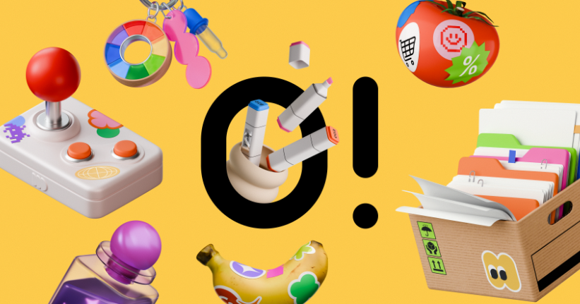
Libraries grouping assets by strict style families solve these exact problems. Ouch currently houses over 101 distinct illustration collections. Options range from minimal monochrome to bold surrealism. For his project, Mateo selected a sketchy look aligning perfectly with his organization’s grassroots identity.
Breaking down layered vector graphics into tagged, searchable objects changes everything.
Finding matching assets for specific UI states becomes a systematic process rather than a guessing game. Designers pull illustrations directly from a single style family. Stroke width, color palettes, and perspective remain identical across landing pages and 404 error screens.
Working with vector files is critical here. Mateo downloaded the SVG formats for his chosen style. Opening the assets in an editor let him dismantle pre-made scenes quickly. Generic background elements got swapped for specific leaf motifs relevant to his agriculture group. Primary accent colors shifted perfectly to match established brand guidelines.
Scaling Across Video and Print Channels
Format adaptation presents another massive hurdle in campaign design. Quiet website homepages demand different energy than noisy Instagram feeds. A week into the project, Mateo’s team faced a new challenge. They needed to adapt static web graphics into animated social media ads.
Motion design formats change the equation entirely. Ouch provides files specifically tailored for animation, including Lottie JSON, Rive, and editable After Effects projects. Taking the same sketchy characters from the donation page, the team downloaded corresponding After Effects files. Customizing keyframes helped them create a short loop of volunteers planting a community garden.
Because the core artwork originated from the same library collection, everything matched flawlessly. That animated reel felt like a natural extension of the website. It never looked like an isolated, tacked-on piece of content.
Desktop management plays a huge role here too.
Practitioners dealing with hundreds of files often rely on the Pichon app. Software like that houses the entire Ouch catalog locally on your machine. Dragging transparent PNGs directly into a Figma canvas or presentation deck saves hours previously spent organizing browser tabs.
Evaluating the Alternative Landscape
Bypassing custom illustration costs isn’t exclusive to one platform. Comparing popular repositories highlights specific trade-offs every creative team must accept.
- unDraw: Startups flock here for a completely free, open-source model. Instant color customization adds massive value. Severe visual saturation remains the main drawback. Heavy reliance on one flat vector style kills differentiation. Standing out becomes almost impossible when using exact minimalist figures found across thousands of tech SaaS platforms.
- Freepik: The sheer volume makes this database incredibly appealing. Finding absolutely anything you need takes mere seconds. Curation time becomes the hidden penalty. Piecing together twenty images sharing identical shading techniques, character proportions, and linework from fragmented contributors is exhausting. Tedious scrolling drains creative energy fast.
- Humaaans: This kind of modularity shines bright for web teams. Mixing and matching heads, bodies, and legs creates beautifully diverse groups. Scope presents a real limitation. Content focuses almost exclusively on human figures. Broader technology, nature, and business abstractions needed for full-scale campaigns simply don’t exist here.
Finding a middle ground matters. Tighter style consistency puts Ouch ahead of Freepik’s chaotic search results. Aesthetic variety easily beats the repetitive nature of unDraw or Humaaans.
Where Pre-Packaged Art Breaks Down
Flexibility only goes so far before you hit hard limits.
Stock libraries almost never carry highly specific, localized metaphors. Suppose an environmental nonprofit needs an infographic detailing the life cycle of a regional bird species. General nature categories won’t suffice. Repositories deal exclusively in broad archetypes. Trees, generic birds, farmers, and tech devices fill the catalogs. Deeply technical or hyper-specific subject matter demands custom illustration.
Licensing restrictions create friction for specific use cases. Using Ouch graphics for web, apps, and marketing materials works perfectly. Printing those assets on merchandise requires contacting Icons8 directly for a specialized agreement. Nonprofits planning to fundraise by selling t-shirts or tote bags must navigate additional legal clearance.
Budgets dictate your final output quality. Basic PNG files ship standard on the free tier, demanding a visible attribution link. Professional campaigns suffer when those links break the immersion of an email newsletter or printed flyer. Teams must upgrade to a paid plan for clean deployments. Upgrading also unlocks SVG formats required for recoloring and editing specific layers.
Tactics for Library-Driven Campaigns
Executing a polished brand identity using off-the-shelf tools requires strict discipline. Follow these core principles.
- Enforce strict style isolation: Pick exactly one style from the 101+ options. Refuse to deviate. Mixing a 3D clay model with a simple line graphic instantly shatters your cohesive brand illusion.
- Edit without vector software: Dedicated design programs aren’t strictly necessary. Icons8 provides a free online tool called Mega Creator. Rearrange elements, swap character heads, and unify color palettes right in your browser before exporting.
- Audit free versus paid assets early: Filter your searches immediately if operating strictly on a zero-dollar budget. Combining low-resolution PNGs with crisp premium vectors creates a jarring user experience.
- Deconstruct complex scenes: Avoid downloading full compositions. Grab SVG files instead. Remove unnecessary background layers. Isolate single objects. Clean, standalone elements often work far better for mobile UI and email design than cluttered scenes.
About the Author

Peter Makeshoff
Peter Makeshoff is the founder and main author of Designer Daily.