Did you ever ask yourself: why do people go to websites? The major motivation for each visit is usually content. Content is crucial, and every designer wants to offer it on their website in the most useful and simple way possible. The most important purpose of a website layout design is information structure, thus establishing the hierarchy of material while ensuring it can be accessed easily are vital goals that a good layout should achieve.
Creating an online presence is a major decision, but the finest websites are the result of many little decisions.
A good website design incorporates many various components, but the most essential are user experience, security, and visual appearance. Because it makes vital content easily available and simple to locate, a smart layout keeps people on the site. A poor layout irritates users, who subsequently abandon the site because they can’t locate what they’re searching for.
This post will provide you with some examples of websites that utilize a distinct layout design so that you may develop pages that break the mould without upsetting user expectations.
Horizontal Scrolling
A side scroll style is an appealing and functional option, particularly for portfolio websites, catalogues, maps, and the like. With sideways navigation, discovering projects, exploring places, and visiting online galleries becomes considerably more interesting. Horizontal scrolling, when done well, can make a website more engaging, entertaining, and memorable, as the websites on our list brilliantly demonstrate.
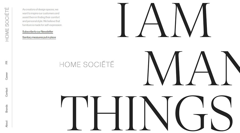
Home Société is a horizontal scrolling website that creates pieces for both indoor and outdoor environments. This is a one-pager with a horizontal scroll from left to right. The entire site is fundamentally simple, yet enthralling due to seamless animation effects and appealing presentations of the company’s products.
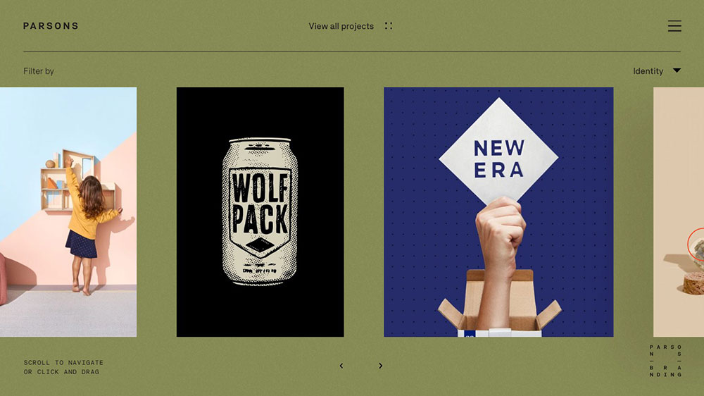
Parsons Branding is a Cape Town-based brand strategy and design firm. You may pick between a never-ending carousel and a complete project grid view on their website. If you choose the former (which is the default view), you will be able to browse through the studio’s projects using horizontal scrolling, but the latter comes with an unlimited scrolling space that you may go in any direction you choose.
Magazine Layout – The Washington Post
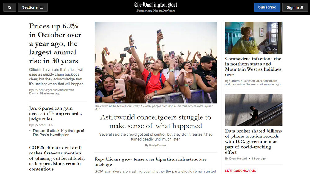
As the name indicates, this layout technique is commonly used in magazines or news sites to display a variety of various articles.
They are inspired by the print layout and allow for the use of headlines and images to introduce content. That may be a fun way to present what is simply a list of links.
It’s also a great layout for emphasizing often changing material. That is why it is so popular on news websites such as The Washington Post.
F-shape
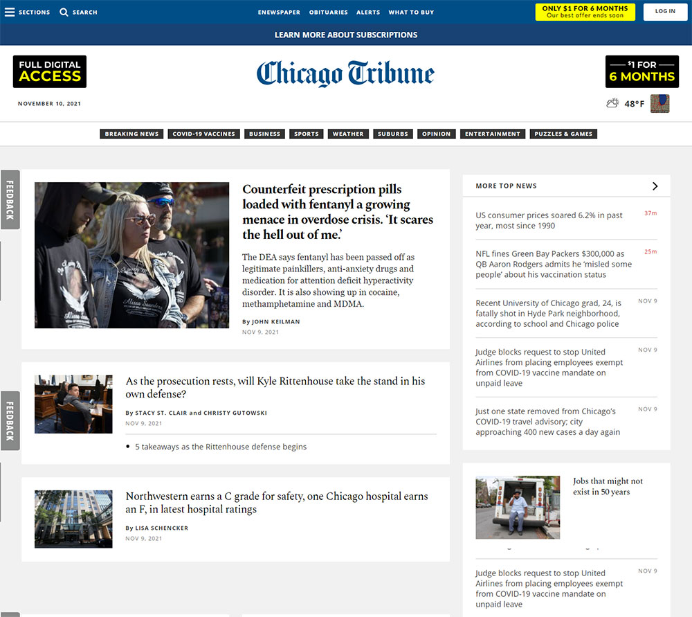
The F-shaped website layout is quite prevalent, and it was developed based on research conducted by Nielsen Norman Group, a UX research consulting business, which conducted an eye-tracking study and discovered that consumers generally read blocks of text and assets in an F pattern.
When there are a number of different alternatives for visitors to click on, many websites employ the F-shape pattern. Consider how Google search results are presented, or how most news websites show their materials.
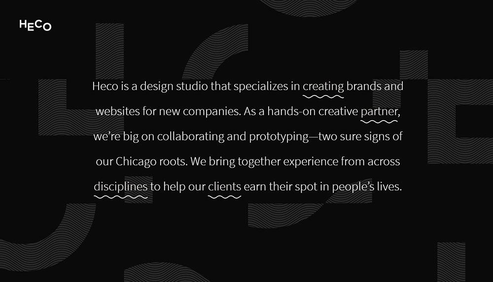
We get a good idea of who they are and what they do without even scrolling. This site, as a whole, is a beautiful example of how to mix a portfolio with more extensive background information, as demonstrated by each of their work. We get to observe how they’ve helped their clients thrive and learn about their work philosophy.
Split Screen Layout
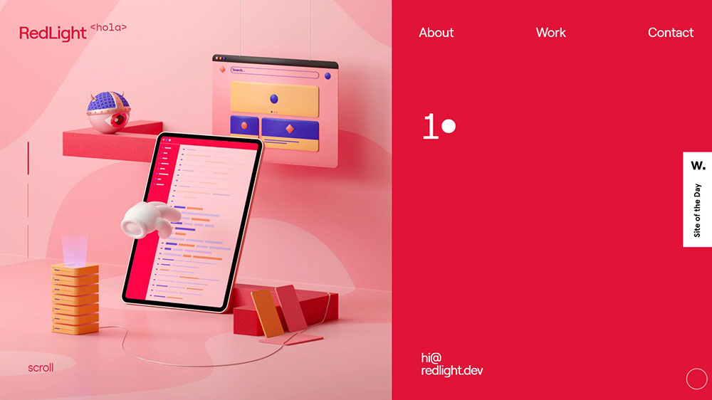
This layout applies to both vertical and horizontal split-screen layouts. A vertical split-screen, in general, serves an important function in communicating dual significance to two or more separate regions. The goal here is to encourage fast options in order to increase initial interaction with the website. Looking simply at the vertical divide, it does not offer a decision, but rather an enhancement of one experience through the other.
Full-screen background video
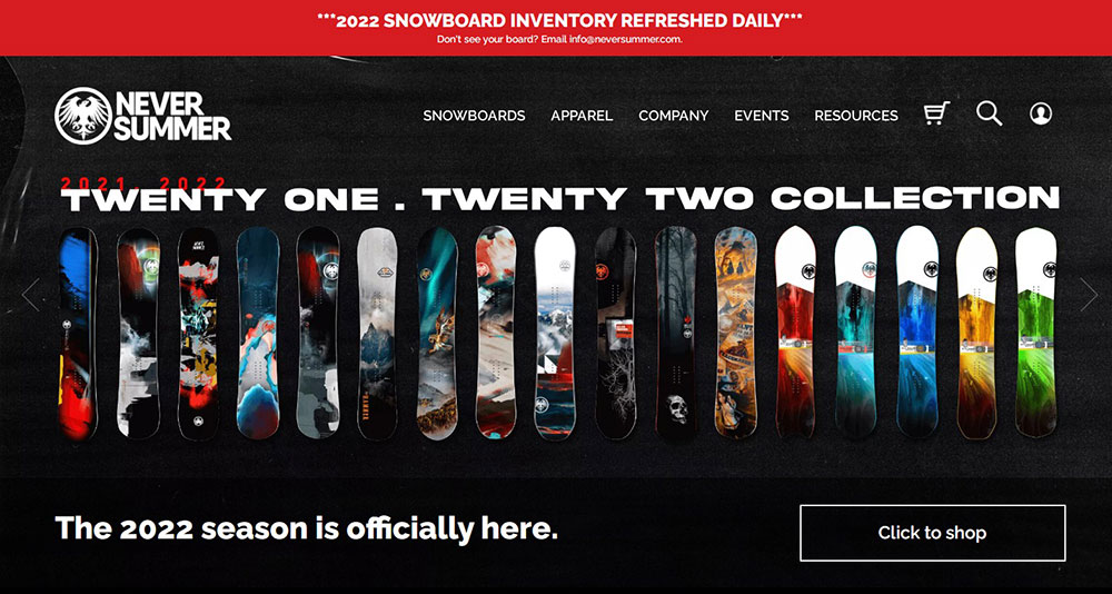
Layout: a full-screen backdrop video serves as a gateway to more typical e-commerce sites.
Summer never focuses on their merchandise without losing their sense of humour. With technical specifications and an emphasis on board building, this page layout might have been suffering from information overload. However, they are able to circumvent this by infusing a lot of individuality. All of this transforms what could be a soulless factory into one with a sense of humour.
Fixed sidebar
The main menu is the first thing most people look for when they want to browse a website, therefore it’s important to get it right. In addition to top-side horizontal navigation, menu choices may be kept visible by putting them in a fixed sidebar. The sidebar is a vertical column on the page’s left or right side. The sidebar remains fixed and constantly visible in this web layout, but the rest of the page changes when visitors scroll down the page. This way, navigation is still possible.
Highly-immersive
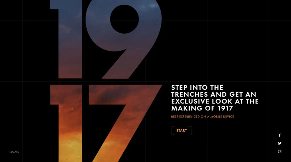
The idea for a website layout: extremely immersive design components. 1917 is an award-winning website dedicated to publicizing the film 1917. The design has completely upended traditional design concepts, providing visitors with an immersive experience.
You may wonder about the trenches and try to fulfil the same goal as the protagonists in the film. You can also examine their maps and utilize other tools thanks to the highly dynamic aspects. It’s a wonderful example from which to obtain some inspiration for your future project.
Z-shape layout
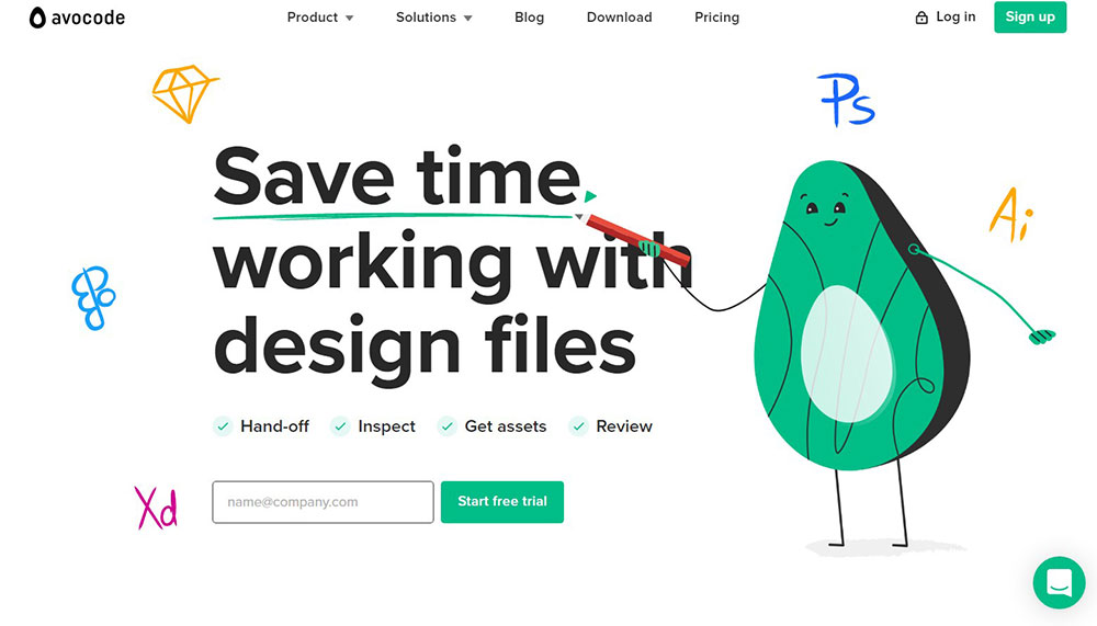
The Z-shape pattern, like the F-shape layout, reflects natural scanning tendencies. Visitors to the site (from Western civilizations) begin in the upper-left corner. They scan in a horizontal line from top left to top right. The following phase, however, is somewhat different: instead of falling down immediately, as in the F-shaped pattern, their eyes meander down and to the left side of the page, forming a diagonal line. Finally, the gaze returns to the right, producing a second horizontal line. Avocode’s usage of drawings on their corporate website is an example of this.
Working with cards, a type of grid, is ideal for websites that hold a large amount of non-hierarchical material.
This website layout is commonly used for news, blog, portfolio, and video websites—websites that must present a large amount of material in an orderly, flexible, and easy manner.
Simplistic Layout
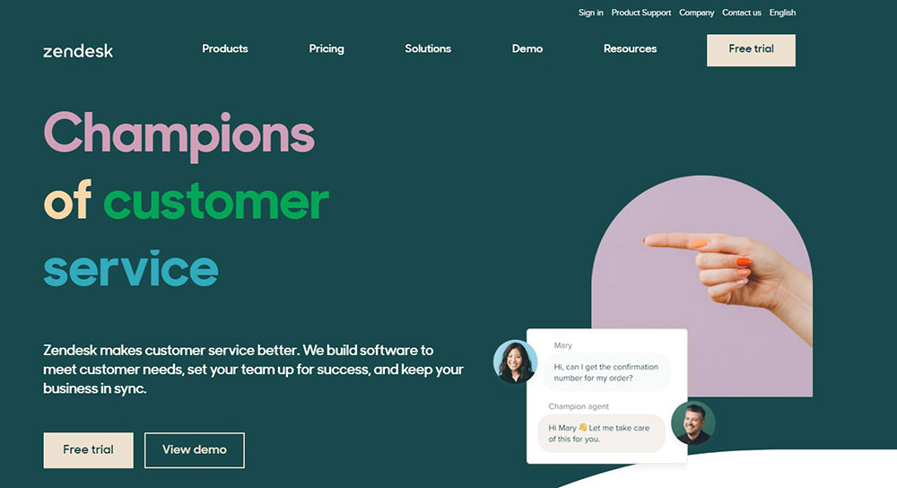
ZenDesk, the market leader in customer support, also provides a static menu as users scroll down, ensuring they always have the means to get the material they want. The simplicity of this arrangement is its charm.
There’s a lot of white space here, the content is well-organized, and the big CTA in the top-right corner is back.
Split-screen layout
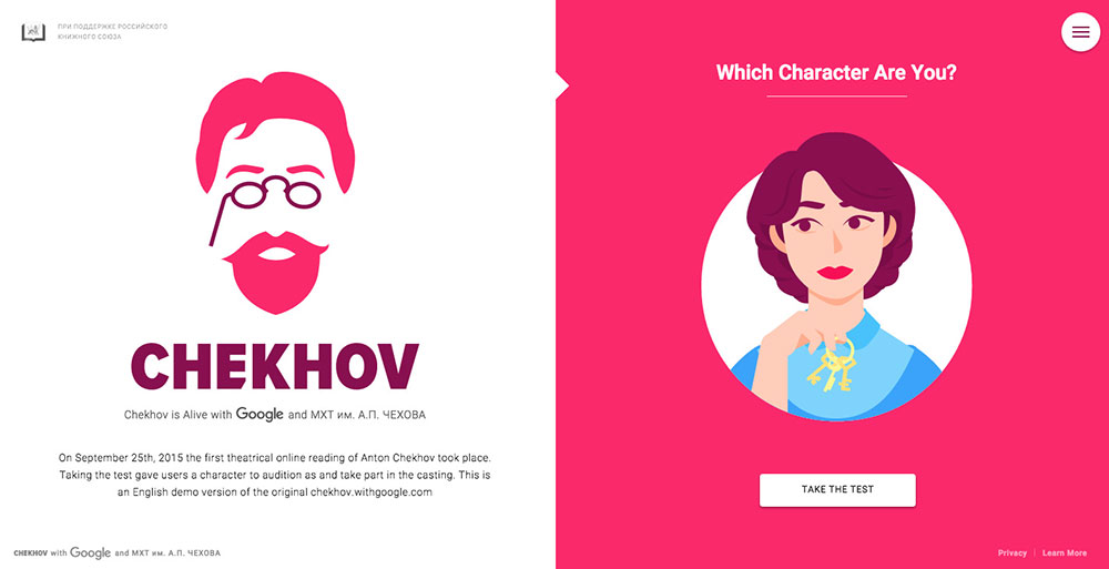
Chekhov employs a split-screen arrangement, providing equal weight to two equal bits of material. By juxtaposing two things, the designer generates contrast, which serves as a fantastic attention grabber. The use of vibrant colours and animations produces and delivers a rich and dynamic experience to users. If your site has to provide two dramatically different versions of the user journey, you could consider using a split-screen layout.
Large Images Layout
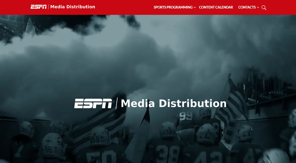
With this dynamic and eye-catching site loaded with big, high-resolution pictures and video, ESPN takes its sports content and programming to the next level. The site employs background video to match the excitement of the sports network, as well as sections with subtle hover and transition effects to provide a seamless user experience. The ‘featured sports’ slider is enthralling and does a good job of displaying each sport alongside fascinating statistics and information about available programs.
Minimalism Layout
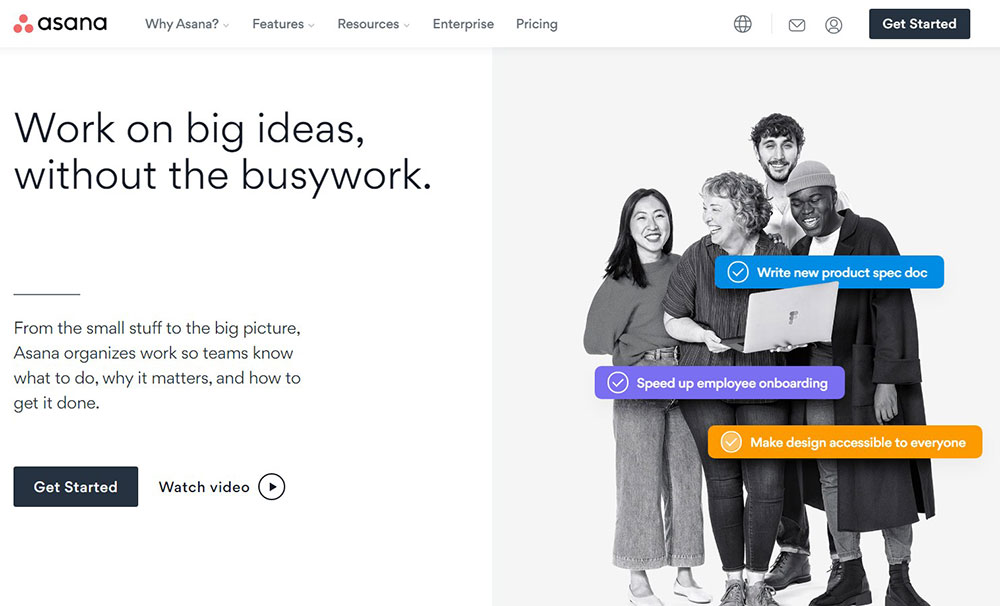
The site of Asana is easy to navigate and makes liberal use of white space to accentuate the headline and call-to-action. Everything the visitor needs to know, be tempted, and convert is above the fold, with no need for scrolling.
If the visitor wants to learn more, he or she may scroll down to see more of the presentation we’ve been teased with, and there’s a basic navigation menu that is straightforward and built for speed.
Single column
Single column webpages are as straightforward as they get. On your website, all of your assets are organized into a single column. That’s all. It just takes one column, and all visitors have to do is scroll down to access additional material.
It’s a popular website design for minimalist blog sites like Tumblr and Medium, as well as social networking platforms like Instagram and Twitter, where postings are automatically sorted by one factor: date.
Content Focused Layout
On news sites or blogs, web designers frequently employ the content focused style, which typically features a major column for text and one or more side columns for supplemental information.
This style has the advantage of allowing you to adjust the line length of the core content by altering the width of the side columns. This is significant because if the text’s line length is too long or too short, it becomes difficult to read, decreasing understanding and memory of the information. Usually, WordPress themes for designers have multiple layouts available for you to choose from, in case you want to create a website that has both a landing page on its homepage, and a blog section.
Asymmetrical Layout
The asymmetrical arrangement deviates from symmetry norms to the point of bending them in favour of a singular promise: there is more to us than perfection. The idea is to make active space and white space more lively.
Parallax scrolling effect
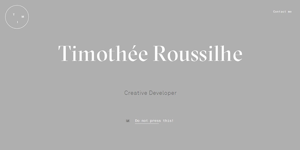
Timothee Roussilhe’s resume website is Time thee Roussilhe. It’s straightforward but inventive. He enhances the experience with a parallax effect. As you scroll down, boxes appear and disappear. What’s remarkable is how all of the boxes use the parallax effect; you almost feel like you’re watching a movie when surfing the site.
Use the parallax effect while designing a website to add a nice aspect. To avoid a cluttered design, keep the layout basic and utilize a clear colour scheme.
Conclusion
You can’t have a successful website unless you consider user experience and conversions. The good news is that you now have numerous examples to guide you in designing the ideal website style for your target audience.
Your website is intended to be the face of your online presence and a virtual representation of your brand. If your website does not have a design that reflects how you want to be seen, it will eventually fail to operate optimally.
About the Author

Bogdan Sandu
Bogdan is a designer and editor at DesignYourWay. He's reading design books the same way a hamster eats carrots, and talks all the time about trends, best practices and design principles.