
Design is a lot like cooking. Most of the time, you follow the recipe, trust your instincts, and produce something that works. But every now and then, you misread “tablespoon” as “teaspoon,” or you confidently add salt instead of sugar, and suddenly you’ve created something that makes people question your entire education.
Welcome to the wonderful world of design fails.
These are the moments when typography betrays us, when color theory packs its bags and leaves, and when user experience becomes user confusion. A restaurant menu printed in a font so ornate you need a magnifying glass and a degree in calligraphy to read it. A logo that, from the right angle, looks like something you definitely can’t show your grandmother. A website button labeled “Submit” that’s actually just a decorative image. A sign instructing you to “Push” while the door clearly says “Pull.” These aren’t just mistakes, they’re accidental comedy gold.
What makes design fails so delightful is their humanity. Nobody sets out to create a confusing parking sign or a packaging design that makes the product look like something from a horror movie. These errors come from late nights, rushed deadlines, miscommunication, or simply not stepping back to see the bigger picture. And honestly? We’ve all been there.
In this article, we’re celebrating the mishaps, the misalignments, and the “what were they thinking?” moments that remind us design is hard. We’ll laugh at the fails, but we’ll also learn from them, because every cringe-worthy kerning disaster and every unfortunate logo placement is a lesson in humility and attention to detail.
So buckle up and prepare to cringe, chuckle, and maybe double-check your own work. After all, today’s design fail is tomorrow’s cautionary tale. And who knows? Your worst mistake might just end up on a blog like this one.
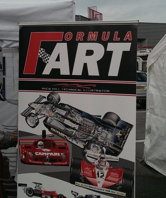
1. Formula Fart
Yes, legibility matters, no matter what you are designing.
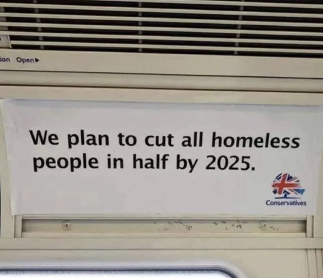
2. Copywriting matters two
Homeless people have it bad enough, leave them alone.
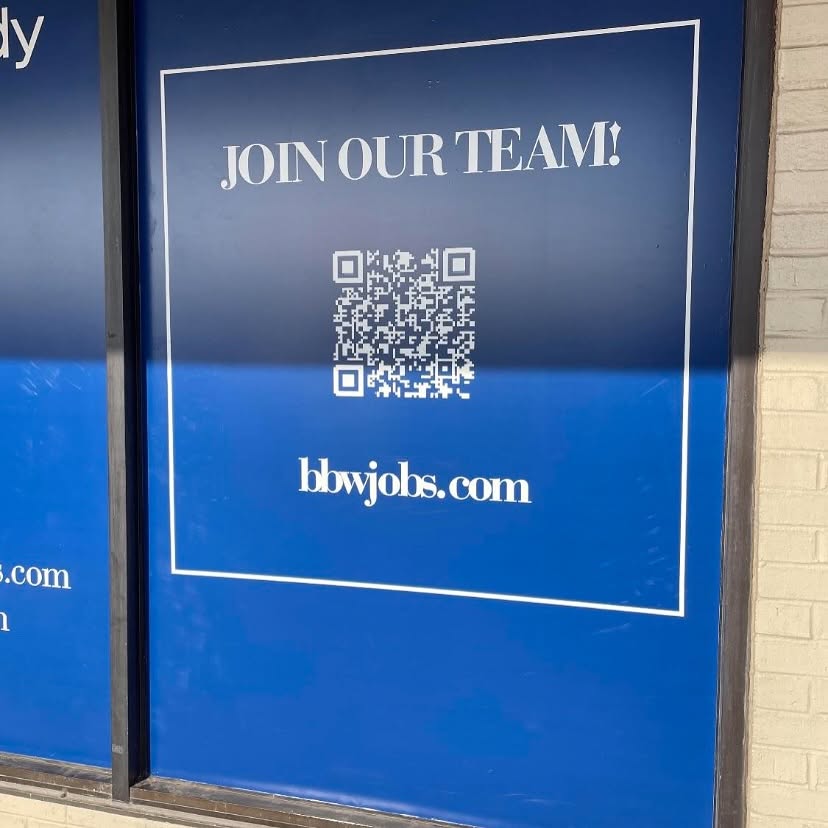
3. bbwjobs.com
Probably one of the worst examples of keming.
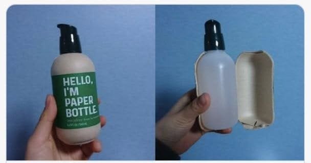
4. Paper plastic bottle
Lies, so many damn advertising lies.
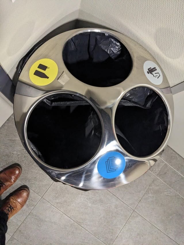
5. Gamified recycling trash can
Hard to guess what goes where.
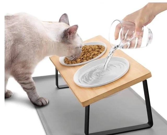
6. Gravity cat feed
The design looks pretty cool, but gravity and water don’t exacty interact that way.
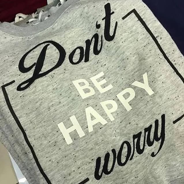
7. Don’t be happy, worry!
Fine example of how reading order override attempts of differentiating with colors.
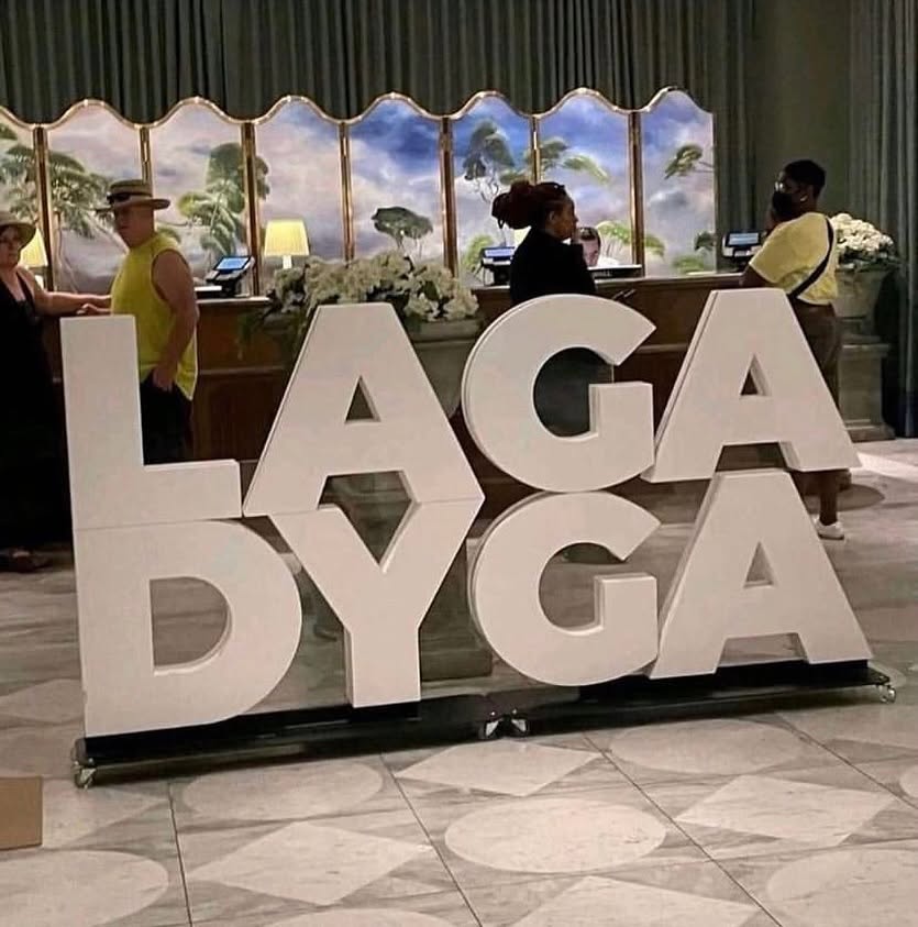
8. Laga Dyga
These two words shouldn’t have been displayed this way.
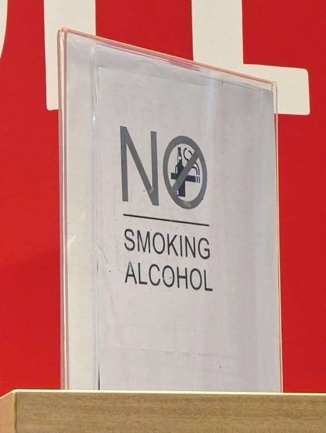
9. NO SMOKING ALCOHOL
When people embrace every vice together, you have to give them a stern warning.
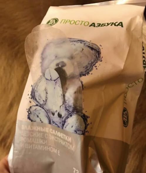
10. Happy Bear
This has to be intentional, I’m sure there is a Russian designer giggling about this somewhere.
About the Author
Peter Makeshoff
Peter Makeshoff is the founder and main author of Designer Daily.