Leaving the metaphorical store with the cart full is one thing; leaving it abandoned at the checkout page is quite another. Cart abandonment is one of the biggest drains on e-commerce profitability, and often it’s not about price or shipping cost alone. Poor design, confusing flows, and friction points turn potential buyers away. Fortunately, many fixes are relatively simple. Here are five UX improvements to focus on, with practical advice.
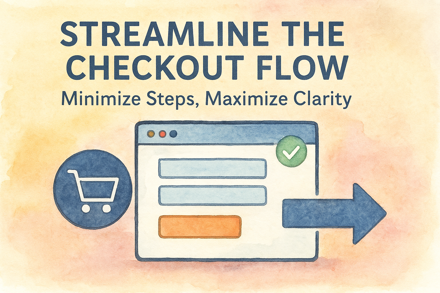
1. Streamline the Checkout Flow: Minimize Steps, Maximize Clarity
What often goes wrong: Users hit the checkout button, then face five different pages before placing an order: address, payment, shipping, review, confirmation. At each stage, there’s risk of drop-off.
UX fix: Reduce the number of steps. Combine or remove unnecessary ones. For example:
- Merge address + shipping into one step if possible.
- Display a progress indicator (e.g. “Step 2 of 3”) so customers know how far along they are.
- Remove non-critical asks (e.g. newsletter opt-ins) until after purchase.
Why it helps: Every additional step is a barrier. The clearer the path, the more comfortable the user feels. Less cognitive load, fewer distractions means fewer opportunities to abandon.
2. Be Transparent About Costs Early
What often goes wrong: Users add items to cart, proceed to checkout, then see shipping, taxes, or other fees added at the end. That surprise kills trust and increases abandonment.
UX fix: Show all expected costs (shipping, taxes, handling) as early as possible:
- In the cart preview or summary.
- Provide shipping cost estimates before checkout.
- If shipping or taxes depend on address, let the user input that early (postal code etc) or offer typical defaults.
Also clarify return policy, any extra fees (duties, customs…), so customers don’t feel ambushed.
3. Optimize Form Design: Reduce Friction and Errors
What often goes wrong: Forms that are long, unclear, inflexible. Required fields with vague labels. Format errors (postal code, phone number) reject input. Users having to fill fields that aren’t relevant.
UX fix:
- Use clear, concise labels. Inline hints (for example: “Format: 12345” or “Include country code”).
- Use smart defaults. Autocomplete where possible (address, city/state from postal code).
- Validate as the user types, not after submission. Show error messages clearly and helpfully.
- Offer alternatives: guest checkout vs account creation. Many users abandon when forced to create an account.

4. Reduce Distractions; Keep Focus on Checkout
What often goes wrong: While in checkout, users are distracted by navigation menus, large banners, cross-sell popups, or other calls to action. They drift away.
UX fix:
- Use a “checkout mode” that simplifies navigation: hide or subdue header links, sidebars, things that divert attention.
- Avoid or delay cross-selling or upselling until after the order is placed. If you do show order-relevant suggestions, make them subtle and contextual (e.g. “Would you like gift wrapping?”).
- Provide reassurance: show trust badges, secure payment icons, small statements like “100% secure checkout,” especially near payment inputs.
5. Mobile Checkout Must Be Exceptional
What often goes wrong: Many sites treat mobile experience as afterthought: tiny buttons, hard-to-tap fields, zooming needed, clumsy input for keyboard, weak affordances. Abandonment rates on mobile tend to be much higher.
UX fix:
- Use mobile-friendly input types (e.g. numeric keyboards for phone/payment, date pickers where appropriate).
- Ensure touch targets are large enough, spacing is generous.
- Simplify layout: avoid long scrolling, collapse non-critical sections.
- Use mobile wallet / payment services (Apple Pay, Google Pay, etc.) to reduce typing.
Measuring Success & Iterating
Implementing fixes is just the start. To really reduce abandonment you need to measure, test, and iterate.
- Use analytics to identify drop-off points in your checkout funnel (e.g. after shipping options, at payment screen).
- A/B test changes (e.g. “checkout in 2 steps” vs “checkout in 4 steps”) to see what works for your customers.
- Use qualitative feedback: session recordings, usability tests, survey feedback (“what stopped you from completing purchase?”).
- Monitor trust signals: page load time, error frequency, clarity of messaging (especially around costs & returns).
Conclusion
Cart abandonment is seldom just one issue. It’s a combination of friction, surprise costs, confusing forms, distractions, and often poor mobile experience. By simplifying the flow, making costs transparent, optimizing forms, reducing distractions, and giving mobile users a high-quality path, you can make checkout far more inviting. Good UX isn’t about fancy visuals; it’s about removing barriers, building trust, and smoothing every step toward the “Place Order” button.
About the Author

Peter Makeshoff
Peter Makeshoff is the founder and main author of Designer Daily.