
An error message is a moment of failure. The user has tried to do something and failed. The system has tried to process something and failed. The interaction has broken down. How you communicate this failure determines whether the user feels helped or blamed, supported or attacked.
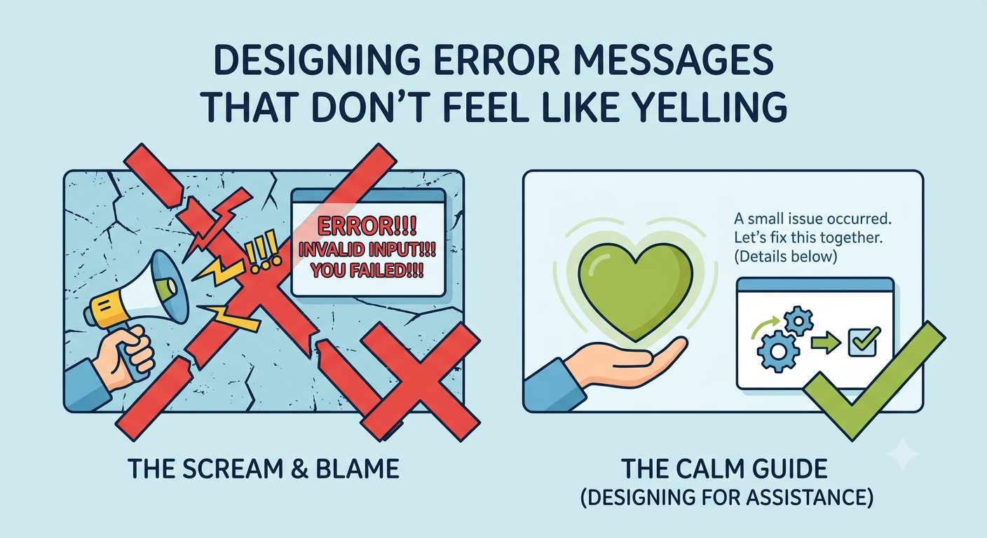
Most error messages feel like yelling. They are written in all caps. They use exclamation points. They blame the user. They offer no solution. They are the digital equivalent of a frustrated sigh. This is not just unhelpful. It is damaging.
Here is how to design error messages that feel like assistance, not accusation.
The Tone Problem
The tone of an error message is as important as its content. A message that is abrupt, accusatory, or dismissive will alienate the user. The user will feel attacked. They will not trust the system. They will be less likely to try again.
The solution is to use a calm, neutral, and helpful tone. Write in the active voice. Use plain language. Avoid exclamation points. Do not blame the user. The user is not the enemy. The problem is the enemy.
The Content Problem
An error message that does not explain the problem is a failure. The user knows something went wrong. They do not know what. They do not know why. They do not know how to fix it.
The solution is to provide a clear explanation of the problem. What went wrong? Why did it go wrong? What can the user do to fix it? The message should answer these questions in plain language.
The Structure Problem
The structure of an error message determines how it is perceived. A message that is scattered and disorganized feels chaotic. A message that is clear and structured feels trustworthy.
The solution is to use a consistent structure. State the problem. Explain the cause. Provide a solution. The user should be able to scan the message and understand what to do.
The Visual Problem
The visual design of an error message determines how it is perceived. A message that uses red text and aggressive icons feels alarming. A message that uses a calm color and a simple icon feels informative.
The solution is to use a visual design that is informative but not alarming. Use a color that signals a problem but does not create panic. Use an icon that indicates an issue but does not create fear.
The Microcopy Problem
The microcopy of an error message determines how it is perceived. A message that says “invalid input” is unhelpful. A message that says “your email address is missing the @ symbol” is helpful.
The solution is to be specific. Do not use generic language. Do not use jargon. Do not use vague terms. Explain exactly what went wrong and exactly how to fix it.
The Bottom Line
An error message is a moment of failure. It is also a moment of opportunity. A well-designed error message can turn a frustrated user into a loyal user. A poorly designed error message can turn a frustrated user into a lost user.
Design error messages that feel like assistance, not accusation. Use a calm, neutral, and helpful tone. Provide a clear explanation of the problem. Use a consistent structure. Use a visual design that is informative but not alarming. Be specific. The user will appreciate it. And they will come back.
About the Author

Peter Makeshoff
Peter Makeshoff is the founder and main author of Designer Daily.