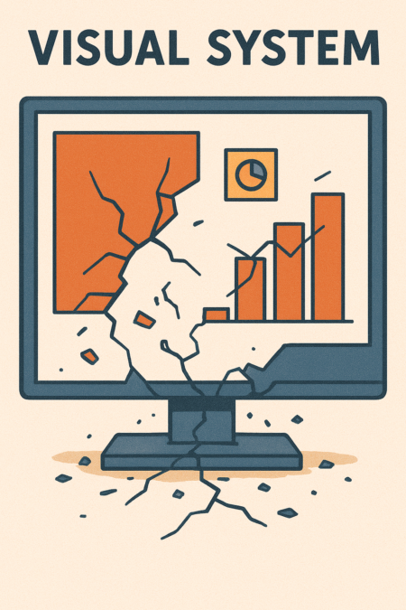
A design system is a promise. It promises that a button in Tokyo will feel like a cousin to a button in Toronto. It promises that an icon born today will align with an icon created three years from now. But as a product grows from a single team to dozens, from one market to thirty, that promise is tested. What looks beautifully coherent in a Figma library can crumble under the pressure of real global use.
This is the challenge of scale. It is not just about making more things. It is about maintaining clarity, consistency, and brand soul across an exploding matrix of contexts, cultures, and contributors. Let us explore where systems typically fracture and how to build them to bend, not break.
The Breaking Points: Where Scale Applies Pressure
Visual systems do not fail all at once. They develop hairline cracks in predictable places.
1. The Typography Tremor
A type scale perfect for English collapses with German compound words or Thai’s taller ascenders. A font licensed for North America may not cover Cyrillic or Japanese. The text that once fit neatly in a button now overflows in French, which can be up to 30% longer.
2. The Color Collapse
Colors are cultural. A vibrant alert red might signify prosperity in China. Your pristine “cool gray” palette might feel impersonal and cold in a market that values warmth. Accessibility standards (WCAG) are non negotiable, but ensuring contrast across thousands of component combinations is a constant battle.
3. The Icon & Imagery Implosion
A “folder” icon is universal, right? Not when some cultures use binders, not file folders. A “star” for favorites can be misinterpreted. Literal illustrations that work in one region may confuse or offend in another. The system’s beautiful, detailed icon set becomes a maintenance nightmare when a new product category demands fifty new icons yesterday.
4. The Spacing Snag
Your 8pt baseline grid is sacred. Then a marketing team in Brazil needs a dense, information rich banner that breaks the grid “just this once.” Then engineering implements a component with hard coded padding. Soon, the rhythmic harmony of your spacing is a cacophony of exceptions.
5. The Component Chaos
A “card” component designed for blog posts is pressed into service for product listings, team profiles, and pricing plans. Developers, under deadline, copy the component and modify it directly in the code, creating a “fork.” Soon you have Card, CardV2, ProductCard, and ProfileCard. The system has spawned unsanctioned offspring.
Principles for Resilient Design Systems
To withstand these pressures, your system must be built not as a rigid monument, but as a living, adaptable framework.
1. Build with a Global First Mindset
Do not design for English and localize as an afterthought. Start with an international perspective.
- Typography: Choose a font family with extensive language support from day one. Define line height and spacing as ratios or multipliers, not fixed pixels, to accommodate different scripts.
- Layout: Design text containers to be fluid. Assume text will expand by 30-40%. Use min and max widths and avoid fixed height containers.
- Imagery: Establish a principle based, not literal, illustration style. Use metaphor and abstraction carefully. Build a process for culturally reviewing all public facing imagery.
2. Define the Core, Enable the Flexible
The most resilient systems clearly separate what is immutable from what is adaptable. Use the concept of Core, Brand, and Market Layers.
- Core: The unchangeable foundation. This includes your spacing scale, color accessibility contrast rules, and grid logic. Breaking this breaks the system.
- Brand: The expressive but consistent layer. Your primary color palette, headline typeface, and key visual motifs live here. Changes here require centralized approval.
- Market: The flexible layer. This is where a regional team can introduce a locally relevant illustration style or a marketing team can use an approved extended color for a campaign. Provide clear “sandboxes” for this kind of innovation.
3. Govern Through Enablement, Not Control
A system that says only “no” will be bypassed. A resilient system says “yes, here is how.”
- Document the “Why”: Do not just list hex codes. Explain the psychology behind your primary color. Explain how the type scale creates hierarchy. This shared understanding empowers teams to make better decisions autonomously.
- Create a Contribution Model: Have a clear, public path for teams to propose new components or tokens. This turns potential rebels into contributors, strengthening the system.
- Provide Tools, Not Just Rules: Build a token generator so teams can create compliant spacing or color derivatives. Offer easy to use templates for common marketing layouts.
4. Design for the Extremes, Not the Average
Stress test your components with real world content.
- Use “Lorum Ipsum” in Multiple Languages: Test your layouts with long German words, right to left text like Arabic, and character based languages like Chinese.
- Create “Hellraiser” Components: Build example cards packed with the longest headlines, the most tags, and the biggest numbers. If the component can handle that, it can handle anything.
- Audit for Accessibility at Scale: Use automated tools to run regular contrast checks across your live product, not just your mockups. Bake accessibility linting into your development pipeline.
The Ultimate Goal: Coherent Flexibility
The end state of a resilient design system is not uniform sameness across the globe. It is coherent flexibility.
A user in Mexico should feel the product was thoughtfully crafted for them, not merely translated. A developer in Berlin should feel empowered to build a new feature quickly, confident the system will support them. A brand manager in Singapore should be able to launch a campaign that feels both locally vibrant and unmistakably part of the global brand family.
Scale is the ultimate test of your design principles. By building systems that are rooted in deep foundations but flexible in their expression, you create not a constraint, but a catalyst for sustainable, global growth. You keep the promise.
The system that survives scale is the one that learns to adapt.

