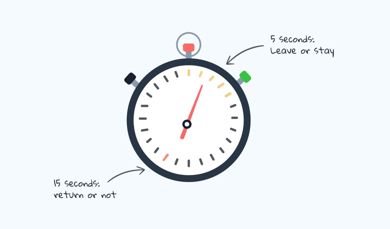
In the time it takes to read this sentence, a user has already formed a lasting judgment about your website. The 5-second test, where a user sees a page for just five seconds before answering core questions, reveals a brutal truth: design is not about exploration; it’s about instant comprehension. This isn’t about aesthetics; it’s about cognitive processing speed. Users aren’t deciding if they like your site in those seconds. They’re deciding if they understand it, and if they should invest another minute of their precious attention.
Here’s what the data says they process, in order, and how to design for that neurological sequence.
The Cognitive Hierarchy: What the Brain Seeks in 5 Seconds
Neuroscience and eye-tracking studies show a predictable pattern of scanning when a new page loads. Design must serve this hierarchy.
1. The Central Visual Anchor (0-1 Second): “What Is This?”
The brain first seeks a single, dominant visual element to categorize the page.
- The Element: A hero image or key video that is contextually diagnostic. It must instantly communicate the product category, service, or core emotional benefit.
- Data Point: Pages with a clear, relevant hero image have a 47% lower bounce rate in the first 10 seconds than those with abstract or stock imagery.
- Design Imperative: Use imagery that shows the product in use or the outcome achieved. A fintech app should show a dashboard, not happy people in suits. A meditation app should show calm, not a generic sunrise. Avoid “mystery meat” navigation, icons or visuals that require interpretation.
2. The Headline Scan (1-2.5 Seconds): “Why Should I Care?”
Immediately after anchoring, the eyes dart to the largest text near the visual anchor.
- The Element: The primary headline (H1). This is not your brand name. It’s a value proposition in plain language.
- Data Point: Users spend an average of 5.7 seconds focused on written content if the headline captures them. They spend less than 1 second if it doesn’t.
- The Formula for Success:
[Clear Audience] + [Core Benefit] + [Differentiator]. Bad: “Innovate Your World.” Good: “For designers: Ship flawless prototypes 3x faster. The only tool with real-time AI feedback.” - Design Imperative: The headline must be in the optical center (slightly above the geometric center), set in a confident, large typeface with high contrast. The supporting sub-header should add crucial detail, not fluff.
3. The Call-to-Action Triangulation (2.5-4 Seconds): “What Can I Do Here?”
Once users understand the “what” and “why,” they immediately search for the “how.”
- The Element: The primary CTA button or link. Its visibility is non-negotiable.
- Data Point: A CTA with a high color contrast ratio (at least 4.5:1) against its background gets 35% more first-visit engagements. Shape and label clarity matter more than clever animation.
- Design Imperative:
- Position: Place the primary CTA in the direct sightline path from the headline. The classic F-pattern scan still holds; the top-left and center-left are prime real estate.
- Label: Use strong, action-oriented verbs. “Get started,” “Try free,” “View plans.” Not “Submit” or “Go.”
- Clarity Over Creativity: A user should never wonder if something is clickable. Underline links, use clear button affordances.
4. The Trust & Scannability Sweep (4-5 Seconds): “Can I Trust This?”
In the final moments, the user’s peripheral vision performs a rapid credibility check.
- The Elements:Visual trust signals and content scannability.
- Trust Signals: Recognizable client logos, security badges (SOC2, Norton), press mentions (Forbes, TechCrunch), and clear, accessible contact information.
- Scannability: The presence of clear sub-headers (H2, H3), bullet points, and bolded key terms.
- Data Point: Pages displaying known trust logos can increase conversion by up to 42%. Lists and bullet points improve information retention by 70% for scannners.
- Design Imperative: Place trust signals near the CTA or in the footer. Do not hide them. Use whitespace to create clear content modules that can be parsed in chunks, not a wall of text.
The 5-Second Test Itself: What to Ask & How to Interpret
After showing a user your design for five seconds, ask only these questions:
- “What was the purpose of that page?” (Tests clarity of value prop)
- “What could you do on that page?” (Tests CTA clarity)
- “What was the most memorable element?” (Tests visual hierarchy)
A failure is indicated by answers like “I’m not sure,” “Sign up for something?”, or “The color blue.” These reveal a breakdown in the cognitive hierarchy.
The Optimization Framework: The “Blink Test” Checklist
Before launching, run your design through this filter:
- [ ] The 3-Word Test: Can you describe the page’s core purpose in three words? If not, the headline is wrong.
- [ ] The Squint Test: Blur your eyes or step back. What single element dominates? It should be the hero image/key visual, not a navigation bar or banner ad.
- [ ] The Peripheral Vision Test: Look away from the center. Can you still clearly identify the primary CTA button by its color and position? It should pop.
- [ ] The First-Last Test: What is the first piece of information you see, and the last? The first should be the value prop. The last should be a next step or a trust signal.
The Philosophical Shift: Designing for Impatience
The 5-second test forces a critical shift: from designing for engagement to designing for immediate comprehension. It champions clarity over cleverness, simplicity over style, and the user’s cognitive load over the designer’s creative expression.
Your homepage is not a brochure to be read. It is a billboard passed at highway speed. Every pixel must earn its place by contributing to one instantaneous, coherent message: This is for you, this is valuable, and this is what to do next.
Master this, and you design not just for the user’s eyes, but for their subconscious. You design for the blink.
About the Author

Peter Makeshoff
Peter Makeshoff is the founder and main author of Designer Daily.