The user made a mistake. They typed an invalid email address. They forgot a required field. They entered a date in the wrong format. Now they are waiting for the form to tell them what went wrong. How you deliver that message determines whether they feel helped or scolded.
Most forms fail this test. They present errors as red text at the top of the page, disconnected from the field that caused the problem. They use vague language that does not explain how to fix the issue. They clear the user’s input, forcing them to start over. These are not error messages. They are punishments.
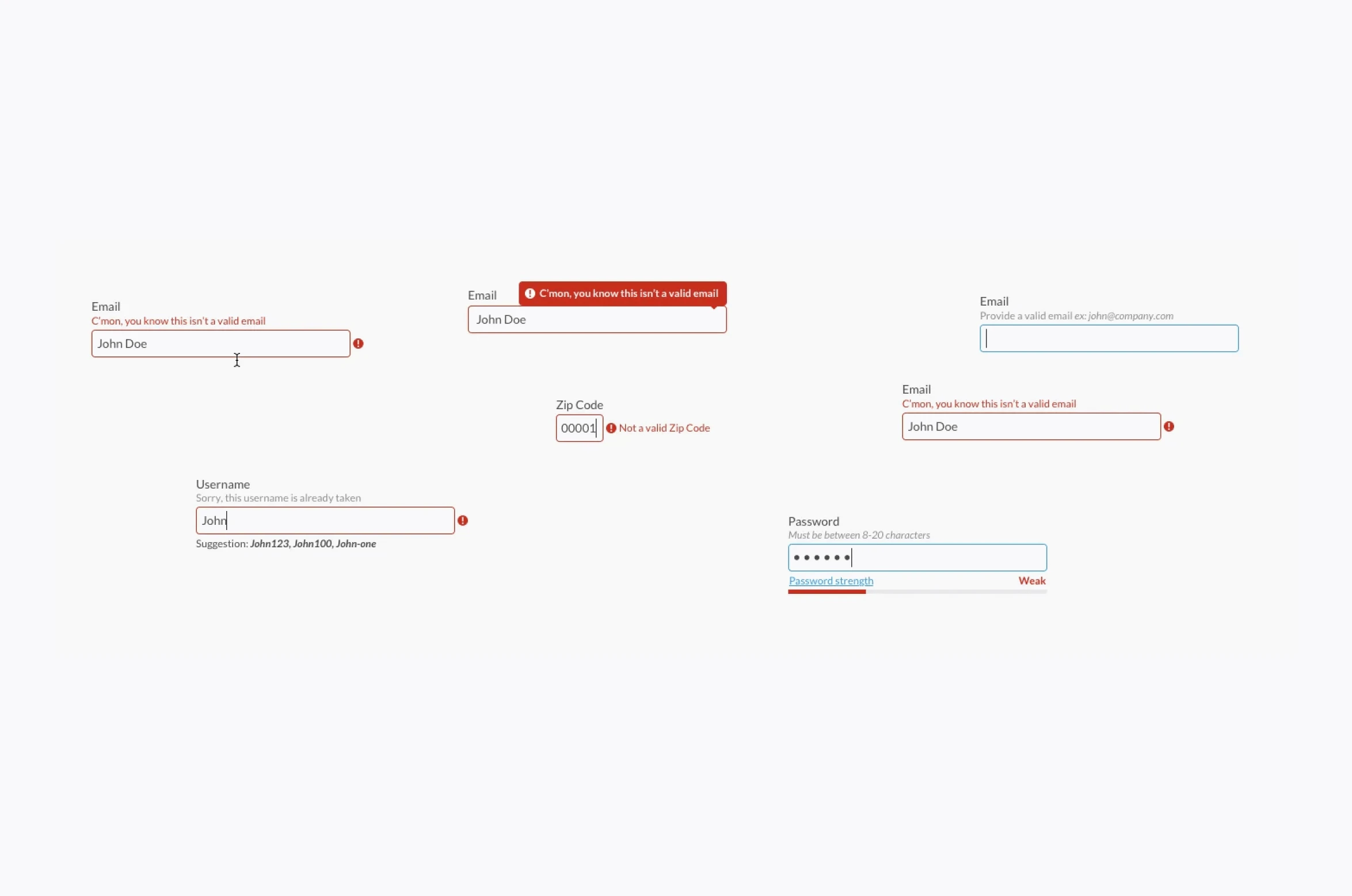
Here is how to design form errors that feel like assistance, not accusation.
The Psychology of Error
Making a mistake is embarrassing. The user already feels a little foolish. They know they did something wrong. They may not know what. Your error message should not compound the embarrassment. It should relieve it.
A good error message says: “This is a common mistake. Here is exactly how to fix it.” A bad error message says: “You did this wrong. Try again.”
The difference is tone. The first is helpful. The second is judgmental.
Timing Is Everything
Do not wait until the user clicks submit to validate every field. Validate inline, as the user types or after they leave the field (on blur).
Inline validation catches errors immediately. The user types an invalid email address. As soon as they move to the next field, the error appears next to the email field. The context is fresh. The correction is obvious.
Submit-time validation is for errors that depend on multiple fields. A password confirmation field is valid alone but invalid compared to the password field. A date range where the end date must be after the start date. These errors cannot be caught inline. They still need clear, contextual feedback.
Never clear the user’s input on error. The user should not have to retype what they already typed. Preserve their work. Mark the error. Let them correct it.
Error Message Anatomy
A good error message has three parts.
The problem: What went wrong? “Your email address is missing the @ symbol.”
The solution: How to fix it? “Please add an @ symbol between the username and domain.”
The location: Where to fix it? The message appears next to the field, with the field itself highlighted.
Messages that state the problem without the solution are incomplete. “Invalid date format” is not helpful. “Please use MM/DD/YYYY” is helpful.
Language That Works
The words you choose matter as much as the placement.
Use the active voice. “You entered an invalid email address.” Not “An error occurred.”
Be specific. “Your password must be at least 8 characters.” Not “Password invalid.”
Avoid “please” as a substitute for clarity. “Please enter a valid email address” is polite but vague. “Enter your email address as name@example.com” is clear.
Do not apologize for the error. “Sorry, something went wrong” is useless. The user knows something went wrong. They do not need an apology. They need a fix.
Use the user’s language. “Card number” not “PAN.” “Expiration date” not “MM/YY.” The form should use terminology the user understands.
Visual Design of Errors
Red text is not the only option. It is not always the best option.
Color: Red signals error. This is universal. Use it. But do not rely on color alone. Add an icon (alert symbol, exclamation mark) for users who are colorblind.
Placement: Next to the field, not at the top of the form. The user should not have to scan the page to find the error that applies to the field they just filled.
Highlight the field. A red border around the field. A red background on the field. A red icon inside the field. The user should see the error in their peripheral vision as soon as the field loses focus.
Do not use red for everything. A red asterisk on a required field is fine. A red label for a field that is not yet in error creates unnecessary anxiety. Save red for when something is actually wrong.
Success States Are Also Feedback
Users need to know when they did something right, not just when they did something wrong.
Green checkmarks next to valid fields provide reassurance. The user sees that their email address was accepted. They can move to the next field with confidence.
Real-time validation feedback can be positive. A password strength meter that updates as the user types. A username availability check that confirms the name is free. These are errors prevented, not errors corrected.
The submit button should enable only when all fields are valid. Users should not click submit, wait for the page to reload, and then discover an error they could have fixed earlier.
Edge Cases and Special Situations
Server errors are not the user’s fault. The user entered valid information, but the server could not process it. The message should reflect this. “We could not save your changes. Please try again in a few minutes.” Not “An error occurred.”
Rate limiting is also not the user’s fault. They submitted the form too many times in quick succession. The message should explain the limit and when they can try again. “You have made too many attempts. Please wait 60 seconds before trying again.”
Session timeouts are frustrating but unavoidable. The user took too long to fill the form. Their session expired. Preserve their input. Do not clear the form. Ask them to log in again, then redirect them back to the partially completed form.
Testing Your Error Messages
Read your error messages aloud. Do they sound like something a helpful person would say? Or do they sound like a stern notice from an unfriendly institution?
Test error messages with users who are not familiar with your product. Watch them make mistakes. See if the error messages help them recover. If they are still confused, rewrite the messages.
A/B test different wording. “Please enter a valid email address” versus “Enter your email as name@example.com.” The latter is clearer. The latter will convert better.
The Bottom Line
Errors are inevitable. The user will make mistakes. The system will fail. The connection will drop. Your error message cannot prevent these events. It can shape how the user feels about them.
The user who makes a mistake and receives helpful, contextual, forgiving feedback will continue. The user who makes a mistake and receives vague, punishing, confusing feedback will leave.
Design errors as assistance, not accusation. The user will thank you. They will not say it out loud. They will just keep using your form. That is thanks enough.
About the Author

Peter Makeshoff
Peter Makeshoff is the founder and main author of Designer Daily.