Building an online store is easier than ever, but getting visitors to buy is another story. Conversion-focused e-commerce design requires more than a pretty layout, it’s about guiding users from curiosity to checkout with minimal friction. Here’s how to design a storefront that doesn’t just look good but sells.
1. Start With a Conversion-Focused Layout
Prioritize clarity over creativity
Your homepage should answer three questions instantly:
- What do you sell?
- Why should I trust you?
- How do I buy?
Keep your hero section simple: a strong headline, high-quality product photography, and a single primary call-to-action (CTA).
Use a clear visual hierarchy
Arrange elements so the eye naturally flows toward the product and CTA. Limit competing colors and fonts to avoid distraction.
2. Make Navigation Effortless
Simplify menus
Group products logically and avoid overwhelming users with too many categories. Include a prominent search bar with predictive text for shoppers who know exactly what they want.
Sticky headers help
A persistent header with cart and account icons means customers never have to hunt for checkout.
3. Showcase Products With Trust-Building Media
Invest in photography and video
High-resolution images from multiple angles and short product videos reduce hesitation. Allow zooming and 360° views for added confidence.
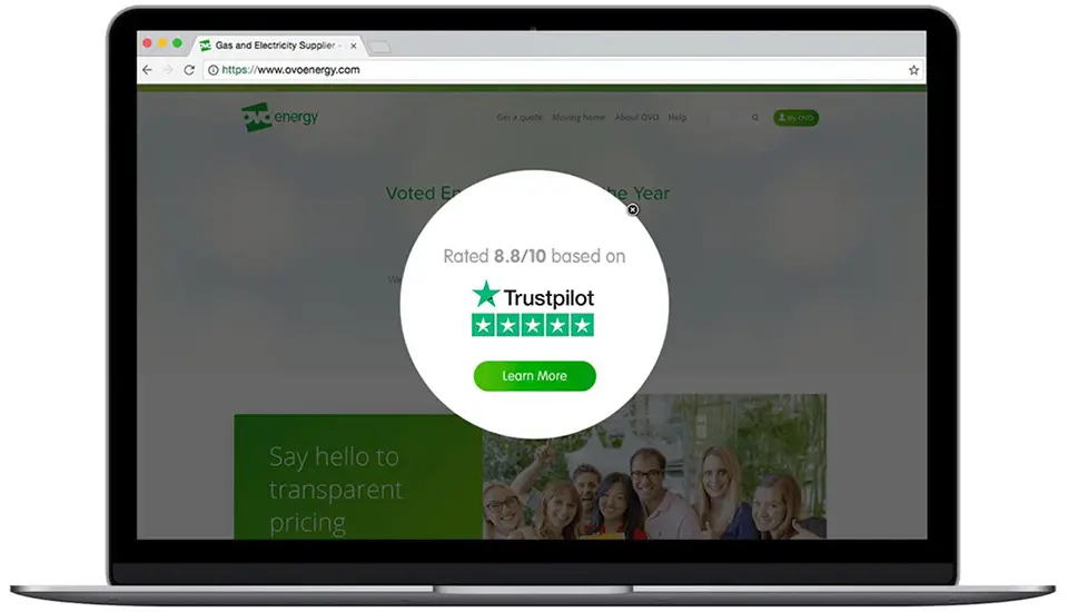
Add social proof
Display ratings, reviews, and user-generated content. Real customer photos carry more weight than brand-supplied images.
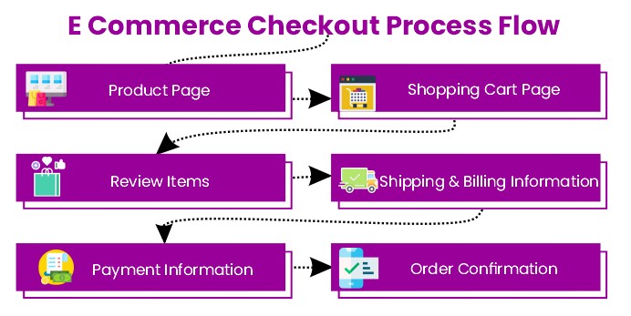
4. Optimize the Checkout Flow
Reduce steps
Every additional page increases abandonment. Offer guest checkout, one-page forms, and auto-fill for addresses and payment info.
Multiple payment options
Include digital wallets like Apple Pay or PayPal to cater to different preferences and devices.
5. Build Trust From the First Click
Show security signals
SSL certificates, visible privacy policies, and recognizable payment logos reassure users.
Transparent policies
Clear return and shipping information lowers purchase anxiety. Consider a progress bar at checkout to show exactly where the user is in the process.
6. Design for Mobile First
With mobile shopping dominating, your store must be lightning fast and thumb-friendly. Use large tap targets, minimal pop-ups, and adaptive images for smaller screens. Test your site across devices regularly.
7. Use Data to Continually Refine
Track key metrics
Monitor conversion rates, bounce rates, and cart abandonment to spot weak points.
A/B test frequently
Experiment with different CTAs, product photo styles, or checkout button colors. Small tweaks can have outsized effects.
Key Takeaway
An e-commerce site that converts isn’t about flashy design—it’s about making the buying journey frictionless and trustworthy. Start with a clean, intuitive layout, highlight your products with credibility, and keep testing to stay ahead of shopper expectations.
About the Author

Peter Makeshoff
Peter Makeshoff is the founder and main author of Designer Daily.