A beautifully cooked dish can still look flat and unappetizing on camera. The difference between a snapshot and a mouthwatering image isn’t the food itself, it’s the composition. How you frame, arrange, and position elements within the shot determines whether viewers scroll past or stop to stare.
Here is a practical guide to the compositional techniques that make food look irresistible.
The Foundation: Choose Your Angle Wisely
The angle you choose sets the entire tone of the image. There is no single “correct” angle, only the angle that serves the dish.
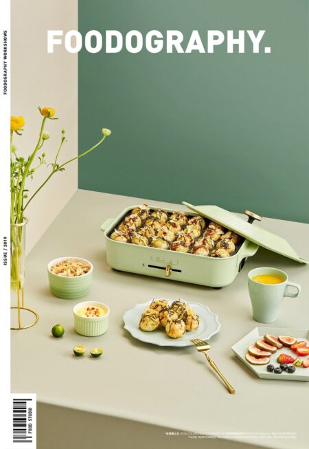
The 45-Degree Angle is the most versatile and widely used perspective. It approximates how we naturally see food when seated at a table, creating a comfortable, familiar view. This angle works for almost everything: plated entrees, bowls, pasta dishes, and any food with height or texture that benefits from a slightly elevated view.
The Overhead Flat Lay positions the camera directly above the table, pointing straight down. This angle works best for flat foods, pizzas, salads, tacos, charcuterie boards, and any dish where the arrangement is as important as the individual elements. Overhead shots also excel at showing multiple dishes together, telling a story of an entire meal.
The Eye-Level Shot positions the camera at the same height as the food, shooting straight across. This angle is ideal for tall foods like stacked burgers, layered cakes, milkshakes, and any dish where height is part of the appeal. Eye-level shots feel dramatic and immersive, putting the viewer face-to-face with the food.
The Macro Close-Up isolates a single detail: the crust of a loaf of bread, the bubbles in a poured beer, the glisten on a chocolate glaze. These shots create intimacy and sensory intensity. Use them sparingly as accents within a broader set of images.
When choosing an angle, consider what the dish is trying to communicate. Is it about abundance? Go overhead. Is it about texture? Go 45 degrees. Is it about height and drama? Go eye-level.
The Rule of Thirds: Not a Cage, a Guide
The rule of thirds remains the most reliable compositional tool in food photography. Imagine two horizontal lines and two vertical lines dividing the frame into nine equal rectangles. Placing key elements along these lines or at their intersections creates visual tension and movement.
A plate placed dead center can feel static. A plate shifted slightly to the left, with a fork or napkin in the opposite corner, feels balanced and dynamic. The viewer’s eye travels across the image rather than landing on a single spot and staying there.
For overhead shots, place the main dish on one of the lower intersections, leaving negative space above. This draws the eye up into the composition and creates breathing room around the food.
Layering and Depth: Building a Scene
Flat, one-dimensional images look lifeless. Layering creates depth and invites the viewer into the scene.
Foreground, middle ground, background. The hero dish sits in the middle ground. In the foreground, place something slightly out of focus, a napkin edge, a fork tine, the rim of a glass. In the background, suggest context without distraction: a salt cellar, a bread basket, a wine glass.
Texture as depth. A crumpled linen napkin adds texture. A wooden table surface adds grain. A scattering of herbs or spices adds organic irregularity. These textural elements break up large empty spaces and make the image feel tactile.
Height variation. Place a pile of napkins, a small vase, or an upright wine bottle to break the horizontal plane. Tall elements create visual rhythm and prevent the composition from feeling like a flat collection of items.
Negative Space: Giving the Eye a Rest
Negative space is the empty area around and between subjects. It is not wasted space. It is intentional breathing room.
A composition crammed edge to edge with elements feels chaotic and exhausting. A dish surrounded by generous negative space feels calm, intentional, and premium. This is why high-end restaurant photography often features a single plate on a vast tabletop, the emptiness signals confidence and value.
For social media, negative space also serves a practical function: it leaves room for text overlays without covering the food.
The S-Curve and Leading Lines
Guide the viewer’s eye through the image using natural curves and lines.
An S-curve works beautifully for tablescapes. A napkin draped diagonally, a line of breadsticks, the curve of a spoon handle, these elements create a path for the eye to follow toward the main dish.
For plated dishes, consider the natural geometry of the food. A swirl of sauce, a line of microgreens, the arc of a citrus twist. These aren’t just decoration. They are compositional tools directing attention.
The Golden Rule: Make a Mess (Carefully)
Perfectly pristine food can look sterile and unappealing. A little imperfection reads as authentic and delicious.
A few crumbs scattered near a slice of cake. A droplet of sauce beside a plate of pasta. A half-peeled orange segment. These small “imperfections” suggest that someone has already started eating, that the food is real and desirable.
The key is intention. A chaotic mess looks careless. A strategically placed crumb looks artful. Clean up the distracting clutter, then add back a few carefully chosen signs of life.
Color Harmony: Let the Food Lead
The food itself should dictate the color palette. Look at what is already on the plate and choose backgrounds and props that complement, not compete.
Use a color wheel for guidance. Complementary colors (opposite each other on the wheel) create vibrant contrast. A green herb garnish on a red tomato sauce. An orange citrus slice on a blue plate. Analogous colors (next to each other on the wheel) create harmony and calm. A beige pasta on a cream plate with a brown wood table.
Avoid backgrounds that match the food too closely. White rice on a white plate disappears. Dark meat on a dark surface is invisible. Contrast ensures the food remains the undisputed hero.
Light Direction: The Invisible Composer
Composition includes light. Side light raking across the surface of a steak creates texture. Backlight filtering through a glass of amber ale creates glow. Soft, diffused light from a window creates gentle, flattering conditions for almost any dish.
Hard, overhead light creates unflattering shadows directly beneath the food. Flat, even light from a ring light removes all depth and dimension. Learn to see light as a compositional element with shape, direction, and quality.
The Bottom Line
Great food photography composition is not about following rigid rules. It is about making intentional choices that serve the dish. Choose an angle that shows the food at its best. Arrange elements to guide the eye. Leave negative space for breathing room. Add texture and depth. Make a small, artful mess. Let the food lead the color palette. And learn to see light as a compositional tool.
The goal is simple: make the viewer hungry. Everything else is just technique.
About the Author

Peter Makeshoff
Peter Makeshoff is the founder and main author of Designer Daily.