Great packaging starts with great photography. Whether you’re designing for a premium chocolate brand or a fast-casual restaurant chain, the images you work with need to do more than look pretty. They need to trigger hunger, communicate quality, and tell a story about what’s inside the box.
Food photography is its own discipline with specific rules. Here’s what brand and packaging designers need to understand about how the best food images are made, and why they work.
The Psychology: Why We Can’t Look Away
There’s a reason food imagery stops us mid-scroll. It’s biological.
Research from the Max Planck Institute confirms what we’ve always suspected: the mere sight of appetizing food stimulates the release of ghrelin, the “hunger hormone,” in our blood. Our brains process these visual stimuli, and physical hunger responses are triggered involuntarily. This isn’t learned behavior. It’s hardwired.
A comprehensive literature review from Aarhus University adds another layer: viewing food images can induce psychological responses similar to seeing real food. A few images stimulate appetite. Many images of the same food can actually induce feelings of satiety, which has fascinating implications for how often we repeat visual motifs in packaging lines.
The same review notes that composition matters enormously. Depicted social cues modulate how we respond. Seeing others eating unhealthy food can increase its social acceptability, potentially promoting unhealthy choices. For designers, this means the context you place around food images is as important as the food itself.
The Light: Shaping Appetite with Direction
Professional food photographers think about light the way designers think about color. It’s the foundation everything else builds on.
- Side light is the workhorse of food photography. Positioning the light source to the side creates distinct shadows and highlights that reveal texture and add three-dimensionality. It mimics the natural way we see food at a table by a window, which is why it reads as comfortable and familiar.
- Backlight creates something different: a soft, glowing effect around the edges of the food, highlighting shape and outline. For drinks and translucent ingredients, backlight produces an appealing glow that suggests freshness. Think of honey catching light or a cocktail glowing amber.
- Dappled light, where light filters through objects to create patterns and shadows, brings a natural, organic feel. It’s less controlled but can feel more authentic for artisanal or rustic brands.
- The dark and moody approach uses deep shadows and rich contrast to convey sophistication and drama. This is the aesthetic of choice for premium, luxury food brands. It signals that this isn’t everyday fuel. It’s an experience.
- Bright and airy, by contrast, uses soft, diffused lighting and light backgrounds to create freshness and openness. It’s the language of health food, farmers markets, and approachable everyday eating.
For packaging designers, understanding these distinctions matters because the lighting style you select becomes part of your brand language. A moody steak shot and an airy salad shot communicate completely different value propositions, even if the technical quality is identical.
The Styling: Making Food Behave
Here’s a truth that surprises most non-specialists: food in photographs rarely behaves like food in real life. It’s manipulated, sculpted, and sometimes entirely fabricated to look perfect on camera.
Professional food stylists have tricks that border on alchemy. They use tweezers to place individual seeds. They spritz liquids to create perfect droplets. They swap dairy cream for something that won’t separate under hot lights. They glue, pin, and prop until every element sits exactly where it should.
For designers working with photographers, the key insight is that styling is a negotiation between what’s technically possible and what reads as authentic. Overstyled food can look artificial and unappealing. Understyled food can look sloppy and unappetizing. The sweet spot is where the food looks aspirational but achievable, the version of itself it wants to be on its best day.
The Composition: Guiding the Eye
Once the light is set and the food is styled, composition determines whether the image works.
- The 45-degree angle is the default for good reason. It approximates how we actually see food when seated at a table, creating a natural, comfortable perspective that highlights texture and plating. For most dishes on most menus, this is the right starting point.
- Overhead shots work for flat foods (pizzas, salads, beautifully arranged sharing plates) and for scenes where multiple elements need to be visible simultaneously. They’re also practical in tight restaurant spaces where you can’t back up far enough for a good 45-degree angle.
- Eye-level shots are for tall foods. Burgers, stacked desserts, layered cocktails, anything where height is part of the appeal needs to be shot straight on to communicate its structure.
- The rule of thirds remains relevant: place your main subject off-center where grid lines intersect. It’s simple, it works, and it creates more dynamic images than centered compositions.
- The rule of odds suggests that odd numbers of elements (three meatballs, five dumplings) are more visually pleasing than even numbers. It’s a useful guideline for arranging multiple items in a frame.
- Negative space gives the eye somewhere to rest and can be used strategically for typography. If you know packaging text will overlay the image, plan for empty areas where that text can live without competing with the food.
The Camera Settings: Technical Foundation
You don’t need to become a photographer to direct one, but understanding the technical basics helps you communicate what you want.
- Aperture controls depth of field. Wide apertures (f/1.8 to f/2.8) blur backgrounds and isolate the subject, perfect for close-ups where you want the food to pop. Narrow apertures (f/8 to f/11) keep everything sharp, ideal for flat lays and group shots where multiple elements need equal emphasis.
- ISO controls light sensitivity. Lower ISO (100-400) means cleaner images with less grain. Higher ISO lets you shoot in darker conditions but introduces noise. The best food photography uses the lowest ISO possible.
- Shutter speed matters most for handheld shooting. If you’re working without a tripod, 1/125 second or faster prevents motion blur. On a tripod, you can go much slower and use lower ISO for cleaner images.
- RAW format is non-negotiable for professional work. JPEGs discard information that RAW files preserve. When a client needs color correction, exposure adjustment, or compositing later, RAW gives the designer flexibility that JPEG simply can’t.
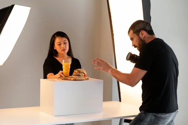
The Restaurant Challenge: Real-World Constraints
Shooting on location adds complexity. Restaurant lighting is rarely ideal, space is tight, and paying diners don’t appreciate being bumped by a photographer’s gear.
Giulia Verdinelli, who shoots for National Geographic Food and Michelin-starred restaurants, shares hard-won wisdom: book lunchtime tables near windows, use side light whenever possible, and bounce harsh overhead light with a white napkin or menu.
For dark interiors, she recommends identifying the main light source and checking shadow direction before committing to a table. Overhead light creates unflattering shadows directly beneath food. Light from the side creates depth and reduces glare.
She also notes that the tilting screen on modern cameras lets you shoot from different angles while staying seated, a small courtesy that matters in a crowded restaurant.
The Designer’s Role: Art Direction Across Price Points
Different projects require different investments. Understanding the range helps you set realistic expectations with clients.
A basic restaurant menu shoot might cost a few hundred dollars and deliver clean, consistent images of each dish. A national advertising campaign might spend tens of thousands per image, with food stylists, prop stylists, multiple assistants, and days of setup for a single shot.
The Bottom Line
Food photography that sells starts with understanding why we respond to food images the way we do. It’s built on lighting that reveals texture and shape, styling that makes food look its best without crossing into artificiality, and composition that guides the eye to what matters.
For packaging and brand designers, the best collaborations with photographers happen when you speak the same language. You don’t need to know how to set up a softbox. But knowing the difference between side light and backlight, understanding why a 45-degree angle works, and recognizing when a shot needs a food stylist will help you get the images your designs deserve.
The goal is simple: make people hungry. Everything else is just technique.
About the Author

Peter Makeshoff
Peter Makeshoff is the founder and main author of Designer Daily.