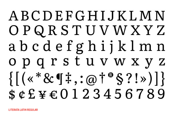
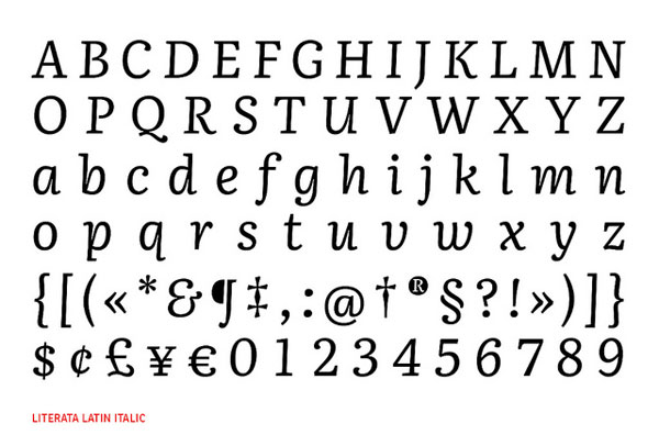
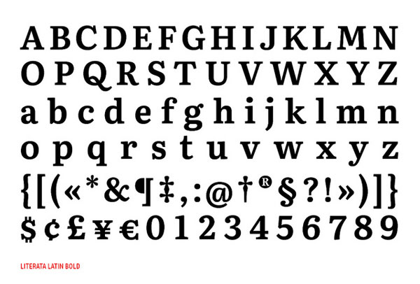
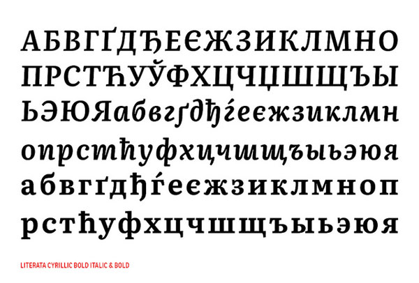
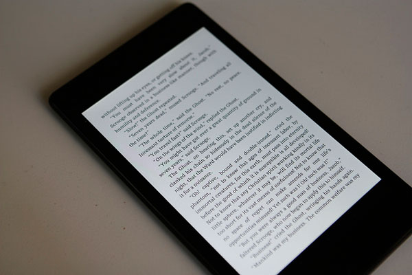
So far, Droid Serif was the default font for reading books on Google Play. Earlier in May, Google quietly introduced a new typeface to replace it along with the release of the latest version of PlayBooks. Google introduced Literata, a well-balanced serif font family that was designed for readability on screen.
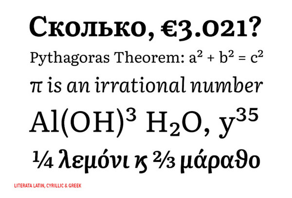
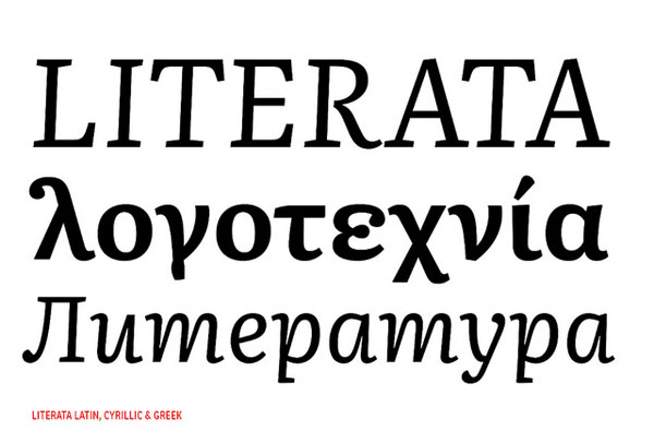
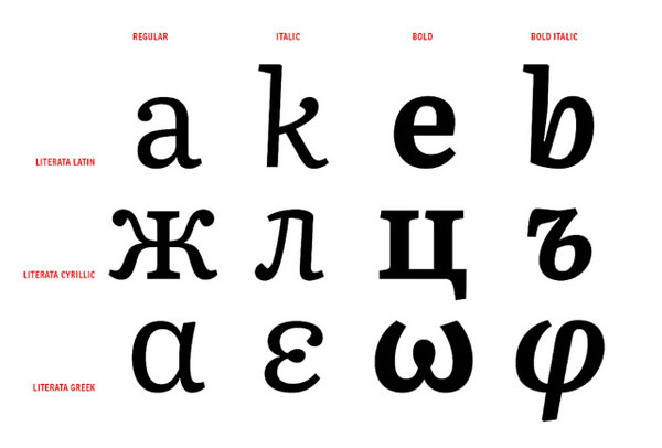
The new typeface was designed by Type Together, a firm specialized in creating tailored fonts for the corporate world. Literata makes the junction between the literary world, with a more textured look-and-feel, and the world of tablets and smartphones with its focus on on-screen readability. Literata features two weights and the matching italics, and it has been adapted for various other languages.
About the Author

Mirko Humbert
Mirko Humbert is the editor-in-chief and main author of Designer Daily and Typography Daily. He is also a graphic designer and the founder of WP Expert.