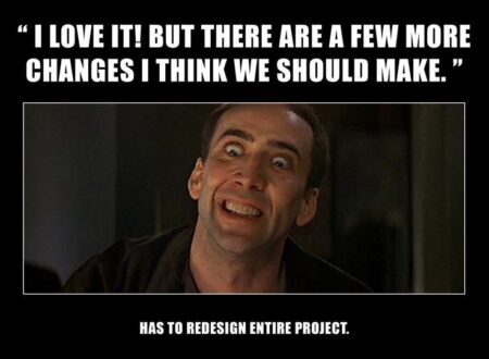
We live in a world of beautiful pixels, perfect grids, and meticulously chosen font pairings. As designers, we strive for visual perfection. But let’s be honest: our masterpieces don’t come to life by magic. They are built, line by line, by our invaluable partners in crime: developers.
To bridge the ever-present gap between the design and development worlds, I sat down with a few seasoned developers and asked them the question we all need to hear: “What do designers do that drives you crazy?”
The answers were surprisingly consistent, heartfelt, and delivered with a sense of “please, for the love of code, stop doing this.” This isn’t about pointing fingers; it’s about fostering empathy and creating a smoother, more collaborative workflow. So, take a deep breath, and let’s dive in.
1. The Dreaded “Simple Change”
The Developer’s Cry: “Can you just nudge this over a few pixels? It should be simple!”
Why It’s a Problem: What seems like a minor visual tweak to us can be a structural nightmare in code. A “simple” nudge might mean rebuilding an entire component, breaking a carefully constructed grid system, or unraveling responsive behavior on multiple screen sizes. Developers think in systems and components, not in static pixels. A change in one place can have unintended consequences in another.
The Fix: Context is key. Instead of asking for a “simple change,” provide the why. “This text feels unbalanced; can we explore shifting it left to improve the visual hierarchy?” This opens a conversation. Better yet, use a tool like Figma Dev Mode that shows the exact margins and padding, so the developer can assess the true scope of the change instantly.

2. Ignoring the Grid (Or Not Using One at All)
The Developer’s Cry: “I can tell when a design was made by just dragging things around until it ‘looked right.’ Nothing aligns to a baseline, and spacing is completely arbitrary.”
Why It’s a Problem: Developers use CSS grids, flexbox, and other layout systems to create structured, responsive, and maintainable code. When our designs use random values (e.g., 7px, 13px, 24px margins), it forces them to hardcode dozens of exceptions. This makes the code bloated, difficult to debug, and a nightmare to make responsive.
The Fix: Embrace a strict grid and spacing system. Define a baseline unit (like 8px) and stick to it. Use multiples of that unit for all your margins, padding, and component sizes. Tools like auto-layout in Figma are your best friend here. Designing with a system doesn’t limit creativity; it ensures your vision is built efficiently and consistently.
3. Designing States That Don’t Exist
The Developer’s Cry: *”They designed the perfect, pristine button. But what does it look like when it’s loading? Or when it’s disabled? Or when a user hovers over it with a 1000px-wide footer behind it?”*
Why It’s a Problem: We often design for the “happy path”, the ideal state where everything is pristine. In reality, a UI is a living thing. It has hover states, focus states, error states, loading states, and empty states. When these aren’t designed, the developer is left to invent them, leading to inconsistencies and a broken user experience.
The Fix: Become a storyteller of states. Create a dedicated page in your design file for component states. Show the button in its default, hover, active, focused, loading, and disabled states. Design the empty screen for a user’s first login. Show what an error message looks like. This proactive thinking is the mark of a senior designer.
4. Handing Off with Missing or Inconsistent Assets
The Developer’s Cry: *”The icons are in a different page, the fonts aren’t shared, the images are low-res, and the file is called ‘FINAL_v3_REALLY_FINAL_2.'”*
Why It’s a Problem: A developer’s efficiency is directly tied to the quality of the handoff. Hunting for assets, guessing font weights, or exporting icons themselves is a massive time-sink. Inconsistent naming conventions create confusion and errors down the line.
The Fix: Treat your design file as the single source of truth. Use a consistent naming convention for your layers and pages. Utilize Figma’s (or your tool of choice) built-in features: create a shared, published component library for icons, style guides for text and colors, and use the “Export” tab to ensure assets are ready at the correct resolutions (1x, 2x, etc.). A clean handoff is a sign of respect for your developer’s time.

5. Designing Without a Concept of Feasibility
The Developer’s Cry: “This is a beautiful, complex animation that would take me two weeks to build and would likely crash older phones. Is it worth the trade-off?”
Why It’s a Problem: Pushing visual boundaries is our job, but without a basic understanding of technical constraints, we can design ourselves into a corner. A complex, custom animation might be the centerpiece of our portfolio, but if it makes the app unusable for half the user base, it’s a bad design decision.
The Fix: Communicate early and often. Before you spend hours perfecting a complex interaction, have a quick chat with a developer. “Hey, I’m thinking of a morphing shape animation for this transition. Is that feasible, or is there a more performant way we could achieve a similar feel?” This early collaboration leads to innovative solutions that are both beautiful and buildable.
The Bottom Line: It’s All About Communication
Notice a theme? Every single point boils down to one thing: communication. The designer-developer relationship isn’t a handoff, it’s a partnership.
So, invite a developer to your design critique. Sit with them during their build. Learn the very basics of HTML and CSS to understand their world. The better we understand each other’s craft, the less “crazy” we’ll make each other, and the better products we’ll build, together.

