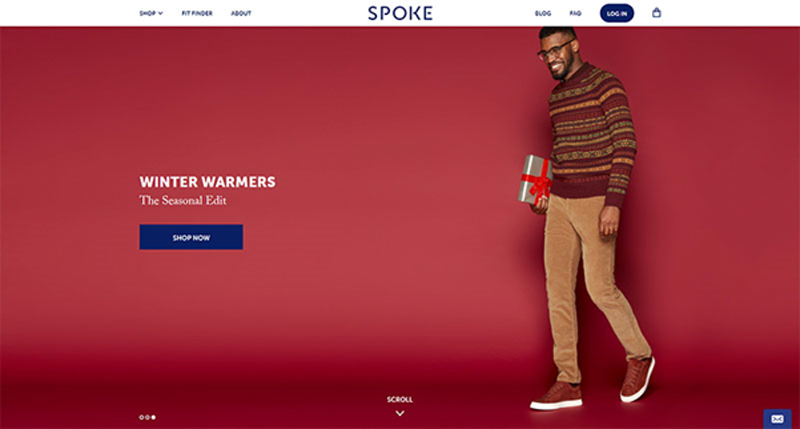
Do you remember the last time you had to contact support to help you check out? Odds are good you can’t, as a site that led you to a deal will also likely make the process smooth.
The high card abandonment rates that go beyond 50% are mostly recorded before initiating checkout, as it is at that point that customers decide whether they trust you or not.
While we can’t speak of universal customer retention rules in eCommerce, we can still share a couple of tips and fundamentals that can help designers build successful sites. Some of them are pretty self-explanatory, but with so many sites burning out in their attempt to attract attention, they shouldn’t be taken for granted.
Functional and simple navigation
It’s not exactly rocket science, isn’t it? Begin with your own examples: Would you purchase a piece you can get in 2 minutes, or scroll through tenths of options until you find what you need?
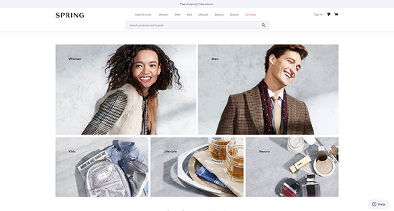
Conversions and complexity simply don’t go together. Shoppers find unrelenting categorization and excess menus and clicks fairly annoying, and they prefer an intuitive, no-brainer navigation.
Speaking of which, we’re not insinuating that you should create an overly simple website. A menu, for instance, is an absolute must, and so are the basic headers and subtitles that help understand the hierarchy of the website.
Quantity is not the only thing you should worry about – what matters is also whether the options are clear, for the sake of which you should use one- to two-word headers. The tone should be transparent and direct, ideally combined with fun and engaging wording that is still on point.
For instance, it may sound like a great idea to label the categories of apparel eCommerce websites as ‘Kicks’ or ‘Threads’, but not everyone in its audience would be able to understand them. Plain and straightforward titles have 9x bigger chances to retain more clients.
Familiarity is another thing people appreciate while shopping online. An arrow pointing to the left is expected to lead to the previous page, the same way a pointing finger should enable them to click on a link.
To make your clients’ shopping experience even friendlier, stick to symbols they can understand.
Before the site goes online, check whether all your navigation options are functional. The last thing you want is that your client will navigate for ages through your intricate and confusing sections, only to discover a 404 error or another inconvenient problem.
Also, I know you want to create cool websites, but remember that those that are popular are also cool because they’re functional at the same time. Don’t sacrifice usefulness for the sake of creating something that only you like.
The influence of color and type
Colors and typography can make or break an eCommerce website, which makes them your leading tools.
Using the right font and palette, retail sites manage to attract and convince thousands of users to check their promotions and to buy their products. Here is how they do it:
Is it readable?
Typography leaves enough room for many engaging experiments, and designers adore it. They shape, twist, and contour letters, and transform words into skillful and beautiful works of art.
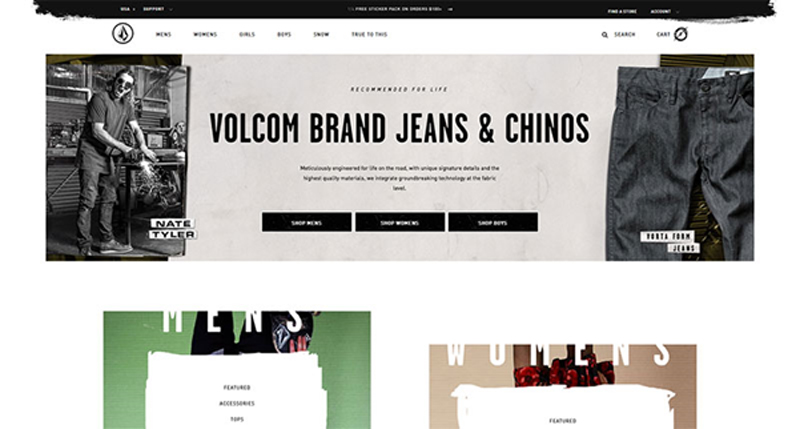
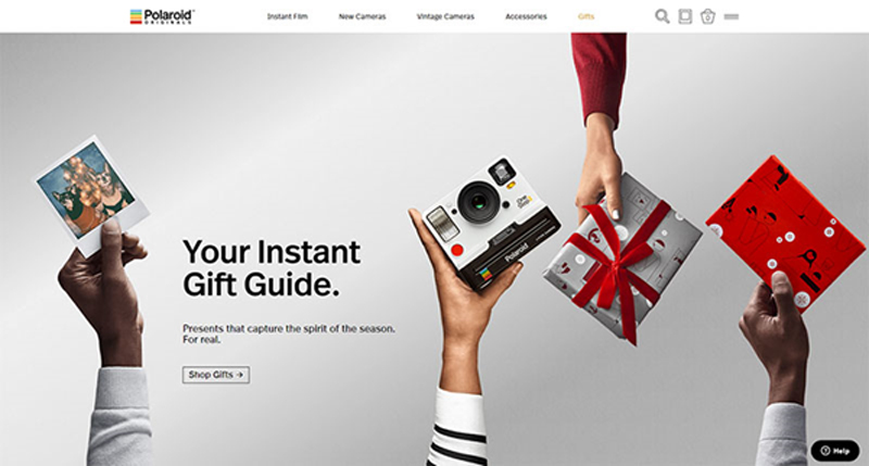
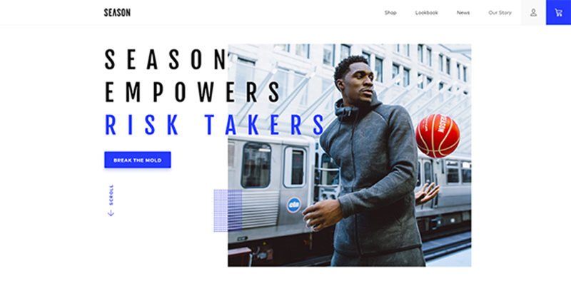
Yet, you must keep in mind that not all visitors come with a refined taste in art, and they may not understand what you’re trying to sell them. Your message should always be readable, up front, and at point, so that it will bring you the answer you expect.
Fun copy is an alternative you should definitely consider.
Consistent types
Make sure that the headers on your site are consistent with the sub-headers and body copies.
This, however, is only a small portion of coming up with a well-defined style for your website, a mission that requires you to be very patient, and one that will never be entirely accomplished. You should think of your website’s style as a living document, and work on it each time your brand undergoes a change.
Customers do recognize uniqueness as they see it, and it is your task to make that happen. To do so, you can always learn from best performing styles in your industry, and try to incorporate their practices on your own website.
Depending on how complex your offer is, you can divide this document into two distinct parts: a guide on creativity and style, and a guide on copy style, and build up the perfect website step by step.
Familiarizing with your brand and your audience
Will 10 seconds be enough for you to describe what your eCommerce website is selling? Could your customers or employees describe it in the same way? If the answer is no, you should take some time to analyze your brand and its current position on the market.
Once you have all details, it will be much easier to take the right steps to position it among competitors, and build up the right style to attract more customers.
Those working with a popular and established brand have a huge advantage, and they should keep up the good work and make customers even happier.
Another important task is to analyze your audience. What can be done to target even more buyers and to boost your revenue? In most cases, designers lack the proper identification of targeted demographics, and end up creating a site that doesn’t feel too comfortable to its visitors.
In cases like these, websites are risking losing the trust factor. Given that there is no salesperson to lead customers to checkout, you must make sure they understand the sales funnel and that they trust your brand.
Balance between form and function
eCommerce websites are not only supposed to be functional, but eye-catchy as well. This is the reason they are entrusted to creative people who know exactly how to attract traffic.
Yet, the quality of your design should not overcome the quality of your products, but rather answer the common questions of customers, and address their needs.
To ensure your customers are motivated to purchase your product, promote it using the services of a professional and experienced web designer.
Automated search
A search feature is compulsory for any eCommerce website, and there are no exceptions to this rule. It would be overly ambitious to believe that all customers browse randomly to discover a piece they like – in fact, most of them arrive with defined expectations, and want to locate the product in few seconds.
To improve their experience, you can take the search feature to a whole new level, and enhance it with an auto-complete functionality.
This means that users will receive automated suggestions before they’ve typed in the entire word, which aims to help foremost horizontal sellers targeting a well-defined audience.
Ending thoughts
Commerce businesses of today rely heavily on quality websites to close more deals. As a matter of fact, for certain retailers, websites are the only interaction portals for their customers, and they do their best to provide them a great shopping experience.
With competition being as harsh as it is, surfers are becoming intolerant to poorly designed websites, meaning that it takes a masterpiece to attract their attention, and to maximize your chances of success.

