There’s a paradox at the heart of contemporary design. The more our tools migrate to screens, the more some designers are drawn back to presses. Letterpress printing, a technology that’s survived since the fifteenth century, is experiencing something unexpected: a renaissance.
It’s not nostalgia. It’s something deeper. In an era of infinite undo and instant distribution, the physical constraints of letterpress offer what digital tools cannot: limitation, patience, and the stubborn insistence that some things can only be made one at a time.
The Break from the Screen
Alan Kitching has been printing for decades. He taught at London’s Royal College of Art, mentored generations of designers, and become perhaps the most recognizable name in contemporary letterpress. When asked if he’s surprised by the renewed interest in the craft, his answer is simple: “No, I am not surprised that more people are getting involved with the handcraft traditions. People need a break from the screen”.
That phrase captures something essential. Screen fatigue is real. The infinite scroll, the endless notifications, the pressure to produce faster, it takes a toll. Letterpress offers an alternative. It’s slow. It’s physical. It demands presence.
Kitching’s philosophy from the beginning was never about preserving the past. “I am not interested in letterpress printing,” he told his students. “I am only interested in what one can make new with this old technology”. That distinction matters. Letterpress revival isn’t about museum preservation. It’s about using historical tools to make work that feels fresh, vital, and distinctly contemporary.
The Physicality of Impression
Digital printing lays ink on paper. Letterpress pushes paper into ink, leaving a physical impression, a debossing that you can feel with your fingers. That tactile quality changes everything about how the work is experienced.
At John Brown University’s printmaking studio, students work on presses from the 1920s, 1930s, and 1940s. Tod Goehner, who teaches there, notes that “tradition makes these students more intentional because these approaches cause you to take more time in thinking through the processes of producing a comp”.
The time isn’t wasted. It’s the point. When you have to lock type into a chase, mix ink by hand, and feed paper sheet by sheet, you make different decisions. You think about each element before you commit. There’s no command-Z.
Companies have taken notice. “Businesses today are looking to put out marketing products that have a texture and a certain rustic look, and these can only be created using this style of traditional printmaking,” Goehner explains. In a world of mass-produced sameness, the evidence of human hands becomes valuable.
The Limitation as Liberation
Anthony Burrill, another prominent voice in contemporary letterpress, sees the constraints of the medium as precisely what makes it interesting. A “forme”, the tight arrangement of type locked into a metal chase, is “strictly limited by the process”. Spacing, kerning, direction, all are constrained by the physical reality of wood and metal blocks.
For digital designers accustomed to infinite flexibility, that sounds limiting. For Burrill, it’s generative. The boundaries create a puzzle to solve. How do you say what you want to say within these walls?
His recent “HOPE” print, created with Dublin’s National Print Museum, emerged directly from the materials. During a visit, Burrill and graphic artist Mary Plunkett discovered an enormous 80-line typeface in the museum’s collection. “As soon as I saw the letters, I knew we had to use them to make a print,” Burrill recalls. When they began arranging the letters, he “instinctively picked up the H, O, P, and E. They fit together so naturally that the design seemed to form itself”.
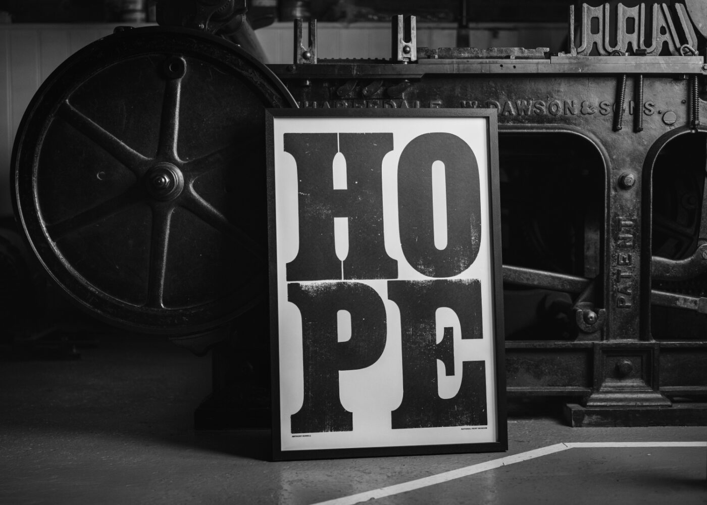
The type dictated the message. That’s not something that happens when you have thousands of fonts at your fingertips.
The Hybrid Practice
The idea that letterpress is anti-digital is a misunderstanding. The most interesting contemporary work lives at the intersection.
Ana Sofia Mariz, a typographer and letterpress printer based in Seattle, designed a typeface called Vine specifically for “post-digital letterpress production.” In this workflow, layouts are created in software using digital fonts, then printed through photopolymer plates generated from PDFs. The digital and physical are not opposed. They’re collaborators.
Mariz’s design brief required creating a typeface that could remain legible and aesthetically coherent despite the distortions that occur in high-pressure printing on soft, thick papers. Those constraints, the physical reality of how paper behaves under pressure, shaped a typeface that turned out to have broader applications beyond letterpress.
Burrill has gone even further, collaborating with designer and educator Oswin Tickler on a project that combines antique wood letter blocks with creative coding. Using software that arranges the letters algorithmically, they produced a book where every copy is unique, 200 different compositions generated from the same set of parameters.
“This is new territory,” Burrill says. “The joys are the combination of different technologies, freeing them from the constraints of one process and exploring them through another. Also the surprise of the outcome, that despite setting parameters, the compositions are ones we wouldn’t come up with”.
The computer doesn’t replace the press. It extends what the press can do.
The Emerging Generation
The proof that letterpress isn’t just a fading craft is in the emerging designers who are adopting it. Theo Hersey runs The Typography Workshop in South London, taking over a collection of wood and metal types from Kitching himself. Michelle Dwyer, a New Yorker based in London, runs her own studio and works as Kitching’s assistant. Christian Granados founded a printing workshop and cultural space in Madrid.
These aren’t retirees preserving a hobby. They’re young designers building careers around a centuries-old technology. Dwyer’s series “The British Tongue” explores quirky English phrases through hand-printed letterpress posters. The work couldn’t exist any other way. The medium is inseparable from the message.
Lessons for Digital Designers
What can someone who spends their days in Figma or Sketch learn from letterpress? Several things.
- Limitation clarifies. When you can’t do everything, you focus on what matters. The physical constraints of type and press force decisions that digital flexibility often defers.
- Process teaches patience. Hand-feeding paper, mixing ink, locking up type, none of it can be rushed. That slowness isn’t inefficiency. It’s engagement.
- Imperfection is character. A slightly off-register impression, the bite of the type into soft paper, the subtle variations across a print run, these aren’t flaws. They’re evidence that something was made by human hands.
- Materials matter. Digital design happens on screens that all look basically the same. Letterpress happens on paper with texture, weight, and feel. Those choices affect how the work lands in someone’s hands.
- Tradition can be a starting point, not a destination. Kitching’s focus has always been on what can be made new with old technology. The past is raw material, not a cage.
The Bottom Line
Letterpress survives not despite the digital age but because of it. When screens are everywhere, the tactile becomes precious. When speed is the default, slowness becomes a luxury. When everything can be copied infinitely, the unique becomes valuable.
The lesson isn’t that every designer should buy a press. It’s that there’s wisdom in old tools, ways of thinking and working that digital environments don’t naturally cultivate. Paying attention to them, learning from them, maybe even occasionally stepping away from the screen to squeeze ink into paper, can make you a better designer no matter what medium you ultimately work in.
As Kitching puts it: “I will never retire from printing. Working on new prints and thinking up new ideas keeps me engaged and active”. That’s the spirit. Not preservation. Engagement.
About the Author

Peter Makeshoff
Peter Makeshoff is the founder and main author of Designer Daily.