Logo design does not mean creating something out of nothing. In fact, it means creating something out of the philosophy of a business. Since a logo represents a business’s brand through graphic, it has to say a thousand words on one impression.
Logo also brings recognition to a business. It will become identity of a business. In order to create a great logo, one has to understand the effectiveness of a logo. Customers will be able to recognize your business from your letterhead, from your online ads, even your in store POS displays from a company like Creative Displays Now, your logo will drive customers to your business. Once you learn about that, these tips will help you to create the perfect identity for your business.
1. Follow the basic rules of logo design
When you are starting with logo development, keep the basic rules of logo design in mind. Your logo should be describable, it should remain effective even without color, it should be memorable, and it should be scalable. A logo not following any of these rules will fail to become a great logo.
KEEP IT SIMPLE:

2. Learn from others success and mistakes
When building logo ideas, make sure that you are learning from others success and mistakes. It is important that you understand why a particular logo failed and why another logo becomes immensely popular. Take for example the iconic “Swoosh” of the Nike logo. It is simple yet conveys the message, providing a strong identity for the company.

3. Have a logo design process
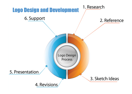
In order to design great logos, one has to develop a process. You can start by generating logo ideas using design brief and then follow your research to have something up for sketching. Alternatively, you can start by sketching your mind and then create a design brief after noting down important points about the brand it will represent. However, you do it, make sure it works for you. Once you know what works the best, stick to it.

4. Leave the color for the end process
Many new designers start coloring their drawing right from the beginning. Remember, color is necessary for conveying the message and grabbing the attention, but it has to come in the end. If you color your drawing from the beginning, you will not be able to focus on the idea alone.
5. Font variation
When you are creating your design to represent your brand, make sure that you are not using many font variations. For most of the designs, you should stick to two fonts at maximum. If you use more than two fonts in your logotype, it will look ugly and it will fail to grab attention.
6. Text size
Since your logo has to look great at every scale, even at one-inch size, you have to make sure that you are using proper text size. The logo should remain visible and readable even if it is trimmed down to the size of a thumbnail.
7. Learn the software
You will not be able to create logos without learning the software. Adobe Illustrator is one of the most popular software programs used for logo design. You will find plenty of online resources where you can learn to use the software. My two favorites areLynda.com and Total Training. You can even find free video tutorials on YouTube to polish your skills.

