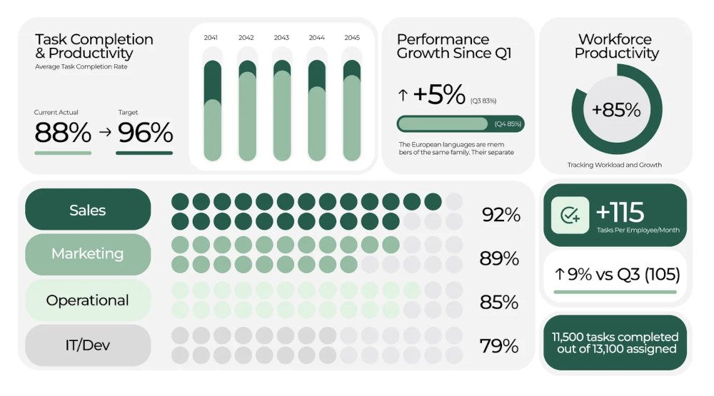
We’ve all been there. You’re handed a corporate report: a dense, text-heavy document filled with spreadsheets and jargon. Your eyes glaze over by page three. For most stakeholders, from investors to employees, this is the reality of corporate communication: important information buried in an impenetrable format.
But what if that same report could be engaging, insightful, and even memorable? This is the power and the purpose of strategic infographic design. It’s not just about making things “pretty”; it’s about transforming complexity into clarity and data into a compelling narrative.
Beyond Decoration: The “Why” of Infographics in Corporate Reporting
In an age of information overload, attention is the most valuable currency. A well-designed infographic does more than decorate a page; it performs several critical functions:
- Enhances Comprehension: The human brain processes visuals 60,000 times faster than text. Charts, icons, and diagrams help audiences grasp complex relationships and trends instantly.
- Improves Retention: People remember only 10% of what they hear three days later, but adding a picture can boost recall to 65%.
- Builds Trust and Transparency: Clear, well-presented data suggests a company that is organized, confident, and has nothing to hide. It demonstrates respect for the audience’s time and intelligence.
- Tells a Story: Raw data is just a collection of facts. An infographic weaves those facts into a narrative about growth, challenge, opportunity, or impact.
The Strategic Blueprint: A Step-by-Step Approach
Throwing a pie chart into a report isn’t a strategy. Effective infographic design requires a deliberate process.
1. Audit and Extract: Find the Story in the Data
Before you open a design tool, dive into the report. Your job is to act as an editor and a storyteller. Ask:
- What are the key messages? (e.g., “We grew market share by 15% in Q3.”)
- What data points are most relevant to our stakeholders? (Investors care about ROI; employees care about culture metrics.)
- What is the overarching narrative of this report? (Is it a story of recovery, innovation, or expansion?)
2. Know Your Audience: Tailor the Visual Language
A one-size-fits-all approach doesn’t work. The infographics for an annual report aimed at institutional investors will differ from those in an internal sustainability update for employees.
- For Executives & Investors: Focus on high-level KPIs, financial trends, and market position. Use clean, professional charts and confident data visualizations.
- For Employees: Highlight cultural achievements, team growth, and how their work contributes to overall goals. Use a warmer tone, supportive icons, and relatable imagery.
- For the General Public: Simplify the message, focus on community impact and environmental initiatives, and use accessible language and engaging illustrations.
3. Choose the Right Visual Tool for the Job
Not all data is created equal, and neither are the ways to visualize it. Match the visual format to the message:
- To Show Composition: Use a stacked bar chart or a waffle chart (often clearer than a pie chart).
- To Show Trends Over Time: A line chart or an area chart is your best friend.
- To Compare Values: A bar chart is simple and effective.
- To Explain a Process or Flow: A flowchart or timeline provides step-by-step clarity.
- To Display Relationships: A scatter plot or a bubble chart can reveal fascinating correlations.
4. Design for Clarity and Brand Consistency
This is where aesthetics serve strategy. A cluttered infographic is just as useless as a wall of text.
- Hierarchy: Guide the eye. Make the most important number the biggest and boldest.
- Color with Purpose: Use color to categorize, highlight, or draw attention, not just to decorate. Stick to your brand palette to reinforce corporate identity.
- Typography: Use a clear, legible font family. Establish a typographic hierarchy (Headline, Subhead, Body) to structure information.
- White Space: Don’t fear empty space. It gives the content room to breathe and significantly improves readability.
- Simplify: Remove any unnecessary gridlines, labels, or decorative elements that don’t serve the core message.
Case in Point: Transforming a Data Point
The “Before”:
*”Our employee satisfaction survey indicated a 12% year-over-year increase in the ‘Feeling of Belonging’ metric, which correlated with a new mentorship program launched in Q2.”*
The “After” (An Infographic Approach):
A small, focused graphic with two elements:
- A large, bold “+12%” as the central figure, with the label “Feeling of Belonging.”
- Below it, a simple icon of two figures connected, with the tagline: “Powered by our new Q2 Mentorship Program.”
The second version is scannable, impactful, and tells a mini-story of cause and effect in under three seconds.
The Bottom Line
In corporate reporting, infographics are not a frivolous add-on. They are a strategic tool for communication. By translating dense data into a visual narrative, you do more than inform, you engage, you persuade, and you ensure that your company’s most important stories are not just seen, but understood and remembered.
The next time you face a complex report, don’t just think about what you need to say. Think about how you can show it. That is the art and strategy of making the complex compelling.

