Motion graphics are everywhere. But most of them fail at their primary job: communicating clearly. They entertain, they distract, they fill space, but they don’t teach.
Great explainer videos do something different. They use motion as a tool for clarity, not decoration. Every transition, every animated icon, every carefully timed reveal serves a single purpose: making complex ideas simple. Here’s how to design motion that actually communicates.
The Foundation: One Problem, One Solution
Before you animate anything, you need a story worth telling. The most common mistake teams make is jumping straight into the creative side, only to end up with a beautiful video that says nothing of value.
The fix is simple: use the “One Problem, One Solution” framework. Define the single biggest headache your audience faces, then frame your product or idea as the clear fix.
This isn’t about listing features. A successful explainer video is a short story with a hero (your customer), a villain (their problem), and a magical weapon that saves the day (your solution). Get this right before you sketch a single frame.
Visual Metaphors: The Shortcut to Understanding
Here’s a number worth remembering: our brains process visual information 60,000 times faster than text. That’s not just a fun fact. It’s the entire justification for motion graphics.
The best explainer videos leverage visual metaphors, symbols that create instant understanding across languages, cultures, and expertise levels. A lightbulb means “idea.” Puzzle pieces mean “integration.” Gears mean “process.” These aren’t random choices. They tap into universal human experiences .
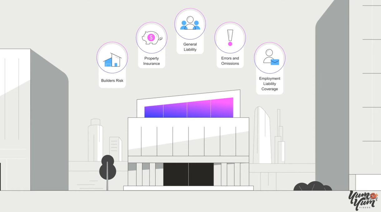
The Accelerant explainer video, created by Yum Yum Videos, demonstrates this beautifully. It opens with scattered shapes representing the confusion of outdated insurance systems. As the video progresses, the shapes become more organized, showing how the company brings structure and clarity. No heavy text. No jargon. Just visuals that tell the story.
Research confirms what works. People remember 65% of visual information after three days, compared to just 10% of written information. For designers, this is the difference between a message that sticks and one that’s forgotten.
Scripting for the Ear, Not the Page
With your core message locked in, the script is where your idea gets its personality. The biggest mistake? Writing dry, corporate-speak that sounds like a press release.
Write like you talk. Use a natural, conversational tone that speaks directly to your audience, not at them. A proven formula is Problem-Agitate-Solution-CTA:
- Problem: Hit a pain point your audience knows intimately
- Agitate: Gently twist the knife, remind them how frustrating that problem is
- Solution: Show exactly how your product or service makes it better
- Call to Action: Tell them precisely what to do next
Pacing matters enormously. Aim for about 150 words per minute. A 60-second video needs a 150-word script. A 90-second video needs about 225 words.
Pro tip: read your script out loud. If it sounds clunky or robotic when you say it, it will sound ten times worse with a voiceover.
Pacing and Information Density
IBM’s design language offers a crucial insight: there’s an inverse relationship between the complexity of a design and the complexity of its animation.
Every moving element increases the density of information presented to a viewer. Minimally populated compositions can handle more expressive, expansive animation. Dense, complex designs benefit from smaller, more textural motion.
This is a principle that separates amateurs from professionals. Amateurs add motion everywhere because they can. Professionals add motion only where it serves the message.
Storyboarding: The Blueprint You Can’t Skip
Here’s a stat that should convince you to storyboard: 93% of marketers say video planning reduces production time by at least 25%. A storyboard is your video’s GPS. Without it, you might reach your destination, but you’ll take a few wrong turns along the way .
A good storyboard doesn’t require artistic talent. Stick figures work perfectly. What matters is thinking through:
- One idea per scene (resist the urge to cram)
- Simple visuals that enhance understanding
- Smooth transitions between scenes
- Timing (aim for 3-5 seconds per scene)
Alongside your sketches, note the voiceover content, how elements should move, and any sound effects. These notes become your animation roadmap, preventing costly revisions later.
Visual Consistency: Building Trust Through Cohesion
Maintain a consistent visual style throughout your video. This includes your color palette, typography, and animation style. A cohesive look creates a sense of professionalism and helps viewers easily understand your brand.
The Accelerant video demonstrates this perfectly. Its illustration style is simple, using 2D shapes and a limited set of icons. Every scene follows the same design rules, which helps viewers stay focused on the message. Because the style is unified, viewers can quickly recognize people, tools, and concepts as they appear.
Use a style guide to keep your video consistent, same font, same colors, same transition types. This prevents the visual errors and inconsistency that scream “amateur.”
The Four Roles of Motion
Research from Northeastern’s Information Design and Visualization program identifies four distinct roles motion can play in visualizations. Understanding these helps you use motion with intention rather than decoration.
Motion as data: Used to animate forms that directly represent data values. This works for geographical flows, weather patterns, or transportation networks.
Motion as interpolation: Used to connect discrete data points, showing viewers that states are connected and part of the same story.
Motion as storytelling device: Used to guide viewers through the narrative, creating awareness, transitioning between scenes, and providing emphasis.
Motion as captivator: The aesthetic aspect, making the design unique and striking while still serving the message.
The ideal implementation weaves all four together, strengthening the visualization and its message.
Typography That Teaches
Text animation is a powerful tool for emphasizing key points. But it comes with a critical constraint: readability.
IBM’s guidance is worth memorizing: type should reinforce the natural rhythm of reading, typically appearing left to right, top to bottom. It should be left in the frame long enough to be legible and comprehensible.
And never, ever stretch or warp type. The integrity of the letterforms must be maintained at all times.
Experiment with different animation styles, fade-ins, typewriter effects, slide-ins. But avoid complex animations that make text difficult to read.
The Role of Sound
Sound design is the unsung hero of motion graphics. Sound effects and music significantly enhance impact and create a more immersive experience.
Use sound effects to punctuate animations and create a sense of realism. A simple “whoosh” during a transition adds surprising polish. Choose music that complements the tone and style of your video. Balance the volume so it doesn’t overpower dialogue or narration.
The Bottom Line
Motion graphics that actually communicate aren’t about flashy effects. They’re about clarity, intention, and serving the message.
Start with a clear story. Use visual metaphors that create instant understanding. Script for the ear, not the page. Storyboard before you animate. Maintain visual consistency. Use motion with purpose, not decoration. And never sacrifice readability for style.
The best explainer videos don’t just entertain. They teach. They make complex ideas feel simple, intuitive, and essential. That’s the standard to aim for.
About the Author

Peter Makeshoff
Peter Makeshoff is the founder and main author of Designer Daily.