In 2026, packaging has become a brand’s most valuable marketing tool. With consumers spending mere seconds scanning shelves, and even less time scrolling through digital storefronts, successful packaging must capture attention, communicate values, and drive purchase decisions instantly. Here are the trends dominating retail shelves this year.
1. The Age of Excess: Chaos Packaging and Hyper Max
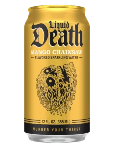
The most dominant trend of 2026 is the outright rebellion against minimalism. After over a decade of beige, muted tones, and “corporate clean” aesthetics, consumers are actively craving dopamine hits from their purchases. This backlash has given rise to Chaos Packaging and Hyper Max, designs that are intentionally loud, cluttered, and disruptive.
The visual language here is unmistakable: clashing neon colors, multiple overlapping fonts, collage-style imagery, and hand-drawn doodles. Brands like Liquid Death (mountain water in gothic metal cans) and Graza (olive oil in bottles that look like shampoo or beer cans) embody this chaotic spirit. For Gen Z consumers especially, this “post-ironic” aesthetic signals authenticity and fun, a welcome contrast to what they see as sterile, algorithm-driven corporate design.
2. Double Take Packaging: The Rule Breakers
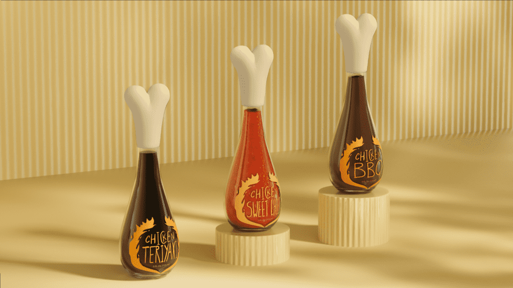
Closely related to chaos design is the Double Take trend, packaging that deliberately contradicts category norms. Think sunscreen that looks like a whipped cream canister, spirits packaged like motor oil, or tampons sold in a cardboard ice cream tub.
“Double Take Packaging thrives on deliberate contradiction,” notes Erin Shea of VistaPrint. “It’s designed to stop shoppers in their tracks”. This approach is particularly effective for startups and small businesses operating on limited budgets. When you can’t afford a billboard, you make the product itself into an unmissable billboard.
3. Analog Design: The Human Touch as a Radical Act
As AI-generated imagery floods digital channels, trust in automated creativity is plummeting. In response, brands are doubling down on Analog Design: packaging with charcoal-smudged typography, pen-and-ink illustrations, typewriter-style labels, and genuine handcrafted imperfections.
Consumer research continues to show rising skepticism toward AI-driven creativity, with trust and authenticity climbing to the top of purchase motivators. Hand-crafted details signal intention, effort, and authorship, qualities that resonate deeply in a cultural moment concerned with data privacy, deepfakes, and creative ownership.
4. Premium but Approachable: “Rich, Not Snobby”
Luxury packaging is shedding its icy, exclusive reputation. In 2026, premium is defined by tactility and warmth rather than ostentation.
This trend, called “Rich, Not Snobby,” uses high-end materials and elevated finishes but pairs them with accessible typography, inclusive imagery, and a tone that invites rather than intimidates. The global luxury packaging market continues to grow (forecast at 4–6% annually), yet today’s affluent buyers prioritize “timeless quality over trendiness.” With the widening wealth gap, overt displays of opulence can read as out of touch. The solution is indulgence that feels grounded.
5. Clinical With Soul: Science That Feels Safe
Driven by the continued global dominance of K-beauty and wellness, Clinical With Soul is a sleek, science-forward look softened by human elements. The visual language includes clean sans-serifs, minimal layouts, metallic accents, and ingredient-first storytelling, aesthetic shorthand for credibility and innovation.
But where pharmaceutical packaging feels cold, this trend adds “soul” via soft gradients, warm accent colors, and friendly typography. The K-beauty market is projected to surpass $28.1 billion by 2026, and its design cues are bleeding into adjacent categories like beverages, supplements, and functional snacks.
6. Apothecary and Alt-History: Trust Through Nostalgia
When consumers face uncertainty, they look to the past for comfort. The Apothecary Aesthetic draws on old-world pharmacy cues: earthy palettes, authoritative serif typography, botanical drawings, and symmetrical, structured layouts.
Pushing this further, Alt-History remixes historical imagery with modern production techniques. A brand might use a 1970s chart or a vintage advertisement, then disrupt it with neon color overlays or asymmetric composition. The result feels familiar enough to evoke nostalgia but bold enough to stand out in 2026.
7. The Sustainable Reset: Rigid Mono-Materials and Reducing Waste
Sustainability is no longer a marketing claim, it’s a regulatory reality. Extended Producer Responsibility (EPR) schemes are shifting costs onto brands based on recyclability and material weight.
However, consumer preferences are shifting away from “less plastic” toward actual recyclability. Rigid mono-material plastics are seeing a surprising resurgence because they perform well in existing recycling streams and face lower EPR fees. Meanwhile, compostable packaging has fallen out of favor due to lack of composting infrastructure and disincentives in EPR fee structures.
Another major focus is lightweighting. By optimizing structural design, brands can reduce material usage, cutting both carbon emissions and regulatory fees. Johnnie Walker’s “Blue Label Ultra” bottle weighs just 180 grams (half the standard weight), cutting carbon emissions by 335 grams per bottle.
8. Digital Integration: The QR Code Renaissance
The days of static packaging are numbered. With GS1 Sunrise 2027 approaching (when retailers will accept 2D barcodes at checkout), brands are integrating QR codes and NFC tags directly into their packaging designs.
These aren’t just barcode replacements. They serve as portals to recipes, sustainability data, loyalty programs, and augmented reality experiences. Over 50% of consumers are likely to scan a code if it offers clear value. For packaging designers, this means permanently allocating visual space for scannable elements and ensuring they enhance rather than disrupt the core design.
The Takeaway for Designers
Don’t fear the chaos. The most successful designs of 2026 are intentionally breaking the old rules, disrupting category norms, embracing analog textures, and using maximalist color while consumers crave a dopamine hit.
Keep it human. With AI everywhere, hand-drawn elements and tactile finishes signal authenticity and rebuild trust.
Design for the after-life. EPR fees and eco-modulation mean your material choices directly impact the client’s bottom line. Prioritize mono-materials and design for actual recyclability.
Remember the unboxing. As e-commerce grows, the physical moment of opening the package is often the only physical touchpoint with the customer. Consider how the structure, texture, and sound of the box contribute to brand equity.
The brands winning on shelves in 2026 are those using packaging as a cultural tool, one that signals values and creates genuine surprise. Your designs shouldn’t just contain a product; they should start a conversation.
About the Author

Peter Makeshoff
Peter Makeshoff is the founder and main author of Designer Daily.