Nutrition facts, ingredients lists, warning labels, recycling symbols, serialized barcodes, the list of legally mandated information on packaging grows longer every year. In the US, the FDA’s proposed Front-of-Pack labeling rule would add even more requirements for saturated fat, sodium, and added sugars disclosures. In the EU, the new Packaging Regulation (PPWR) takes effect August 2026, requiring detailed material composition pictograms, recycled content percentages, and producer identification.
For designers, this is often framed as a burden. Ugly compliance text that ruins your beautiful layout. But the brands doing it right see something else: an opportunity to build trust through transparency.
The Compliance Reality Check
Before you design around regulations, you must understand what you’re dealing with. Label copy and regulatory statements cover product names, ingredient lists, allergens, nutrition panels, warnings, usage directions, and traceability data like batch codes and expiry dates. Each element is a “mandatory statement” anchored in specific regulations, 21 CFR 101 in the US, EU FIC in Europe, and countless national variations.
The stakes are high. Allergen text errors are frequent recall triggers. Claims without supporting evidence files can lead to enforcement actions. And with the PPWR’s new traceability requirements, packaging must now bear type, batch, or serial numbers allowing identification, essentially making every package trackable.
The Brands That Get It Right
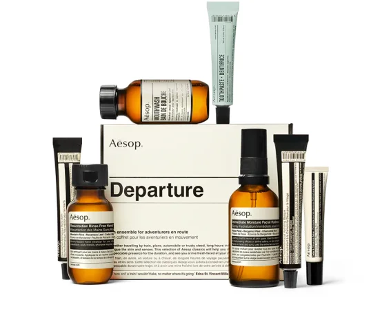
Aesop: The Poetry of Ingredients
Aesop’s packaging is famously minimal: amber bottles, clinical typography, generous whitespace. Yet every product contains a full ingredient list in multiple languages. The secret? They treat regulatory text as design material, not afterthought. The lists are set in the same refined typeface as their branding, with careful leading and tracking that transforms dense information into a textured, readable element. The ingredients become part of the aesthetic rather than an apology for it.
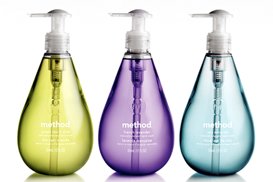
Method: Color-Coded Clarity
Method’s cleaning products are stocked floor-to-ceiling with bright, distinctive bottles. Their approach to regulatory text is systematic: use color and hierarchy to differentiate information types. Allergen statements are consistently placed and color-coded, warnings use high-contrast panels that feel intentional rather than alarming, and the overall effect is clean compliance that doesn’t scream “warning label.”
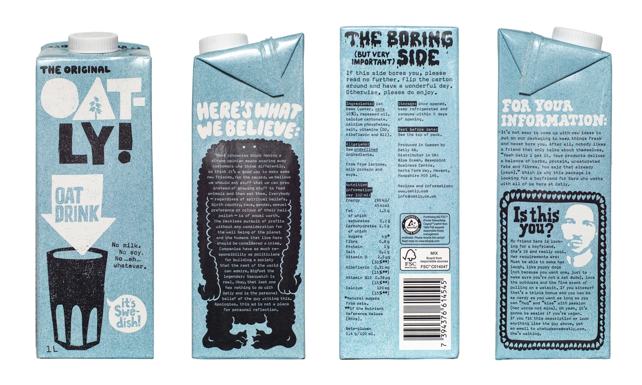
Oatly: The Tone of Voice Revolution
Oatly famously turned their ingredient list and legal disclaimers into brand assets. By writing regulatory copy in their signature irreverent, conversational tone, while technically meeting all requirements, they transformed “boring compliance text” into content people actually read. Their cartons explain why they add certain vitamins, where ingredients come from, and even apologize for the small print. This approach required close collaboration with legal and regulatory teams, but the result is packaging that communicates values while satisfying statutes.
The Technical Solutions
Sometimes design alone isn’t enough. When regulatory information exceeds available space, physical solutions exist.
Extended Content Labels (ECLs) include peel-and-read, booklet, and concertina labels that expand to reveal additional content. These are essential for:
- Products sold across multiple markets requiring multiple languages
- Small cosmetic containers with extensive ingredient and allergen lists
- Chemical products needing detailed hazard and precautionary statements
- Pharmaceuticals requiring patient information leaflets integrated with primary packaging
Modern ECLs can include up to five pages while using sustainable materials, some options save up to 30% material usage compared to traditional booklets. They preserve the integrity of your primary design while providing all required information.
The Designer’s Framework
1. Treat Regulatory Text as Master Data
Label copy must be treated as controlled information, not creative text that can be adjusted freely. Work with regulatory and quality teams to establish “canonical text” per SKU and market. Every change should be versioned and documented. This isn’t just process, it’s the foundation that lets you design confidently.
2. Design for Scanning, Not Just Reading
Consumers faced with dense regulatory information need visual wayfinding. Use:
- Consistent placement for recurring elements
- Typographic hierarchy that distinguishes mandatory from voluntary content
- Color coding for different information types (allergens, warnings, usage)
- Icons and symbols where permitted to reduce language load
3. Integrate Early, Not Late
Regulatory text should be in your design files from the beginning, not pasted in at the end. When it’s an afterthought, it disrupts layouts and creates awkward breaks. When it’s part of the initial grid, it becomes a designed element.
4. Build Flexible Systems
Different markets have different requirements. Design templates that accommodate text expansion, language variants, and country-specific symbols. Use components that can be swapped without redesigning entire packages.
5. Test for Readability and Compliance
Barcode quality depends on surface and layout, low contrast, printing over folds, or glossy surfaces can cause scanning failures. Test your designs on actual materials, with actual production equipment, before finalizing.
The Opportunity
Regulatory text is not going away. The trend is toward more disclosure, not less. The FDA’s proposed FOP labels, the EU’s digital product passports, and global serialization requirements all point toward packaging that carries increasing amounts of mandated information.
The brands that treat this as a design challenge, not a compliance burden, will win. They will build trust through transparency. They will create packaging that informs rather than obscures. And they will prove that even a nutrition facts panel can be beautiful, or at least bearable, when designed with intention.
About the Author

Peter Makeshoff
Peter Makeshoff is the founder and main author of Designer Daily.