Responsive web design has evolved far beyond Ethan Marcotte’s 2010 three pillars of fluid grids, flexible images, and media queries. In 2026, the toolkit has expanded significantly, adding container queries, fluid typography with clamp(), and CSS Grid with intrinsic sizing.
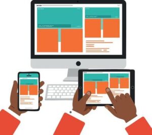
The baseline expectation is simple: a website must work on everything from a 4-inch phone to a 34-inch ultrawide monitor. Mobile traffic exceeds 55% of global web visits, and Google uses mobile-first indexing, evaluating the mobile version of your site for ranking decisions. Here are the practices that actually work.
Start with Mobile-First, But Think Context-First
Mobile-first means designing for the smallest screen first and progressively enhancing for larger devices using min-width media queries. This forces content prioritization because you can only include what’s essential.
However, 2026 demands more. The shift is toward context-first design, building for moments and attention, not just devices. A user checking flight times on a phone wants speed. The same user researching options on a desktop may want comparison tools and multiple tabs. Your interface should respond to the user’s goal and situation, not just their screen width.
Container Queries: Components That Know Their Space
Viewport-based media queries have a fundamental limitation: they respond to the browser window, not the component’s available space. A card in a narrow sidebar needs different styling than the same card in a full-width hero, but both see the same viewport width.
Container queries solve this. Baseline since 2023 with over 90% global support, they let components adapt to their parent’s size:
css
.card-wrapper {
  container-type: inline-size;
}

@container (min-width: 400px) {
  .card {
    display: grid;
    grid-template-columns: 200px 1fr;
  }
}
This is the shift from page-level thinking to component-level thinking, and it maps directly to how modern design systems work. Components become self-contained and context-aware.
Fluid Typography and Spacing with clamp()
Hard breakpoints for font sizes create jarring jumps. Fluid typography scales smoothly between a minimum and maximum value using the clamp() function :
css
h1 {
  font-size: clamp(1.5rem, 4vw, 3rem);
}
This single line makes headings readable on a 320px phone and proportionally scaled on a 2560px monitor, with zero extra breakpoints. The same technique works for spacing, padding, and margins. Tools like Utopia generate fluid type scales and spacing systems that stay proportional across every screen size.
CSS Grid for Intrinsic Layouts
CSS Grid with auto-fit, auto-fill, and minmax() creates responsive layouts without any media queries :
css
.grid {
  display: grid;
  grid-template-columns: repeat(auto-fit, minmax(280px, 1fr));
  gap: 1rem;
}
This grid adjusts the number of columns based on available space. On a phone, one column. On a wide monitor, four or more. The content and its constraints determine the layout, not arbitrary breakpoints. Flexbox remains valuable for one-dimensional layouts (navigation bars, tag lists), but Grid handles two-dimensional layouts and overall page structure more effectively.
The Layered Approach: Combining Techniques
No single technique does everything. Modern responsive design in 2026 uses multiple tools together :
- Media queries for major structural shifts (moving a sidebar below main content on mobile)
- Container queries for component-level adaptation within those layouts
- Fluid sizing with
clamp()for typography and spacing that scales smoothly - CSS Grid for page-level layouts that intrinsically respond to available space
- Component-driven development where responsive behavior is encoded in reusable components, not solved page by page
Touch Targets and Performance Are Non-Negotiable
Interactive elements need minimum tap targets of 44×44px (Apple) to 48×48px (Google). Small buttons that work fine with a mouse cursor become impossible to tap accurately on a phone. Use padding to extend clickable areas without increasing visible button size.
Performance is part of responsive design. A responsive layout on a slow mobile connection is still a bad experience. Use srcset and sizes for appropriately sized images, set fetchpriority="high" on your LCP element, and include explicit width and height attributes to prevent layout shift.
Test on Real Devices
Browser DevTools device emulation is fast and useful, but it does not replicate real touch behavior, font rendering, or network conditions. Test on actual devices at key breakpoints, especially mid-range Android devices, which represent a large share of global mobile traffic but are frequently under-tested.
Responsive design in 2026 is not optional. It is a baseline requirement for SEO, user experience, and accessibility. The tools and techniques have matured. Use them.
About the Author

Peter Makeshoff
Peter Makeshoff is the founder and main author of Designer Daily.