Good designers create. Great designers curate. But the best designers? They remix. The secret isn’t waiting for a lightning bolt of originality—it’s building a deep visual library and learning to reinterpret its contents in ways that feel both fresh and grounded.
This isn’t about copying. It’s about understanding the underlying principles of past movements and recombining them with contemporary context. Here’s how to research, archive, and ethically remix design history.
Why History Matters Now
Every design problem you face has been solved before—maybe not in exactly the same context, but the visual language likely exists somewhere in history. The Swiss Grid, developed in the 1940s and 50s, still underpins some of the most effective layouts today . The psychedelic posters of 1960s San Francisco continue to influence album art and festival branding. The Bauhaus, now a century old, remains the foundation of modern design education .
Understanding these movements gives you a vocabulary. More importantly, it gives you permission to stop trying to invent something from nothing.
The Digital Archive: Your Starting Point
Before you can remix, you need raw material. Fortunately, the internet has made design history more accessible than ever.
Museum-Grade Collections:
- The Metropolitan Museum of Art’s Heilbrunn Timeline offers a chronological, geographical exploration of art history, illustrated by the Met’s collection . It’s an unparalleled resource for understanding visual culture in context.
- Cooper Hewitt Smithsonian Design Museum provides access to a vast collection through the Smithsonian Institution Research Information System .
- The Getty Research Institute holds primary materials for modern movements including Bauhaus, Russian Constructivism, Dada, and Surrealism .
Design-Specific Archives:
- AIGA Design Archives contains over 20,000 selections dating back to 1924, documenting all disciplines of communication design . You can browse by color, year, format, or keyword.
- The Chicago Design Archive provides a permanent online record of excellent design created by local professionals from the late 19th century to the present .
- Graphis Archives presents award-winning work from 1944 to the present, including books, magazines, and annual reports .
Specialized Collections:
- Center for the Study of Political Graphics houses over 90,000 protest graphics from the 19th century to the present—the largest collection of post-WWII posters in the United States .
- The Chinese Type Archive compiles and catalogs resources related to Chinese typography to make them open and accessible .
- Archives of American Art (Smithsonian) holds over 20 million items documenting the visual arts in America .
Physical Collections: Seeing the Real Thing
Digital archives are convenient, but nothing replaces handling original artifacts. The texture of a letterpress print, the scale of a vintage poster, the yellowing of newsprint—these qualities inform authentic work.
Major Collections:
- The Design Library (New York and London) holds over seven million designs, from fabrics and wallpapers to original paintings, dating from the 1750s to the present .
- Denver Art Museum’s AIGA Design Archives contains approximately 12,000 physical artifacts from 1980-2010, representing the largest holding of contemporary American communication design in the world .
- The Design Museum of Barcelona holds historic dies, typographies, and printing plates from the 18th to 20th centuries .
University Collections Open to Researchers:
- Yale University’s Arts of the Book Collection includes examples of binding, typography, illustration, calligraphy, and book design .
- Cranbrook Academy of Art Library maintains an extensive collection on graphic design history, theory, and professional practice .
- Stanford’s Special Collections holds important modern and mid-20th century graphic design books, periodicals, and ephemera .
Three Movements Worth Mining
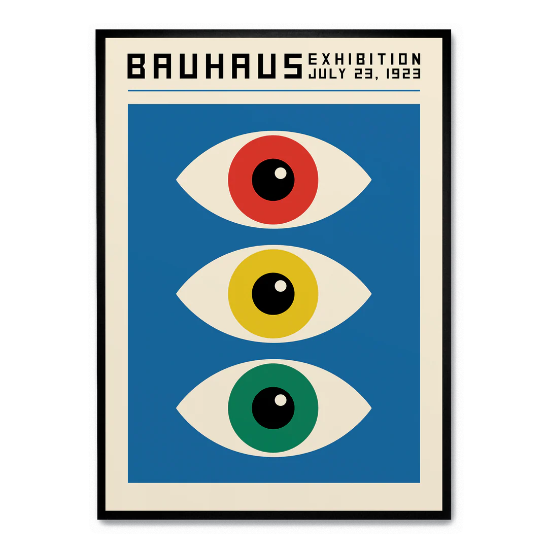
Bauhaus (1919-1933)
Core principles: Geometric forms, primary colors, asymmetrical balance, integration of fine arts and crafts.
Why it endures: The Bauhaus wasn’t just a style—it was a philosophy about design’s role in society. Its focus on function and simplicity continues to resonate because it prioritizes communication over decoration .
How to remix: Take the Bauhaus commitment to geometric abstraction but apply it to contemporary subjects. Use the grid structure but break it in unexpected places. Combine Bauhaus forms with textures and materials the original movement never had access to.
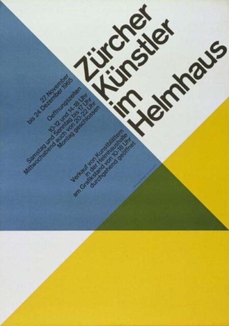
Swiss/International Typographic Style (1940s-60s)
Core principles: Grid systems, sans-serif typography (Akzidenz-Grotesk, Helvetica, Univers), asymmetrical layouts, objective photography, clarity above all .
Why it endures: These principles aren’t about a look—they’re about effective communication. A well-executed grid creates hierarchy and flow that guides the reader’s eye naturally.
How to remix: The Red Dot award-winning book “KASPER FLORIO – Atypical Swiss” demonstrates this perfectly—it uses only two fonts (Darker Grotesque and Xanh Mono) but creates dynamic interest through thoughtful placement, flaps, and slanted pages . The grid is respected, then thoughtfully subverted.
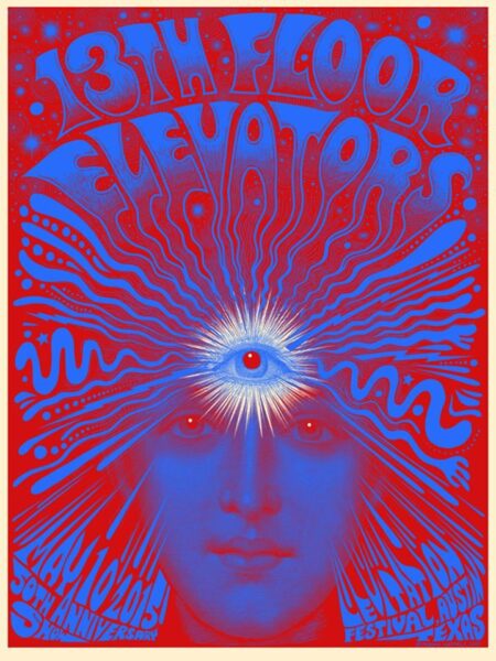
Psychedelic (1966-1972)
Core principles: High-contrast, saturated colors; undulating, distorted typography; kaleidoscopic patterns; visual complexity that rewards extended viewing .
Why it endures: Where Swiss design aims for immediate clarity, psychedelic design invites exploration. Its connection to music and counterculture gives it emotional resonance that purely functional design lacks.
How to remix: Contemporary designers like Paris-based Uchronia are doing exactly this—using “hallucinogenic swirls of orange, purple, acid yellow and searing pink” to create immersive environments that prioritize joy and emotional impact . The key is taking psychedelic’s emotional intensity and applying it with contemporary restraint.
The Remix Framework: From Reference to Original
Step 1: Deconstruct, Don’t Just Admire
When you find a piece that resonates, analyze it systematically:
- What’s the underlying grid or structure?
- What’s the color relationship? (Complementary? Monochromatic? High contrast?)
- What’s the typographic hierarchy?
- What’s the cultural context that made this work resonate then?
Step 2: Extract Principles, Not Aesthetics
The goal isn’t to make something that looks like a 1960s psychedelic poster. It’s to understand why those posters worked—the relationship between visual complexity and engagement, the emotional impact of saturated color—and apply those principles to a contemporary problem.
Step 3: Combine Across Movements
This is where the magic happens. What happens when you apply Swiss grid discipline to psychedelic color palettes? Or Bauhaus geometric forms to Victorian ornamentation? The tension between systems creates something genuinely new.
Step 4: Add Your Context
Finally, ground the work in today. Use contemporary subject matter, current technology, and your unique perspective. The historical references become depth, not costume.
The Line Between Inspiration and Plagiarism
How do you know when you’ve crossed from inspired to infringing? Recent research on similarity evaluation in graphic design offers clues. The key isn’t whether individual elements look similar—it’s whether the main visual features and their relationships have been copied .
The safe zone:
- Using the same grid structure with different content
- Adapting a color palette to a new context
- Applying historical principles to contemporary problems
The danger zone:
- Tracing or directly copying distinctive shapes
- Recreating the exact composition with swapped content
- Using recognizable, culturally significant imagery without transformation
Building Your Personal Archive
Create your own system for collecting and organizing inspiration:
Digital tools:
- Pinterest or Are.na for visual bookmarking
- Notion or Evernote with tags for movements, designers, and principles
- A folder system on your hard drive organized by concept, not just designer name
Physical practice:
- Keep a sketchbook for recording observations from archives
- Print and pin inspiring work where you’ll see it daily
- Collect found ephemera—old magazines, packaging, tickets
The Goal: Work That Feels Inevitable
The best design doesn’t scream “look how original I am.” It feels quietly right—as if it couldn’t have been any other way. That quality comes from deep familiarity with what came before. When you’ve absorbed enough history, you stop guessing and start knowing.
The Bauhaus masters studied centuries of craft before they broke the rules. The Swiss designers understood ornament before they rejected it. The psychedelic poster artists knew commercial art before they dissolved it into color.
Build your archive. Study it deeply. Then trust that what emerges will be yours alone.
About the Author

Peter Makeshoff
Peter Makeshoff is the founder and main author of Designer Daily.