Waiting is inevitable. Whether you’re standing in line at an airport, sitting in a doctor’s waiting room, or staring at a loading spinner on your phone, the experience of waiting shapes how you feel about what comes next. The design of that wait, physical or digital, can mean the difference between a frustrated customer and a loyal one.
There’s a fascinating symmetry between how we design physical queues and digital loading experiences. Both draw from the same psychological principles, and both offer opportunities to turn tedium into tolerable, even enjoyable, moments.
The Psychology: Why Waiting Feels Longer Than It Is
Research consistently shows that our perception of time during a wait is often more important than the actual duration. A study published in the International Journal of Service Industry Management found that “the perception of waiting time is a much better predictor of satisfaction than the actual wait time”. In other words, you can’t always make the wait shorter, but you can almost always make it feel shorter.
David Maister, a retired Harvard Business School professor, identified several principles that affect how we experience waiting. Two of the most important:
- Unoccupied time feels longer than occupied time. This is why a slow elevator in a New York building stopped generating complaints after management installed mirrors. Suddenly, passengers had something to do: check their appearance. The wait didn’t change. The experience did.
- Anxiety makes waiting feel longer. When you’re not sure how long you’ll wait or whether you’ve been forgotten, every second drags. This is why clear communication about delays matters enormously.
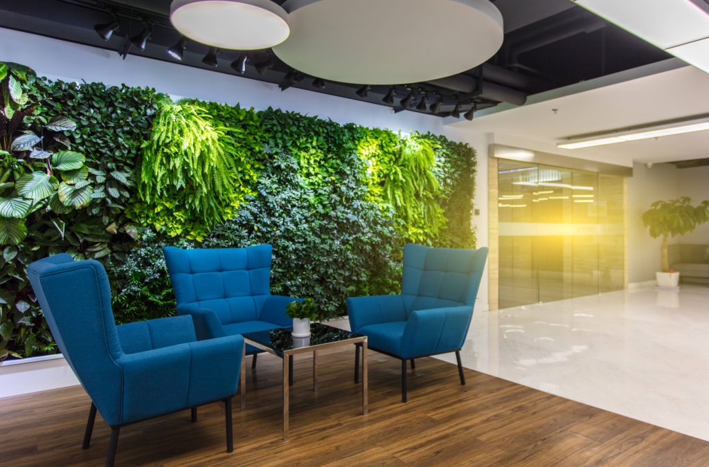
A study in Dutch hospital polyclinics revealed something striking: the attractiveness of the waiting environment proved to be a “stronger determinant of service satisfaction than objective waiting time”. Improving the physical space had more impact than actually shortening the wait.
Physical Spaces: Lessons from Theme Parks, Hospitals, and Airports
Theme Parks: The Gold Standard
Nobody manages queues better than Disney. At the Haunted Mansion, guests wind through miles of line hidden behind elaborate stone pillars and cemeteries. Bubbling fountains, gargoyles, and tongue-in-cheek tombstone inscriptions provide constant distraction. A haunting soundtrack underscores the scene. The wait becomes part of the attraction.
This isn’t accidental. Disney employs psychologists and engineers who understand that “the Disney properties may be the Machiavellian experts at managing the psychology of queueing”. Their queues use switchbacks that shorten the visual length of lines, interactive elements that engage waiting guests, and inflated wait time estimates that create pleasant surprise when the actual wait is shorter.
A University of Florida study on theme park queue design found that when designers implement elements of “interactivity and immersion,” these spaces “create full stories and satisfactory experiences for their guests”. The queue becomes part of the narrative, not just a barrier to entry.
Healthcare: From Clinical to Calming
Medical waiting rooms face a tougher challenge. Patients are often anxious, uncomfortable, and worried. The stakes are higher than at a theme park.
At Dunbar Medical Practice in Scotland, feedback showed the waiting area felt “clinical and uninviting, adding to anxiety and discomfort”. A redesign transformed the space with:
- Comfortable seating, including beanbags for families with children
- Soft furnishings and décor creating a warm atmosphere
- A book swap station that became popular with older patients
- An improved layout that felt less crowded
The results were dramatic. Patients reported feeling “calmer, more relaxed, and less anxious while waiting for appointments”. Staff observed reduced signs of stress and boredom. One team member noted: “We saw children asking parents to sit in the beanbags with them. The new book swap has been a popular hit with our older patients”.
Research confirms these observations. A study on waiting environments distinguished between two aspects: attractiveness (design, decoration) and distracters (TV, entertainment). Both influence satisfaction, but through different routes. Attractiveness operates through affect, serving as a “mood inducer.” Distracters work by diverting attention from the passage of time itself.
Airports: Managing Masses with Technology
Airports face perhaps the most complex queuing challenge: thousands of passengers, multiple security checkpoints, and high stakes for on-time departures. Recent research from Incheon International Airport developed a “dynamic rescheduling framework” that balances workload across departure areas using real-time data. The model allocates passengers to different security screening areas based on predictions, reducing congestion and waiting times while minimizing walking distances.
The lesson: smart allocation can be as important as physical design. When you can’t eliminate queues, you can at least distribute them intelligently.
Digital Interfaces: The Same Principles, Different Medium
Everything we’ve learned about physical queues applies directly to digital waiting experiences. Loading spinners, progress bars, and multi-step forms are the virtual equivalent of waiting rooms and queue lines.
The Two Types of Waiting
UX research distinguishes between passive waiting (standing still, watching a spinner) and active waiting (interacting, being busy). Studies show we overestimate passive waiting by about 36%. Active waiting feels shorter, even when it isn’t.
This is why skeleton screens, those gray boxes that mimic content layout before it loads, work better than spinners. They give users something to look at and a sense of structure, making the load feel faster.
Matching Indicator to Wait Time
Different wait durations call for different treatments :
- Under 1 second: No indicator needed. Anything visible will feel like noise.
- 1–3 seconds: Skeleton screens or simple spinners work.
- 3–10 seconds: Determinate progress bars showing how much is left.
- 10+ seconds: Progress bars with percentage, status updates, and ideally, options to interact with other parts of the application.
The Power of Progress
Research shows that when a product “signals and visualizes progress, users tend to accept longer waiting time because they have right expectations and can track that progress as it’s happening”. Uncertainty amplifies discomfort. Transparency reduces it.
This mirrors physical queue design. When Disney posts “35 minute wait” signs at ride entrances, they’re doing exactly what a good progress bar does: setting expectations and eliminating uncertainty. The slight inflation of estimates creates the bonus effect of pleasant surprise when the actual wait is shorter.
Keeping Users Busy
The principle of “occupied time feels shorter” applies directly to interfaces. Techniques like optimistic UI, where users can proceed with next steps while background processes continue, shift waiting from passive to active.
For long processes like video export, smart design collapses the task into a background state, freeing users to do other things. This is the digital equivalent of giving waiting patients something to read or watch.
Multi-Step Flows
Forms and multi-step processes are a form of queuing. The same principles apply :
- Break long processes into pages with one task each
- Show progress clearly
- Communicate what’s required before errors happen
- Use dynamic paths that adapt based on previous answers
When users can see how many steps remain and understand what’s needed, anxiety drops and completion rates rise.
The Convergence: Designing for Dignity
Whether physical or digital, great waiting design shares common principles:
- Distraction matters. A well-placed mirror, a book swap, a skeleton screen, all give the mind something to do besides count seconds.
- Progress is calming. Knowing how much longer, whether through a visible queue or a progress bar, reduces anxiety.
- First impressions count. The waiting space sets expectations for what follows. A clinical, unwelcoming waiting room signals indifferent care. A frozen, blank screen signals broken software.
- Fairness is fundamental. People tolerate waits better when they believe the system is fair. Single-file queues that prevent “slips and skips” often satisfy more than faster multi-line systems.
- Value justifies waiting. The more valuable the reward, the higher the tolerance for waiting. Communicate why the wait is worth it.
The Bottom Line
Waiting is never just waiting. It’s an experience that shapes perception, satisfaction, and loyalty. Whether you’re designing a theme park queue, a medical waiting room, or a loading animation, you’re doing the same thing: managing human attention and expectation.
The best waiting design doesn’t eliminate the wait. It makes the wait feel purposeful, transparent, and maybe even pleasant. It turns a necessary pause into part of the journey.
As Richard Larson, known as “Dr. Queue,” puts it: “Many, perhaps most, people would prefer a line with twice the wait having guaranteed first come, first served”. Fairness and certainty matter more than speed.
The next time you design a progress bar or arrange seating in a lobby, remember: you’re not just managing space or time. You’re managing trust.
About the Author

Peter Makeshoff
Peter Makeshoff is the founder and main author of Designer Daily.