Notifications have become the architectural pillars of the attention economy, engineered to maximize engagement at the cost of human focus. The default design pattern—interrupt immediately, demand acknowledgment, and obscure dismissal—is a business model disguised as a UX pattern. It’s time to architect a new paradigm: one where interruption is a carefully calibrated tool of service, not a weapon of capture.
This is the design of respectful attention.
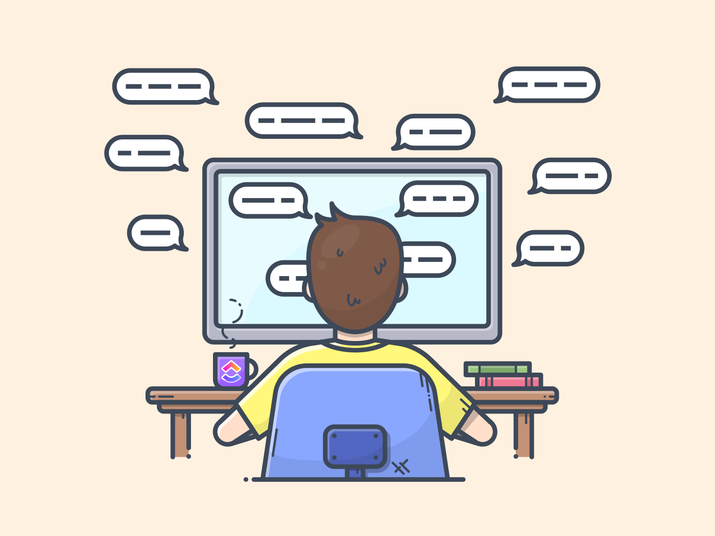
The Crisis: The “Interruption-Addiction” Loop
Modern notifications exploit fundamental cognitive vulnerabilities:
- Variable Rewards: The dopamine-driven “pull-to-refresh” model, where the value of the interruption (a like, a message, a news alert) is unpredictable.
- Loss Aversion: Urgent language (“You might be missing out!”) and red badges that can’t be ignored.
- Social Obligation: Implying a human is waiting (“John is typing…”) to trigger a sense of urgency.
This creates a state of chronic, low-grade anxiety and fragmented attention—a condition now termed “attention fragmentation syndrome.”
An Ethical Framework: The Interruption Hierarchy
Not all interruptions are created equal. We must classify them not by what benefits the sender, but by the legitimate need of the receiver. We propose a four-tier hierarchy of interruption, each with its own distinct design pattern.
Tier 1: Critical & Actionable
Definition: Requires immediate user action for safety, security, or critical personal function. Time-sensitive and consequential.
- Examples: Security breach alert, “Your flight boards in 10 minutes,” severe weather warning for your location, critical healthcare reminder.
- Ethical Design Pattern:
- Channel: Full-screen, audible, and haptic interruption. Bypasses “Do Not Disturb.”
- Design: Clear, imperative language. One or two maximum, highly distinct actions (e.g., “Acknowledge,” “View Details”). No branding flourishes.
- Justification: User has explicitly or implicitly consented to this level of interruption for this specific, high-stakes category.
Tier 2: Important & Time-Bound
Definition: Pertains to a commitment or active task, with a clear deadline. Not critical to safety, but important to the user’s stated goals.
- Examples: “Your meeting starts in 5 minutes,” “Your food delivery driver is approaching,” “Your draft document was auto-saved.”
- Ethical Design Pattern:
- Channel: Banner or large toast notification that appears at the edge of focus. Gentle sound or haptic only if the user is not in a focused app (as determined by system-level focus modes).
- Design: Contains all necessary context in the notification itself. Provides a clear, easy action (“Join,” “View Order”) and a clear, easy dismissal. Disappears automatically after the relevant moment passes.
- Justification: Serves an in-progress user intention.
Tier 3: Informational & Asynchronous
Definition: An update the user will want to know, but does not require immediate action. The vast majority of notifications belong here.
- Examples: A new email, a social media mention, a comment on your post, app update available.
- Ethical Design Pattern:
- Channel: Silent. No sound, no haptic. Appears in a dedicated, unified notification center or a subtle badge.
- Design: Grouped by topic and batched. Instead of 10 separate “New Like” notifications, one reads “You have 10 new interactions on your post.” The UI prioritizes summary over individual pings. The default action is “Snooze” or “Schedule Review,” not “Open App Now.”
- Justification: Respects the user’s focus time. Provides information on their schedule.
Tier 4: Promotional & Speculative
Definition: Content the sender wants the user to see, with no basis in the user’s active tasks or commitments.
- Examples: “New in-app item!”, “Trending story you might like,” “Don’t forget to use our app!”
- Ethical Design Pattern:
- Channel: Opt-in only. Never a notification. Belongs in an “Updates” or “News” tab inside the app.
- Design: Must be clearly distinguishable from Tier 1-3 communications. No red badges. No language mimicking urgency or personal obligation.
- Justification: This is not a user need; it is a business desire. It must not be allowed to masquerade as one.
New UX Patterns for Respectful Attention
1. The “Focus Covenant” Onboarding:
Upon first launch, the app must request permission for each tier of notification separately, with plain-language examples. “May we send you critical security alerts? (Tier 1)” vs. “May we send you promotional updates? (Tier 4).” Defaults: Tier 1 & 2 ON (with explanation), Tier 3 OPT-IN, Tier 4 OFF.
2. The “Interruption Budget” Dashboard:
A system-level or per-app settings panel that visualizes your interruption “spend.” It shows: “This app interrupted you 12 times this week: 0 Critical, 2 Important, 10 Informational.” This creates transparency and accountability, turning a hidden cost into a managed resource.
3. The “Snooze to Schedule” Dismissal:
The primary dismissal button for Tier 3 notifications is not “Clear” but “Snooze Until…” with smart options: “End of Work Block,” “Tonight,” “This Weekend.” This teaches the system the user’s focus rhythms and transforms interruptions into deferred, planned tasks.
4. The “Sender Accountability” Receipt:
For messaging apps, replace “Read Receipts” with “Focus Receipts.” A sender could see a gentle indicator: “Delivered. Notifications are muted until 5 PM.” This socially enforces focus-time respect without exposing personal activity.
The Business Model Realignment
This ethical framework forces a hard truth: if your business model relies on tricking users into Tier 4 interruptions disguised as Tier 2, your model is predatory. Sustainable design aligns business goals with user well-being. A user who feels in control of their attention is more loyal, less likely to disable all notifications, and more positively engaged when they do choose to open your app.
The Designer’s Mandate
Our role is no longer to maximize “time-in-app” at any cognitive cost. It is to become stewards of human attention. This means:
- Advocating for the “Quiet Default”: Designing for the state of focused flow as the primary experience, with interruptions as the carefully designed exception.
- Prioritizing Summary Over Spark: Valuing the design of elegant digests and batched updates as highly as the design of the initial engaging hook.
- Measuring What Matters: Shifting success metrics from “notification open rates” to “user-configured quiet hours respected” and “satisfaction with notification relevance.”
The most humane and sophisticated software of the next decade will not be the one that shouts the loudest. It will be the one that whispers at exactly the right time, and has the wisdom to remain silent when the user’s mind is otherwise beautifully occupied. Our task is to design that wisdom into the fabric of every interface.
About the Author

Peter Makeshoff
Peter Makeshoff is the founder and main author of Designer Daily.