Waiting is a design failure. Yet in a world of network requests, complex computations, and data transfers, it is an inevitable one. The critical insight is this: you cannot design away the wait, but you can absolutely design the experience of waiting. The milliseconds become a stage, and your progress indicator is the performer. It manages anxiety, shapes perceived duration, and ultimately defines whether users trust your product or abandon it.
This is the psychology and craft of designing for latency.
The Psychology: Why a Blank Screen is a Crisis
A human brain, faced with uncertainty, defaults to a negative bias. An unacknowledged wait triggers a cascade of destructive thoughts:
- “Did it break?” (Loss of trust)
- “Is it my fault?” (User self-doubt)
- “How long will this take?” (Anxiety)
- “I should leave.” (Abandonment)
A well designed indicator intercepts this cascade. It provides certainty, sets expectations, and occupies the mind. It transforms a passive, frustrating pause into an active, managed expectation.
The Toolkit: Choosing the Right Indicator
The choice of indicator is a direct communication about the nature and duration of the wait.
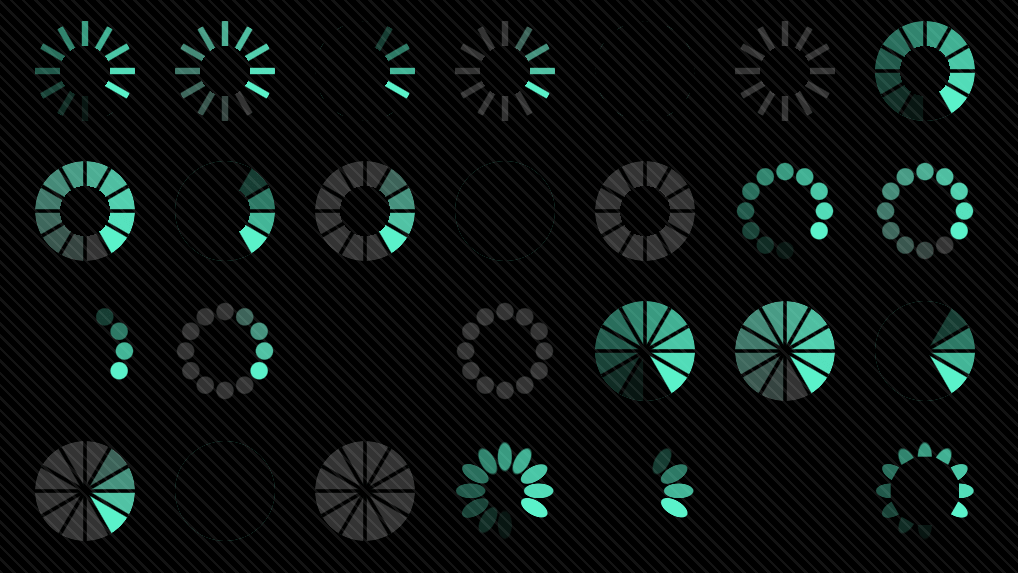
1. The Indeterminate Loader (Spinner, Pulse)
- Best for: Very short waits (under 2-3 seconds), where the duration is unknown or variable.
- Psychology: “Something is happening. Please stand by.” It acknowledges action but provides no timeline.
- The Craft: After 3 seconds, anxiety rises sharply. An indeterminate spinner must either resolve or transition into a determinate indicator. A spinner that spins for 10 seconds is an admission of poor planning.
- Example: GitHub’s pulsing placeholder when a single-line comment is saving.
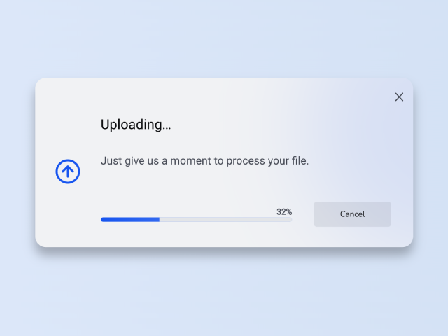
2. The Determinate Progress Bar
- Best for: Known durations (file uploads, installs, multi-step processes).
- Psychology: “We know how long this will take, and we are being transparent with you.” It is the ultimate tool for managing expectations.
- The Craft:
- Never Lie: The bar must move forward reliably. A bar that jumps ahead or stalls destroys trust permanently.
- The Ease-Out Illusion: Start the bar movement quickly to give an early sense of momentum, then slow it as it approaches 100%. This leverages the peak-end rule—users judge the experience by its peak (fast start) and its end (smooth completion).
- Add a Label: “3 of 5 files uploaded” is infinitely more reassuring than a moving bar alone.
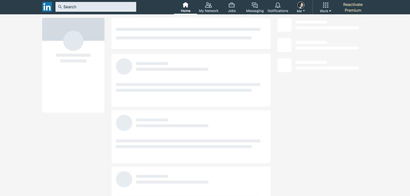
3. The Skeleton Screen (Perceived Performance)
- Best for: Content-heavy pages (dashboards, feeds, articles).
- Psychology: “The page is here, we are just personalizing it for you.” It shifts the mental model from “loading” to “populating.”
- The Craft: The skeleton must be an accurate, low-fidelity wireframe of the incoming content. A generic gray block is a missed opportunity. A skeleton that mirrors the final layout (text lines, image blocks) creates a powerful illusion of speed, as the user’s mind begins to engage with the structure before the content arrives.
- Example: LinkedIn or Facebook’s feed, which loads the social framework instantly before filling in posts.
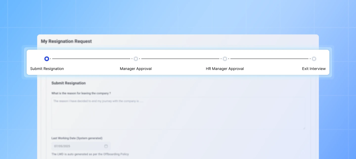
4. The Progressive Disclosure
- Best for: Complex pages with multiple independent modules.
- Psychology: “We are getting you useful things as fast as possible.”
- The Craft: Load the core, interactive framework first (navigation, header), then populate it with content in order of priority. A user can often begin navigating even while lower-priority images load. This is not just a technical pattern, it’s a design philosophy: prioritize what the user can do over what they can see.
Advanced Tactics: Designing the Emotional Arc of the Wait
1. Occupy the Mind
Boredom exacerbates perceived duration. Use animation, microcopy, or educational tips to provide a distraction.
- Slack’s loading messages: “Reticulating splines…” uses humor to charm.
- A game installer: “Did you know? You can customize your controls in Settings.” This uses trivia to make the wait feel productive.
2. Communicate Value
Connect the wait to a worthwhile outcome.
- Instead of: “Processing…”
- Try: “Applying your custom filters to 10,000 records.” This justifies the wait by highlighting the scale of the task being performed for the user.
3. The Promise of Completion
Always signal the end state.
- A progress bar that fills and then displays a clear “Complete!” checkmark.
- A skeleton screen where the final image fades in, not cuts in.
- A micro-interaction, like a satisfying “shhk” sound as a download finishes.
These completion signals provide cognitive closure, telling the user the system has reached a stable, successful state.
The Ethical Line: When Design Deceives
This power comes with responsibility. A fast-moving progress bar that artificially inflates speed to hide a long wait (a tactic called “false progress”) is a dark pattern. It trades short-term satisfaction for long-term erosion of trust. The goal is to accurately shape perception, not to fabricate it.
The Principle: Waiting is a Conversation
Every loading state is a moment of dialogue between your product and your user. A blank screen is silence. A spinner is a polite “one moment, please.” A progress bar is a detailed briefing.
By designing this conversation with empathy, honesty, and a touch of craft, you do more than fill time. You build a relationship where the user feels respected, informed, and confident that your system is working diligently on their behalf. In the end, a well-designed wait doesn’t just feel shorter. It feels like quality.
About the Author

Peter Makeshoff
Peter Makeshoff is the founder and main author of Designer Daily.